Client: Arx anima, Arxlight, Peng-Boom-Tschak
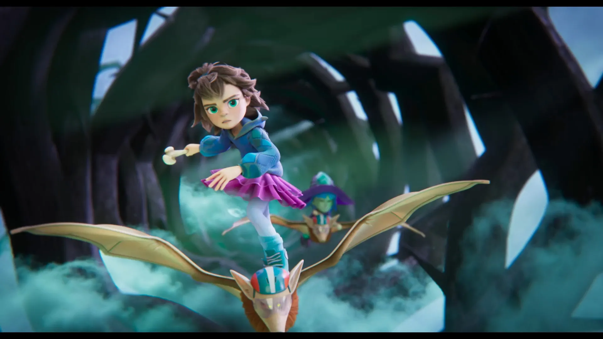
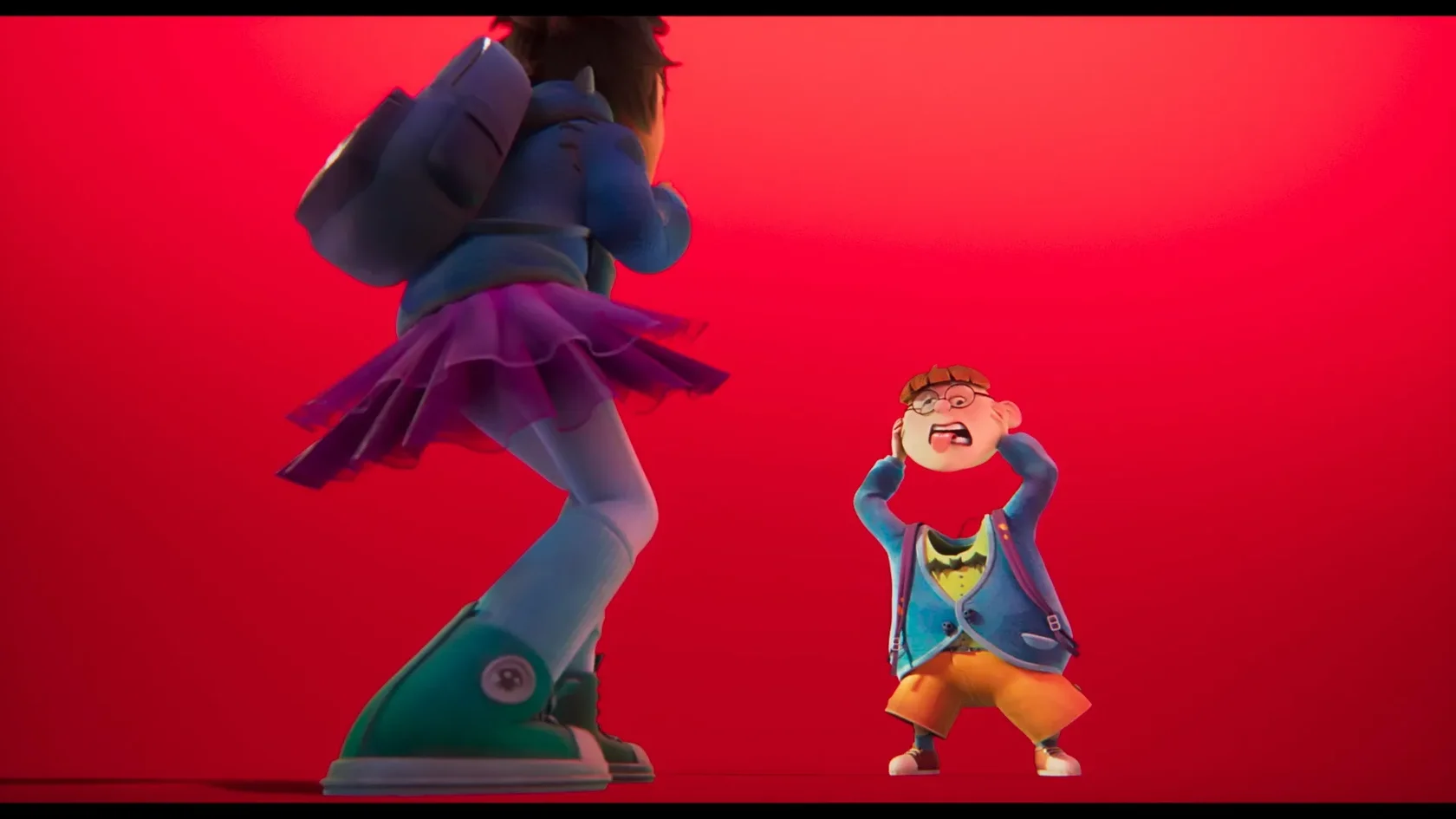
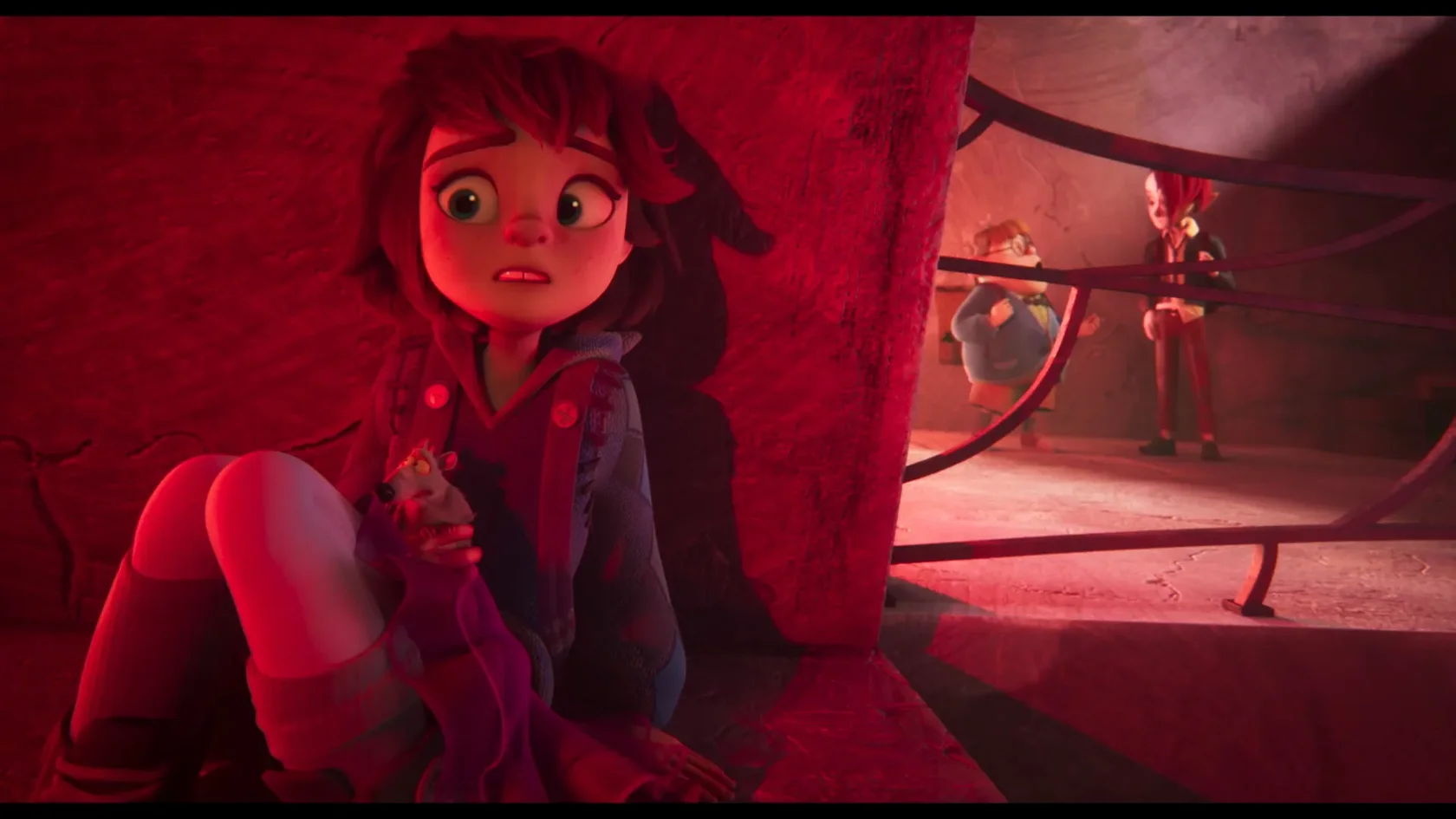
Monster Mia is a 3D animated film based on the bestselling book series ‘Monstrous Maud’ by author A.B. Saddlewick, directed by Verena Fels.
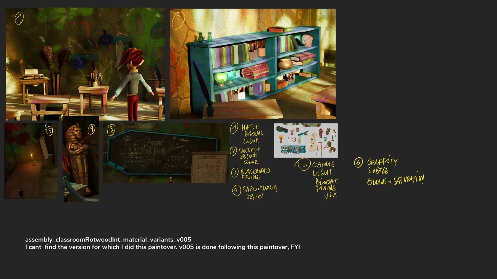
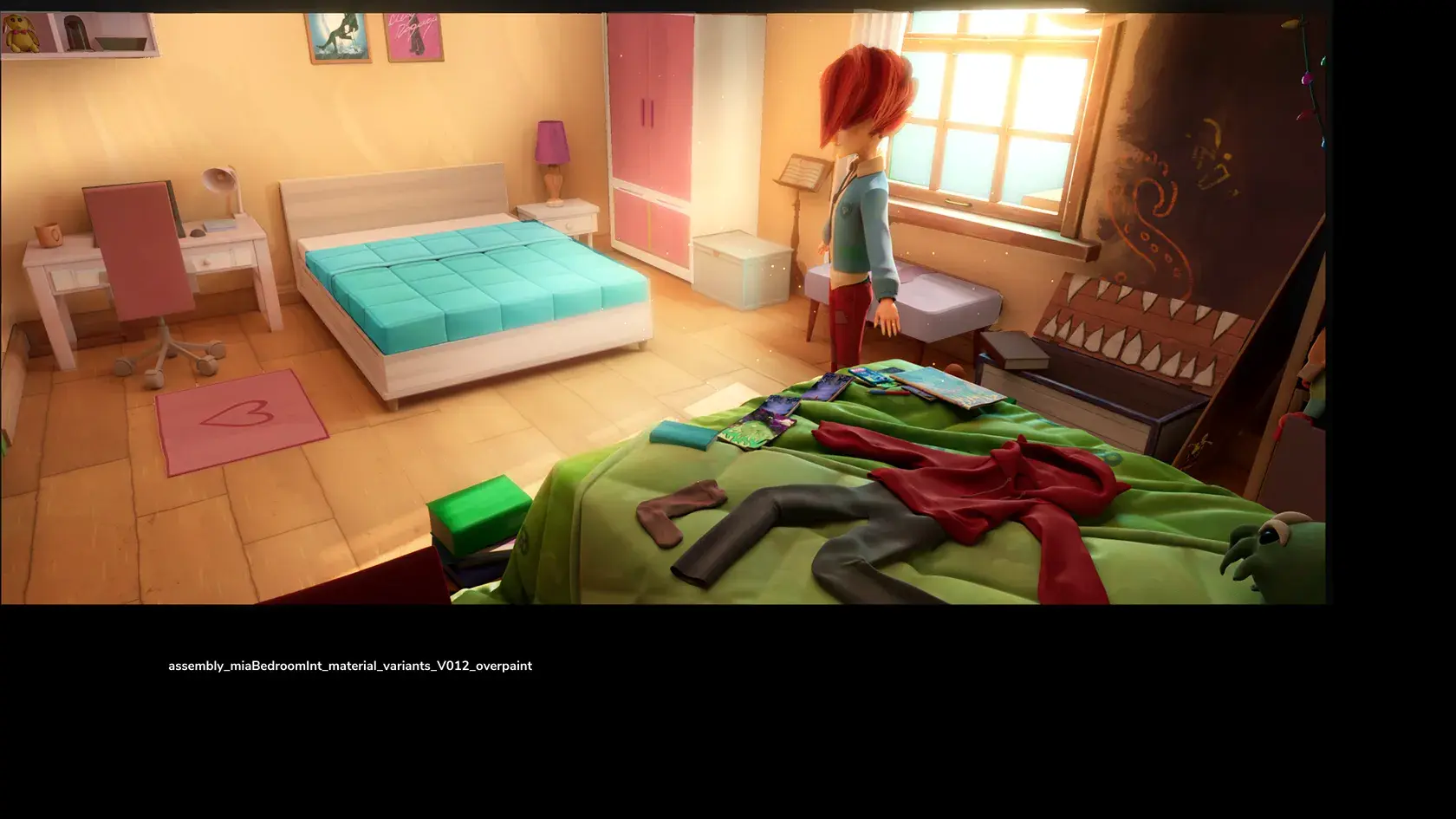
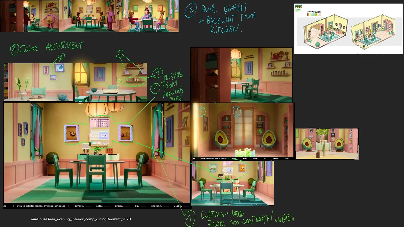
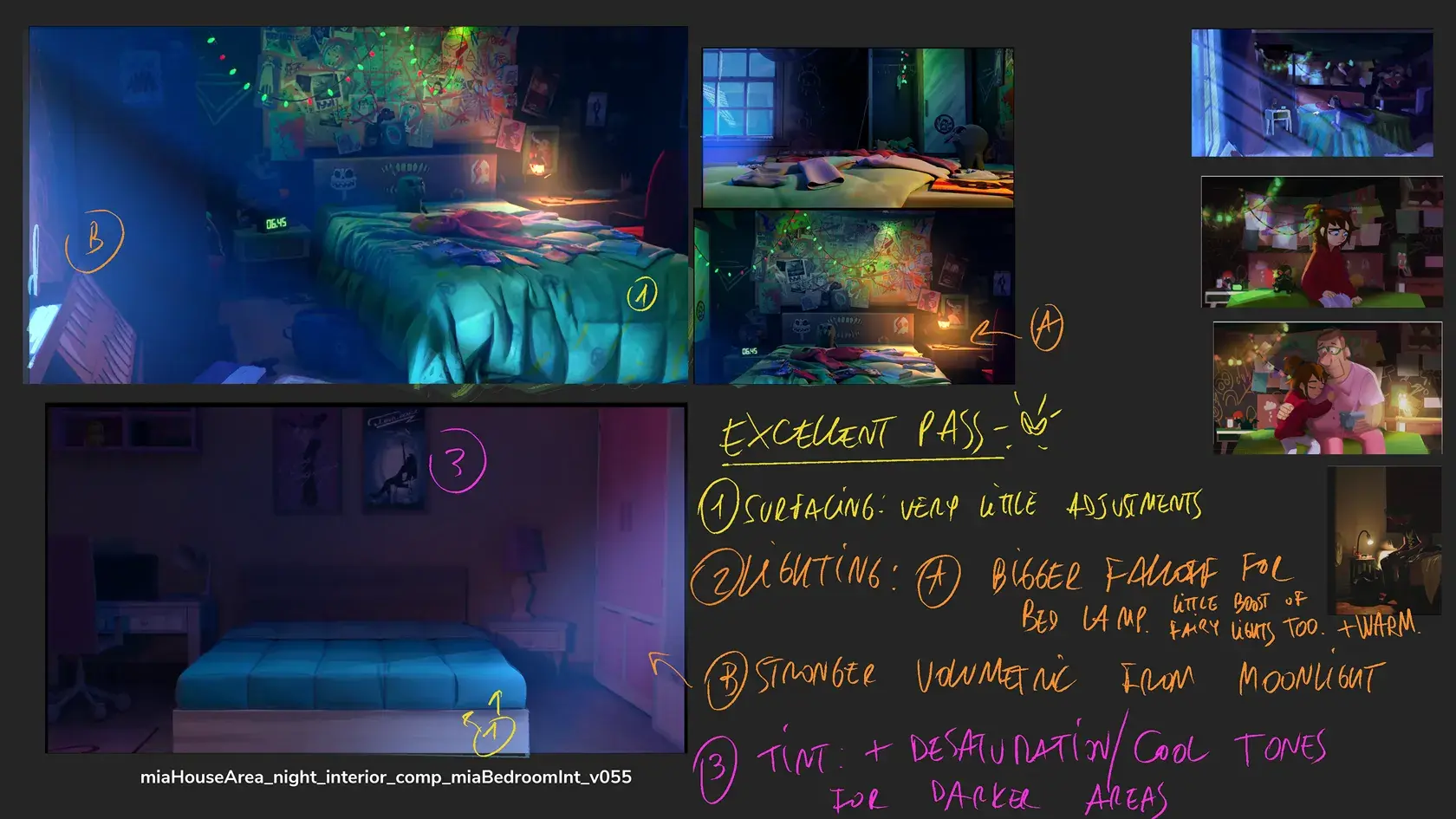
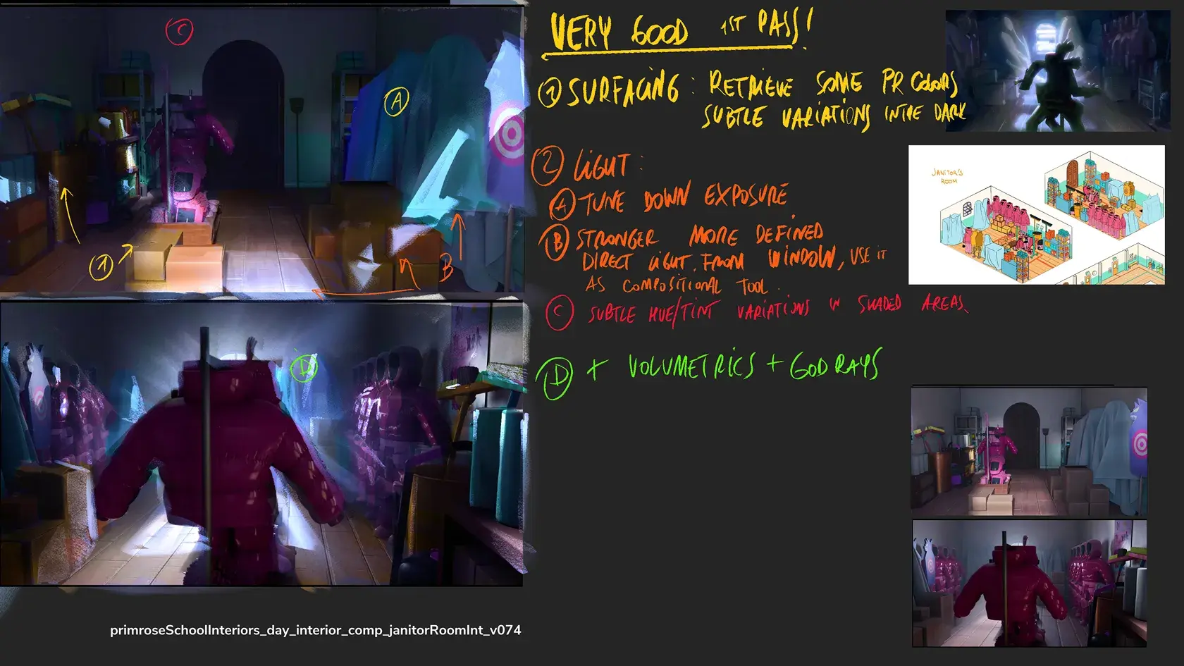
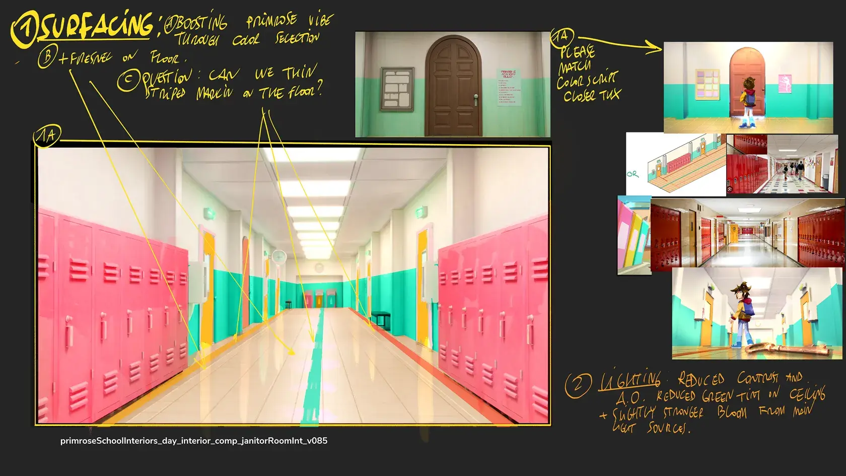
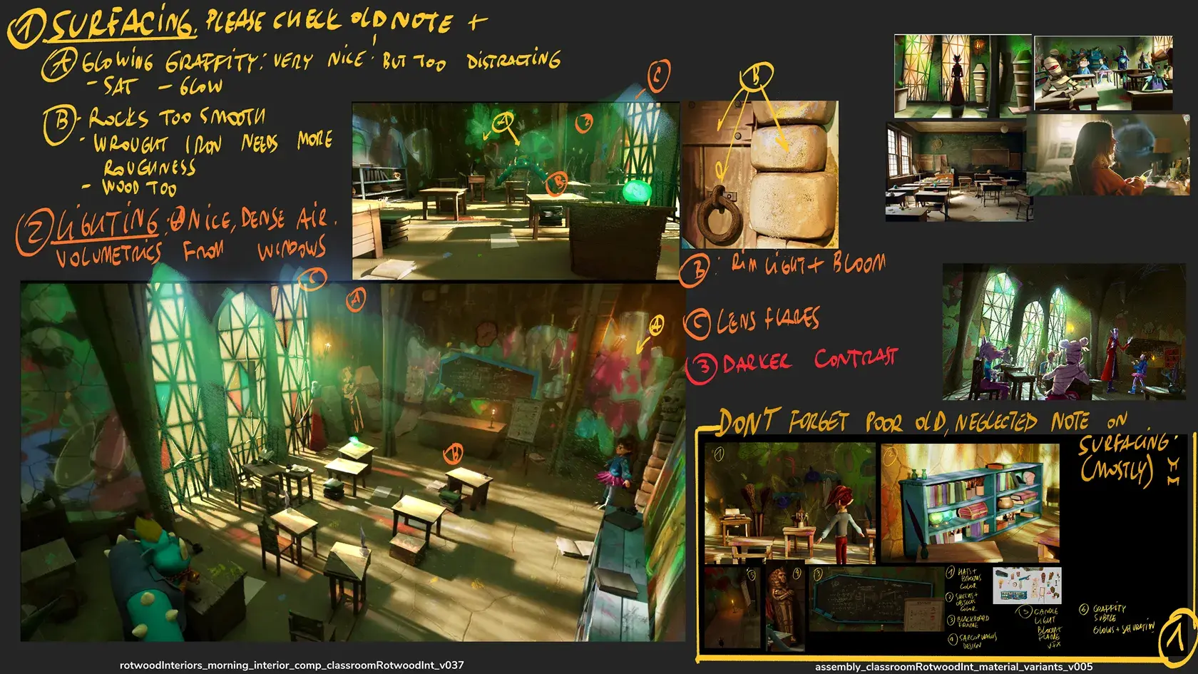
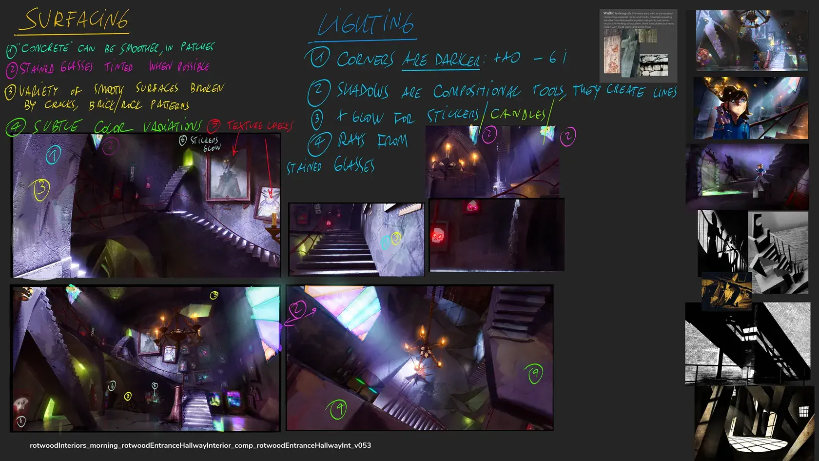
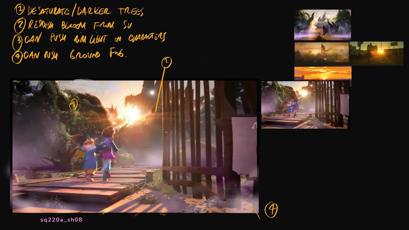
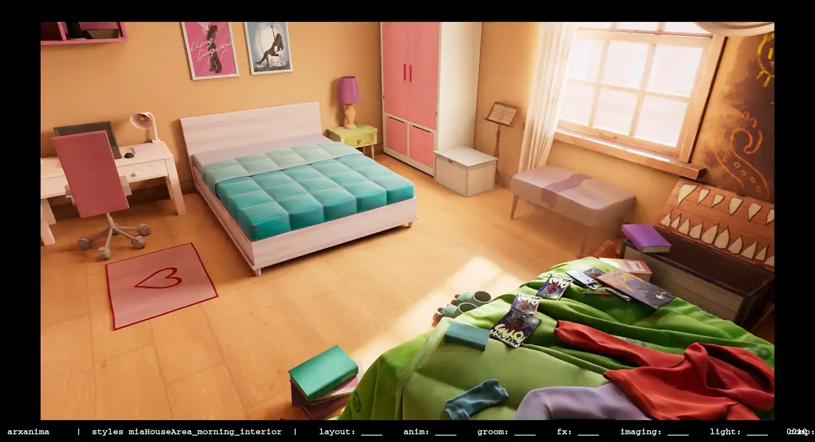
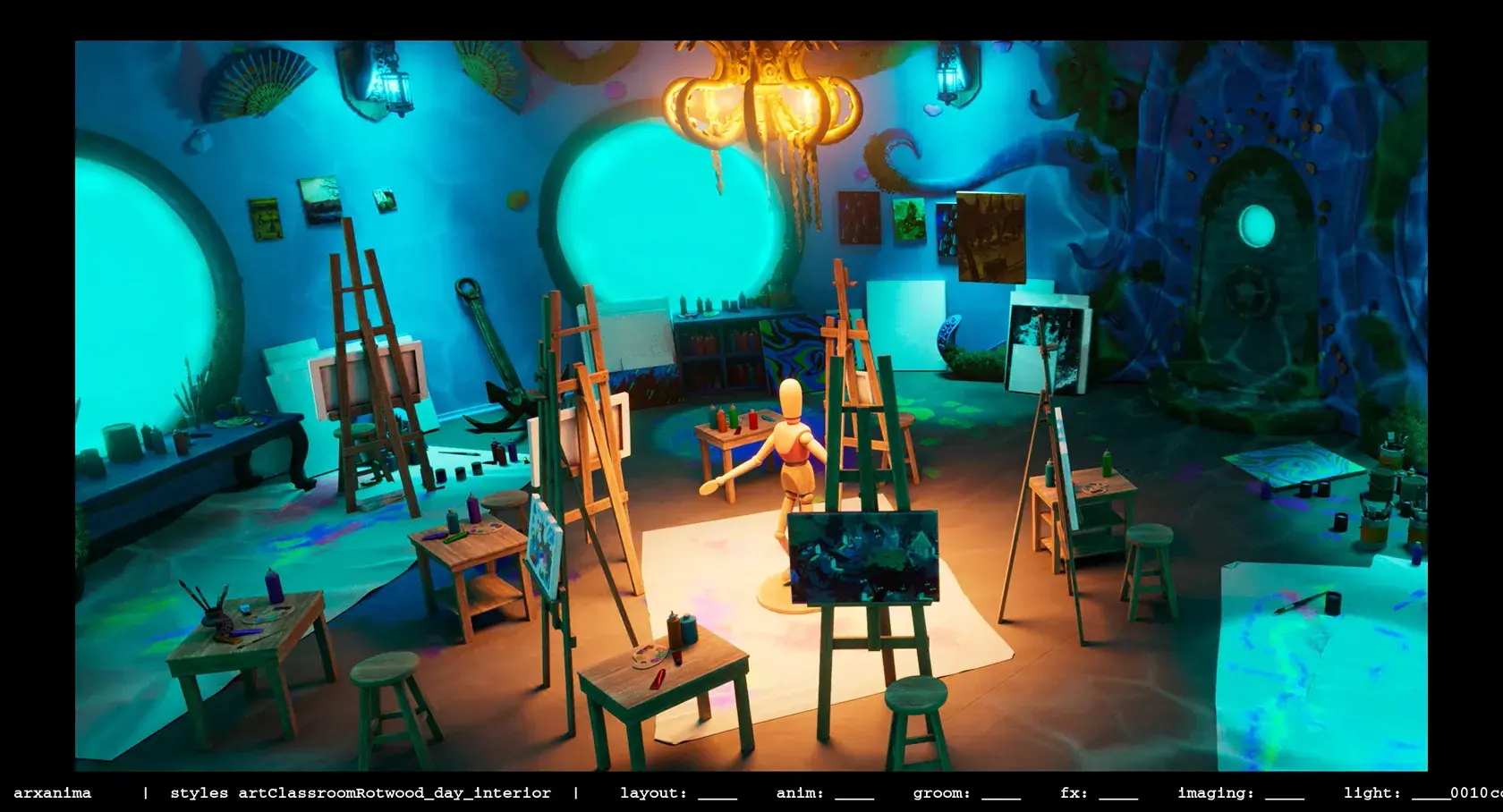
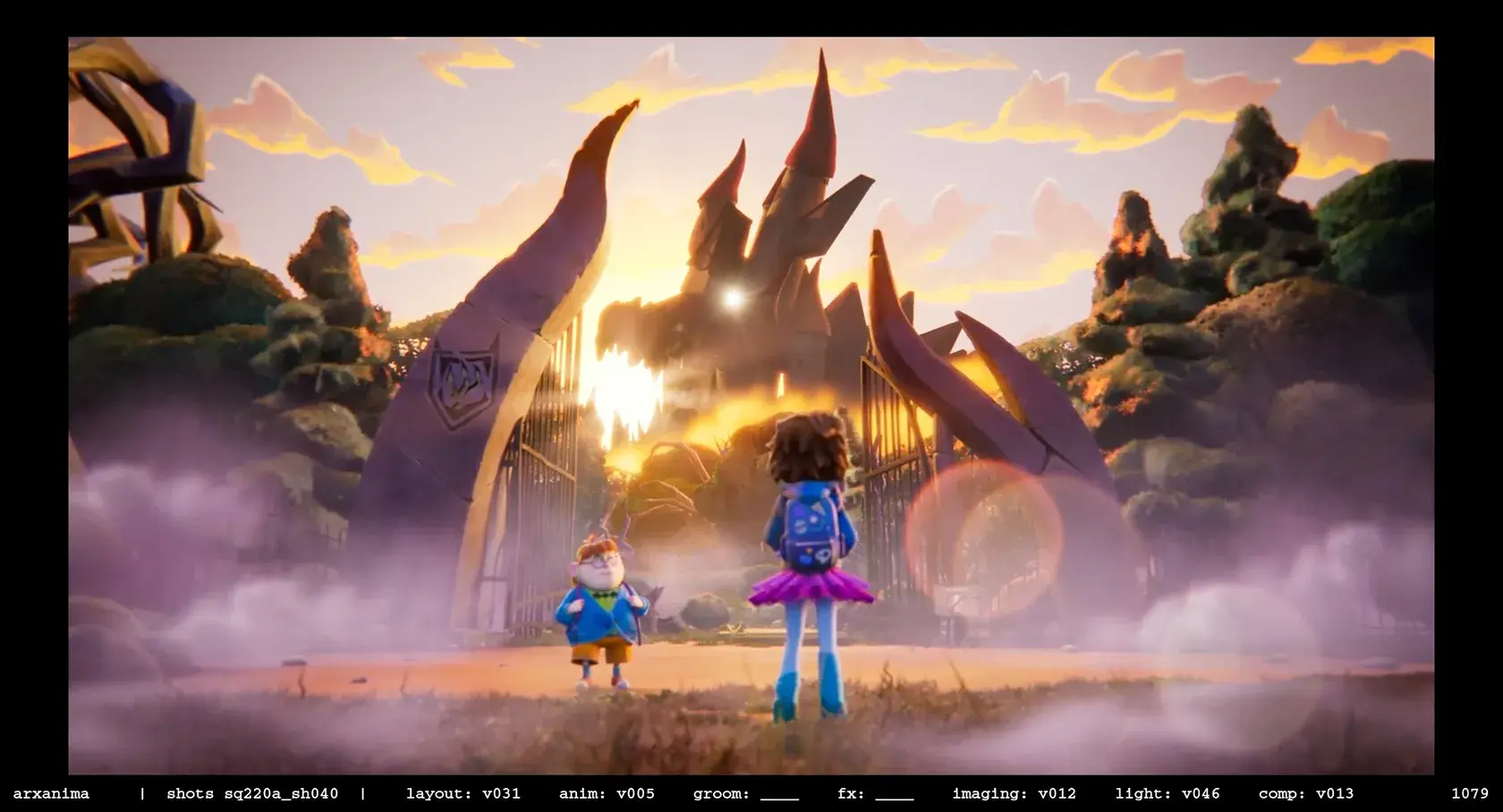
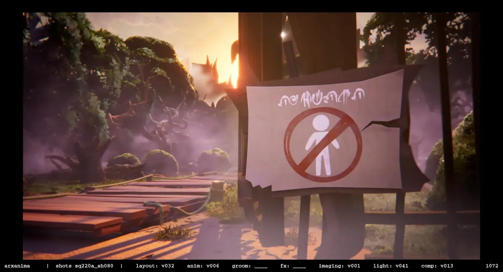
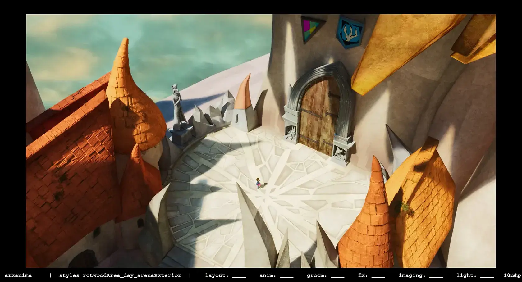
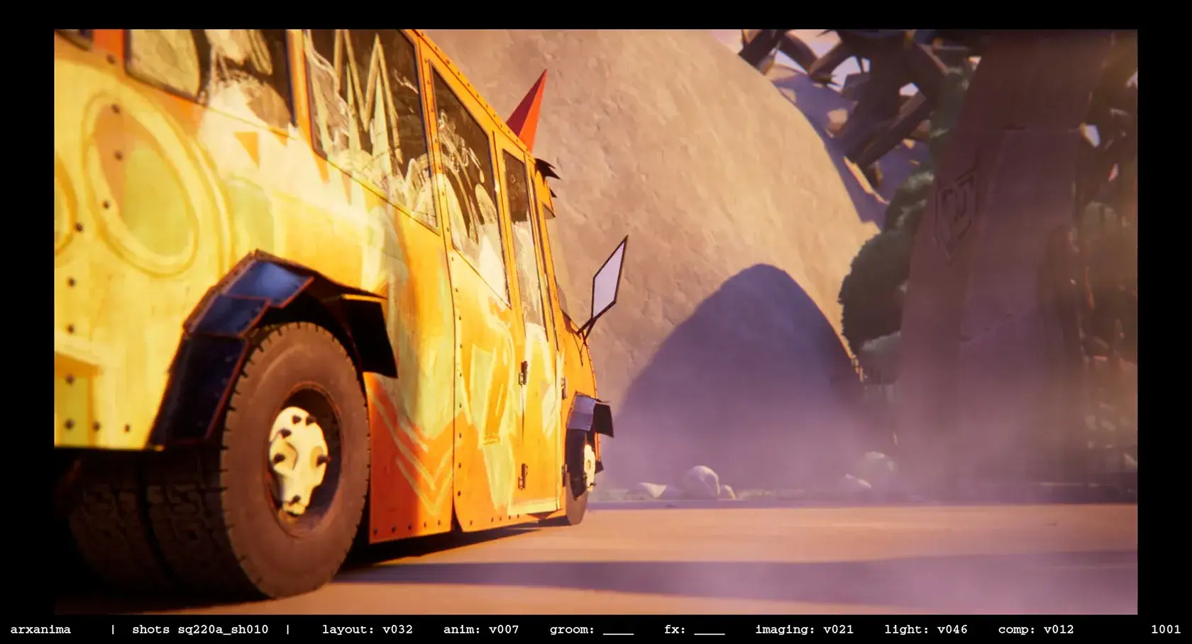
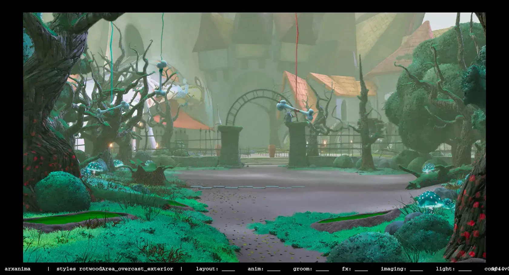
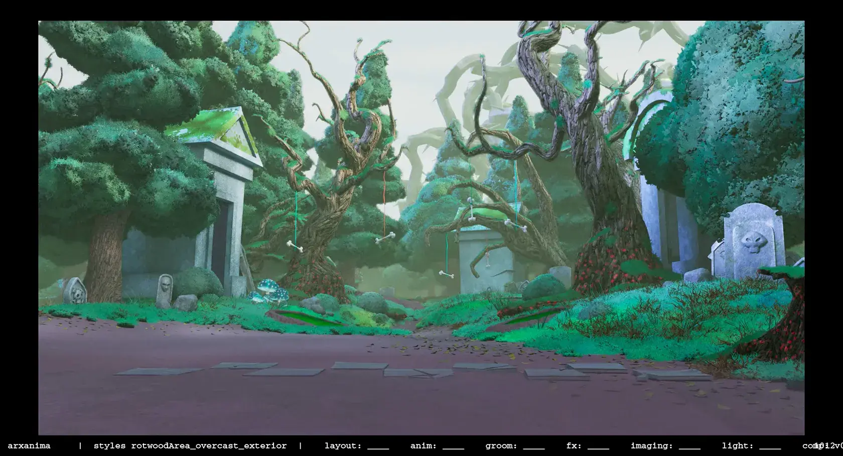
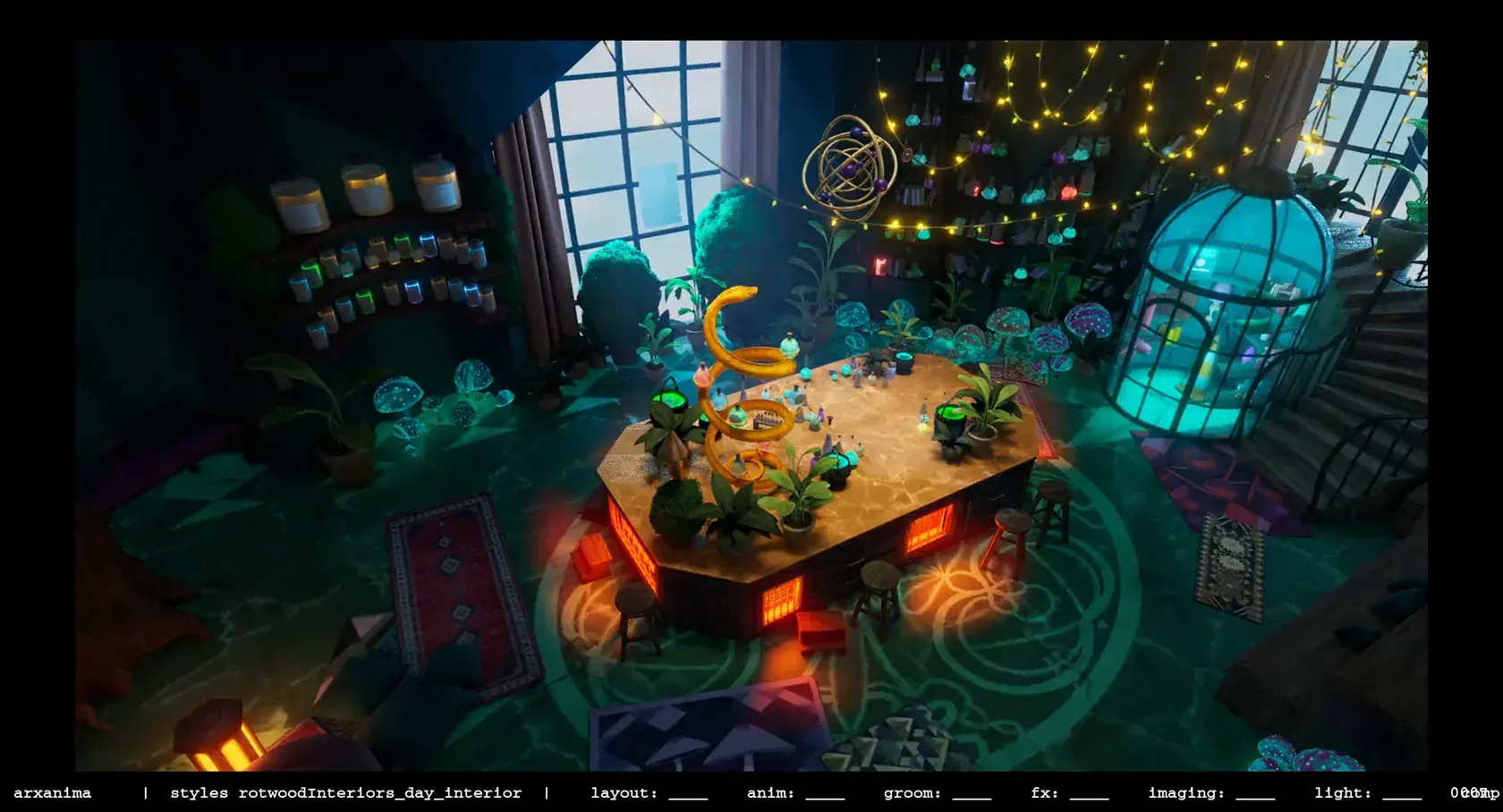
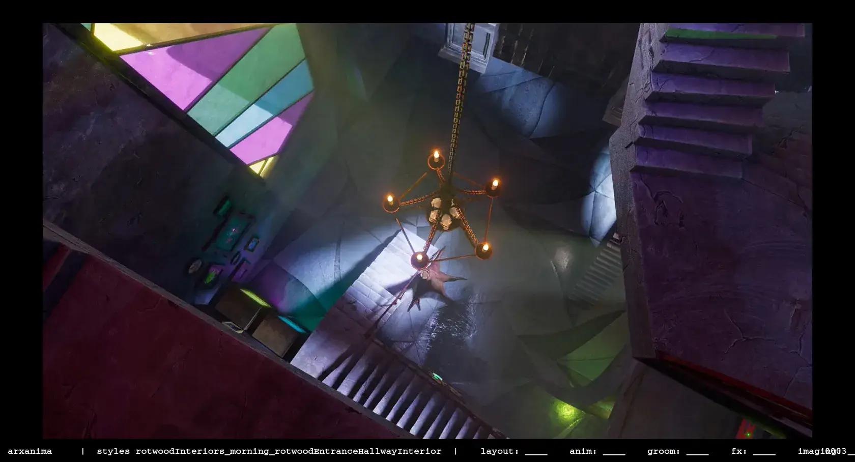
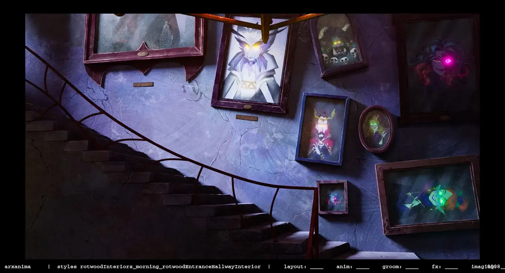
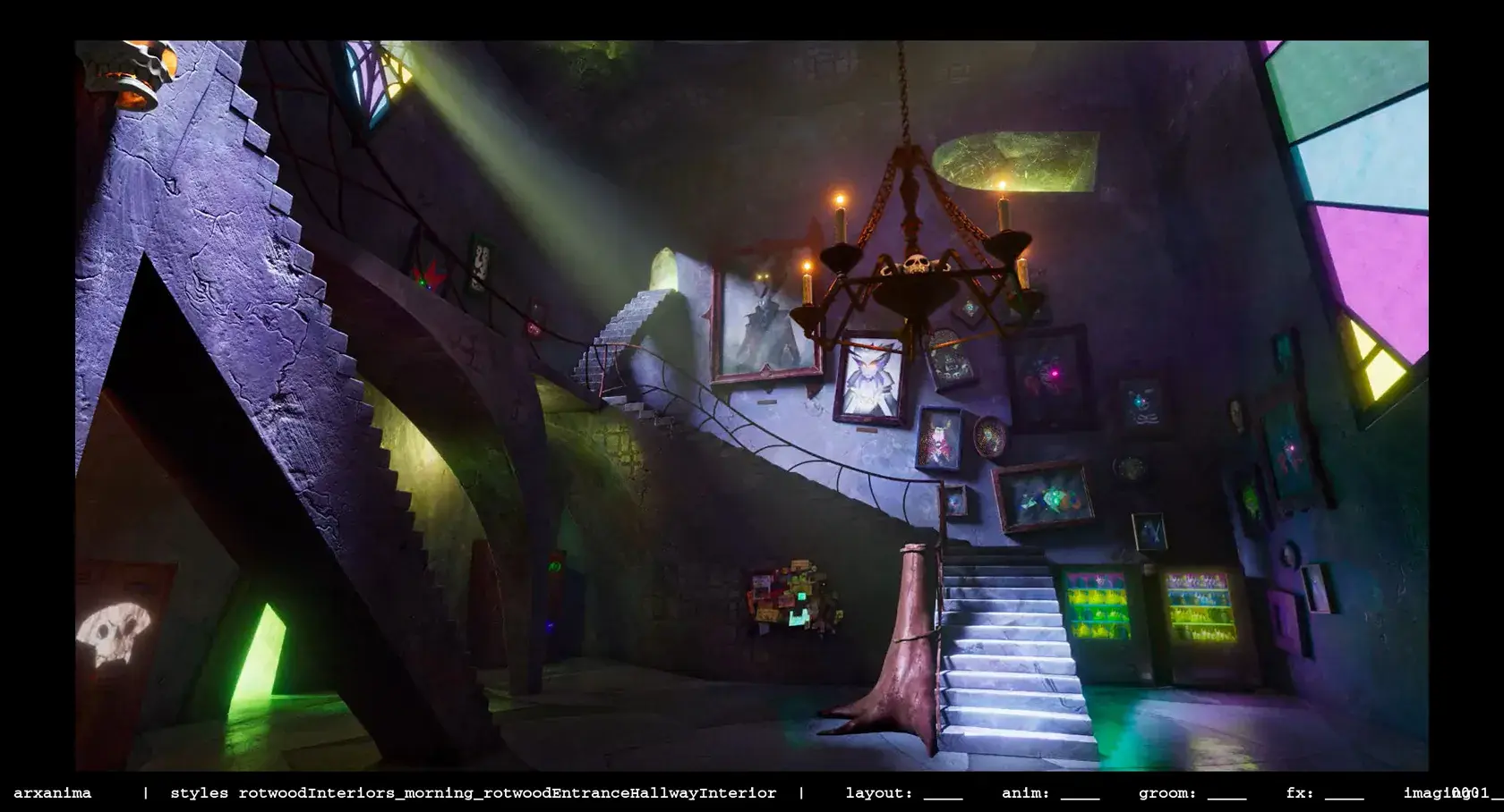
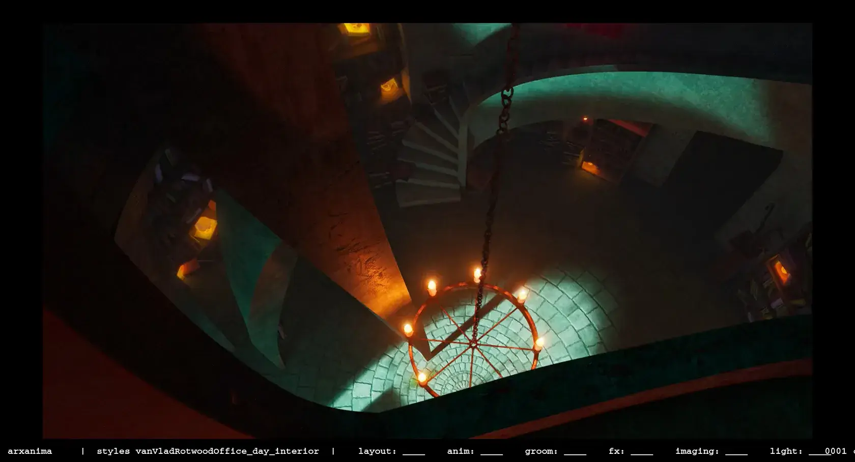
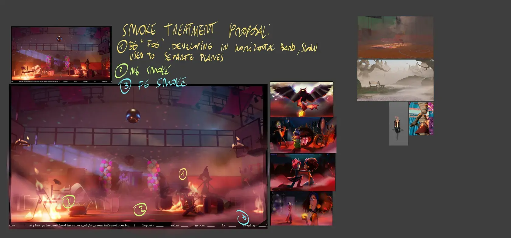
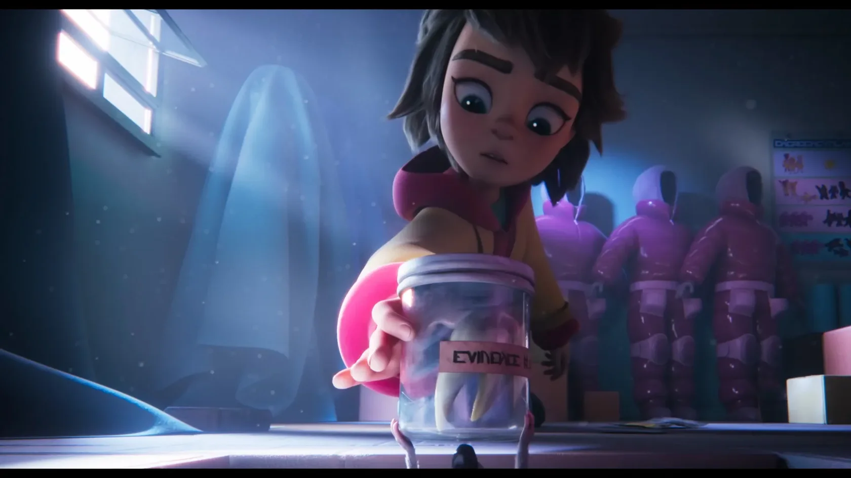
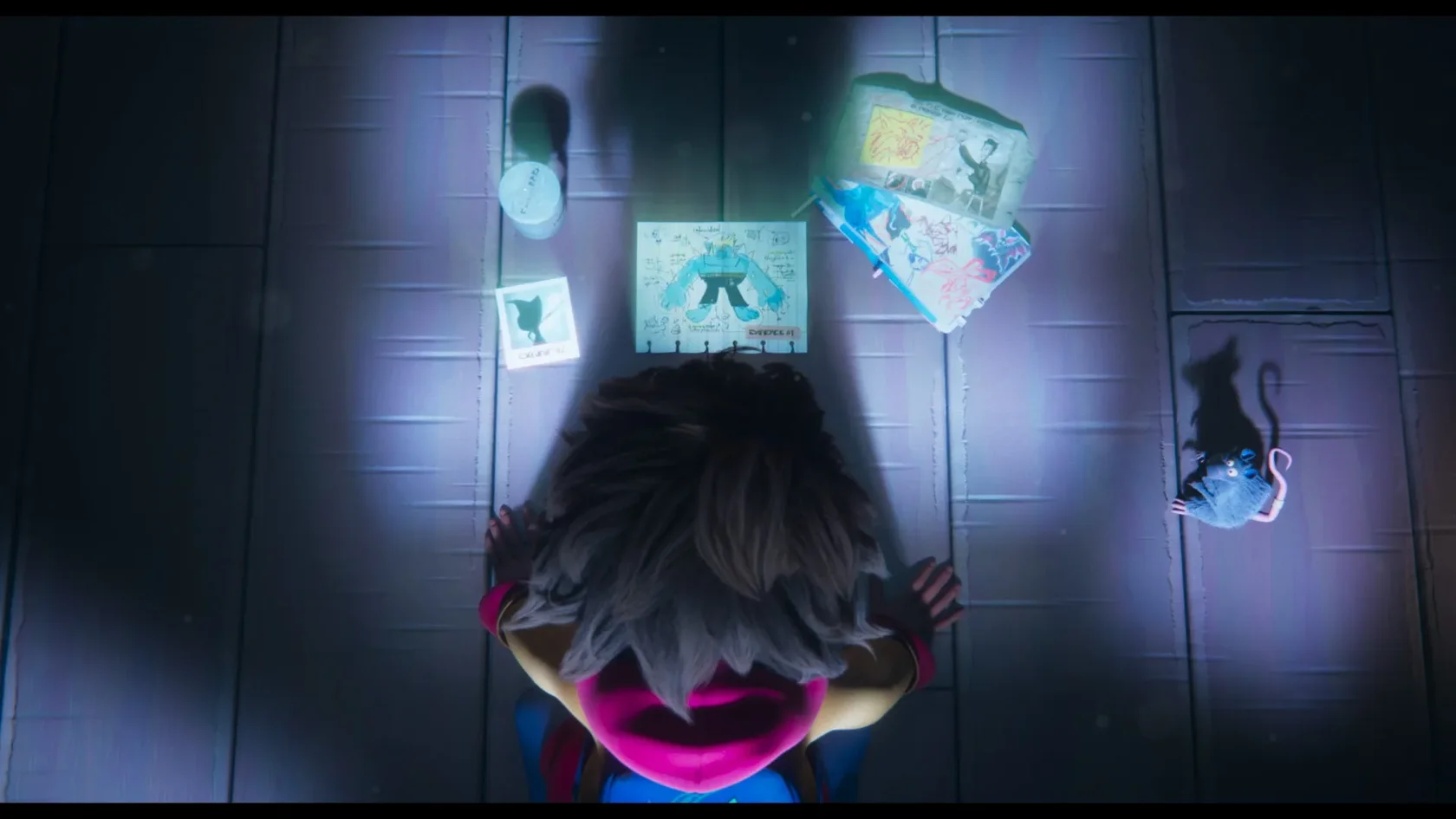
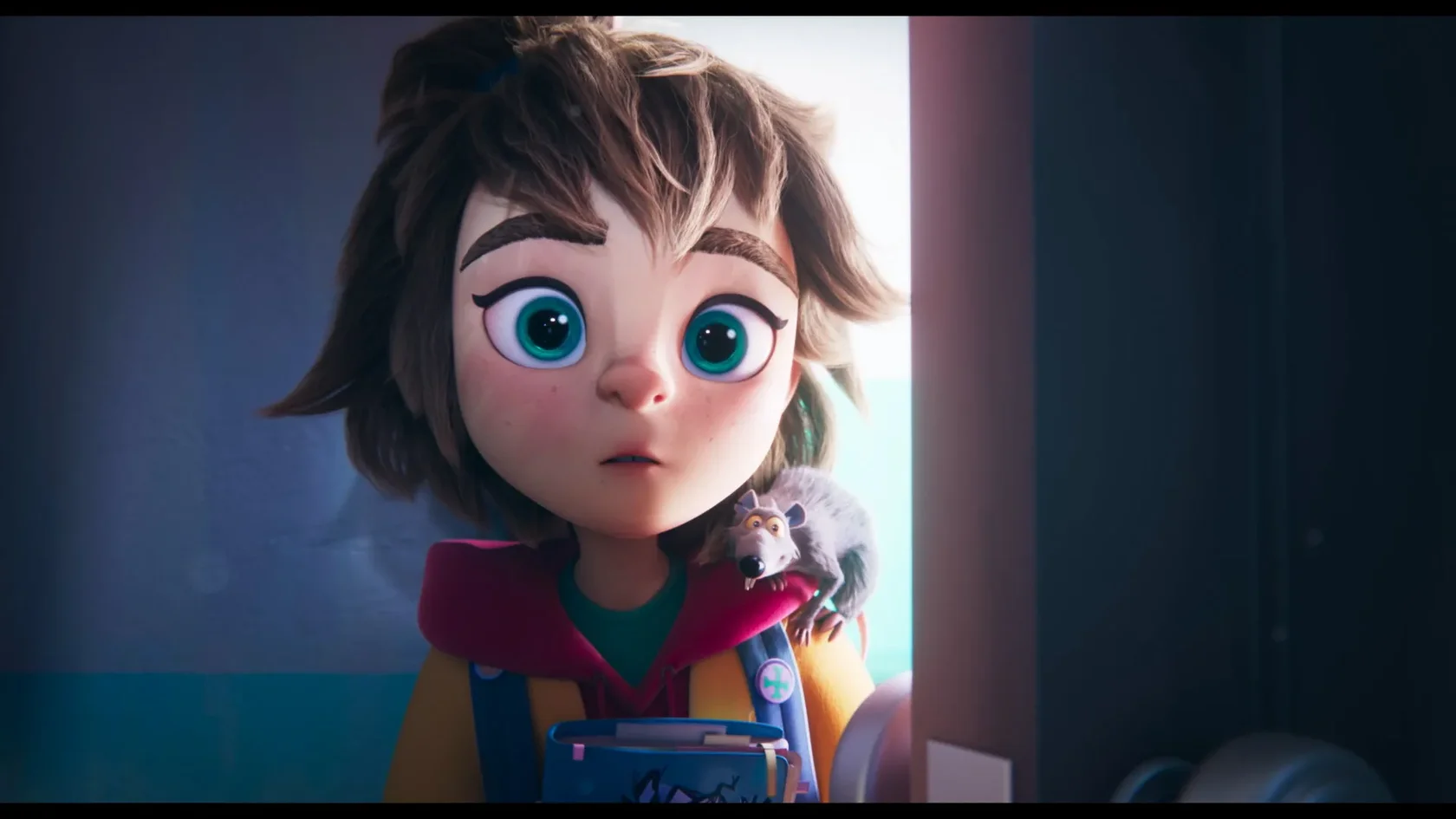
I worked on the film from September 2023 to October 2025 as a production designer. In this role, I was responsible for defining the overall look of the film, working closely with the director and producers, supervising the art department that designed the characters and sets, and then supervising and guiding various departments during the entire production (modelling, surfacing, VFX, lighting/compositing and colour grading).
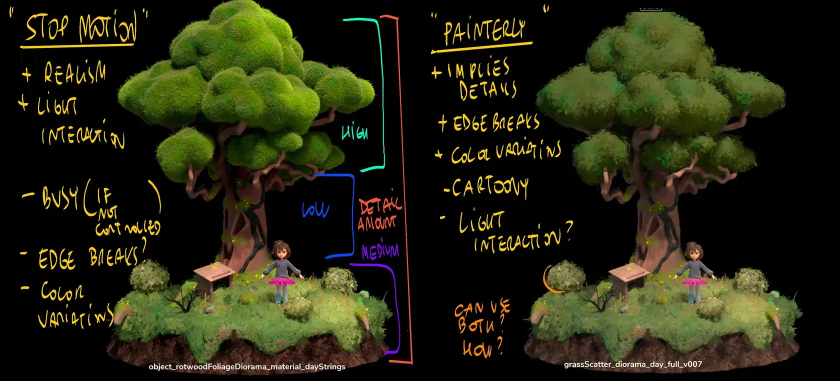
Initially, we wanted a rather stylised look, with flat, structured shapes and non-PBR lighting, but during production we had to tone down some of the more “bold” aspects to find the right visual balance between time, budget and producer feedback.
Coming out in October 2026! (I will post all the material then:)
Visual Development
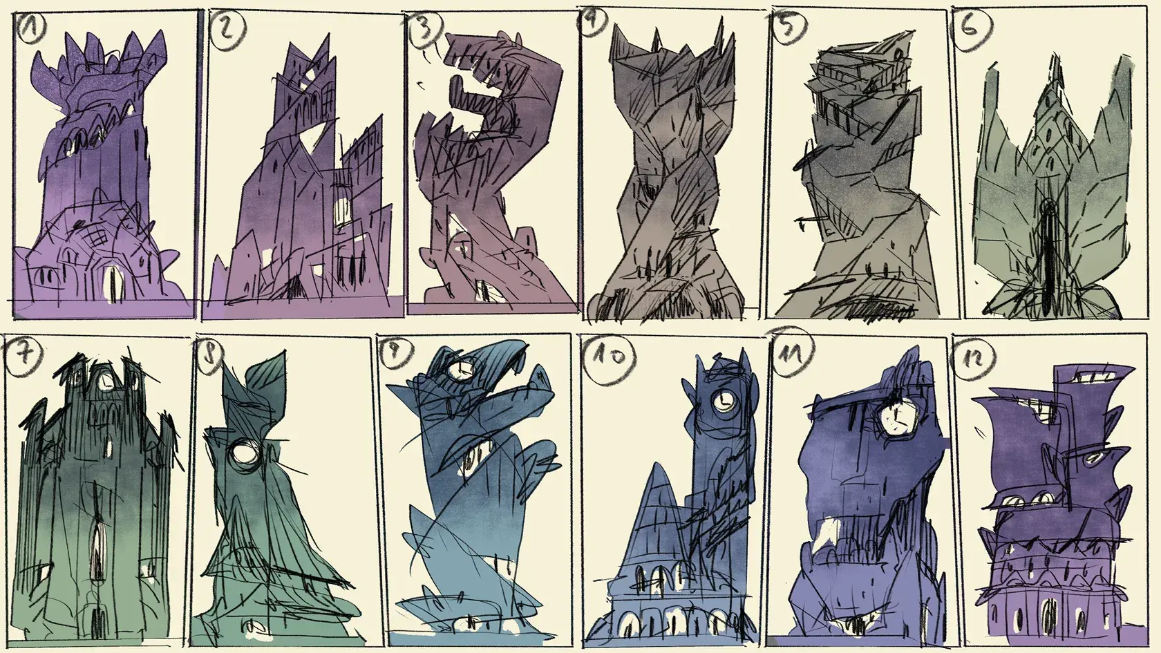
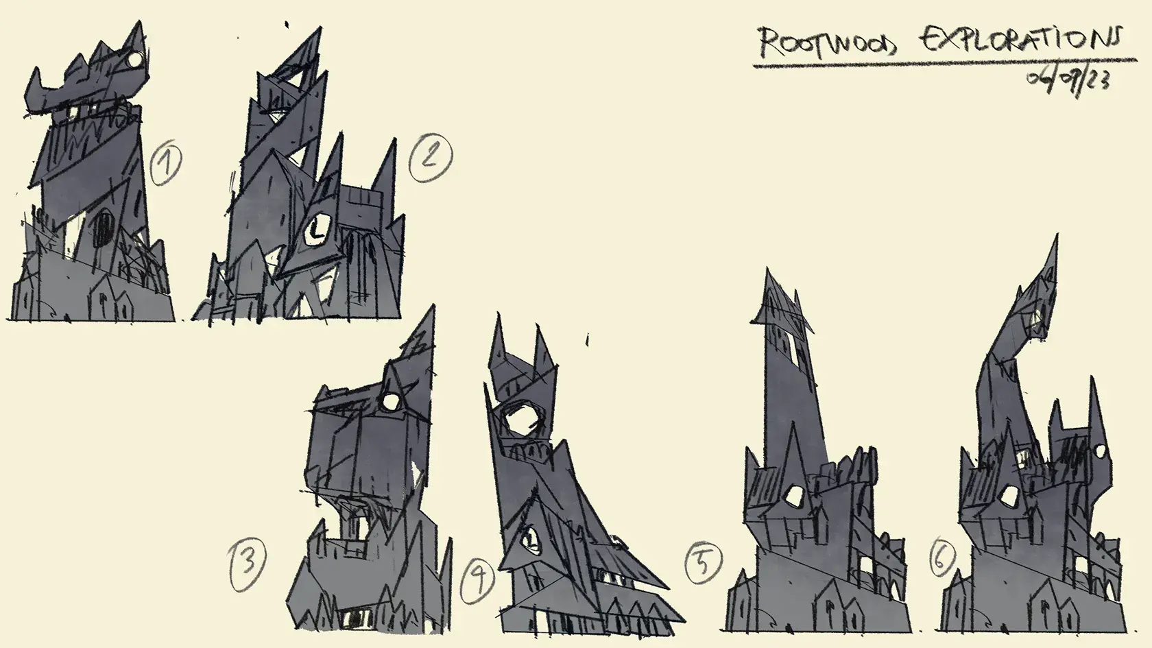
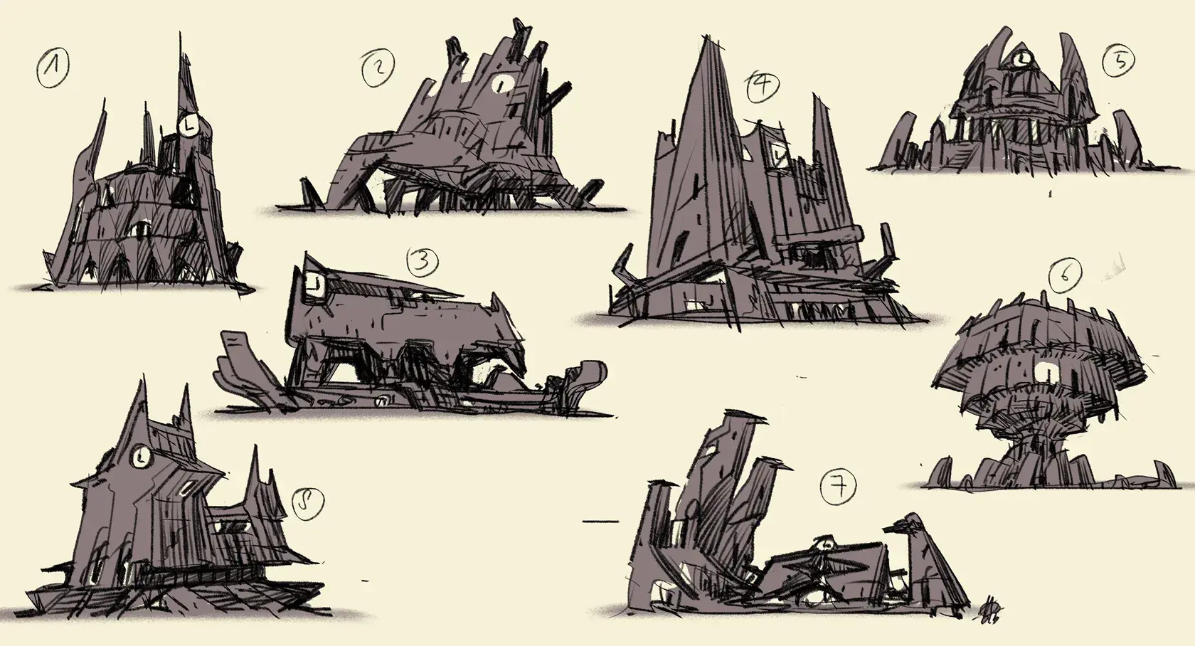
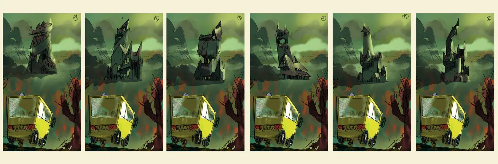
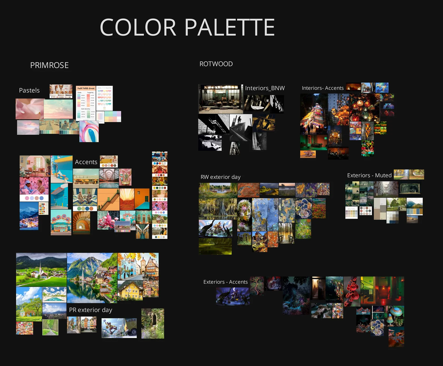
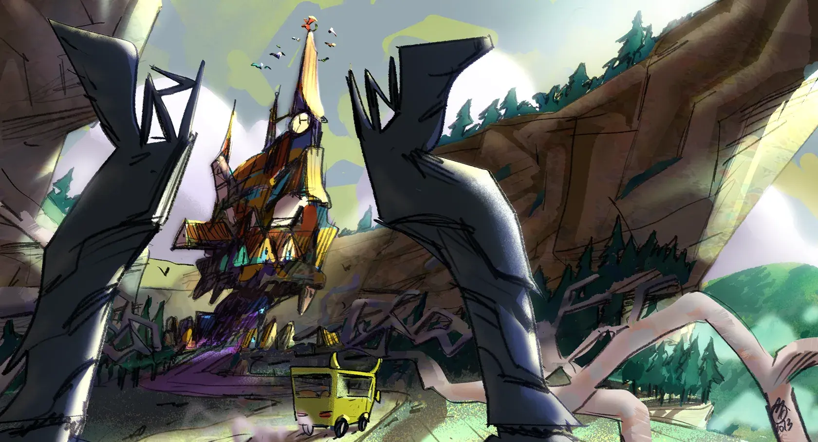
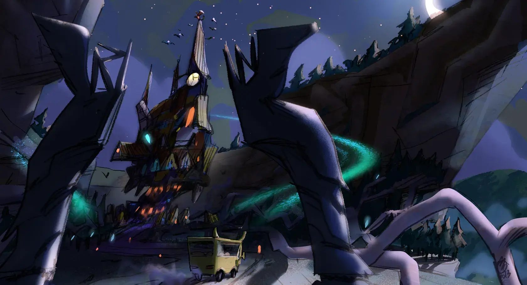
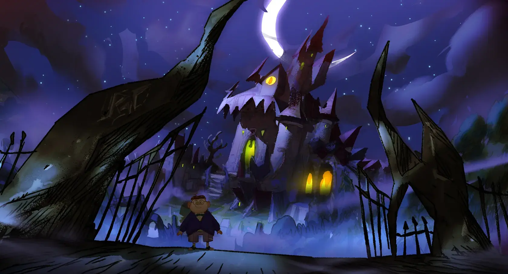
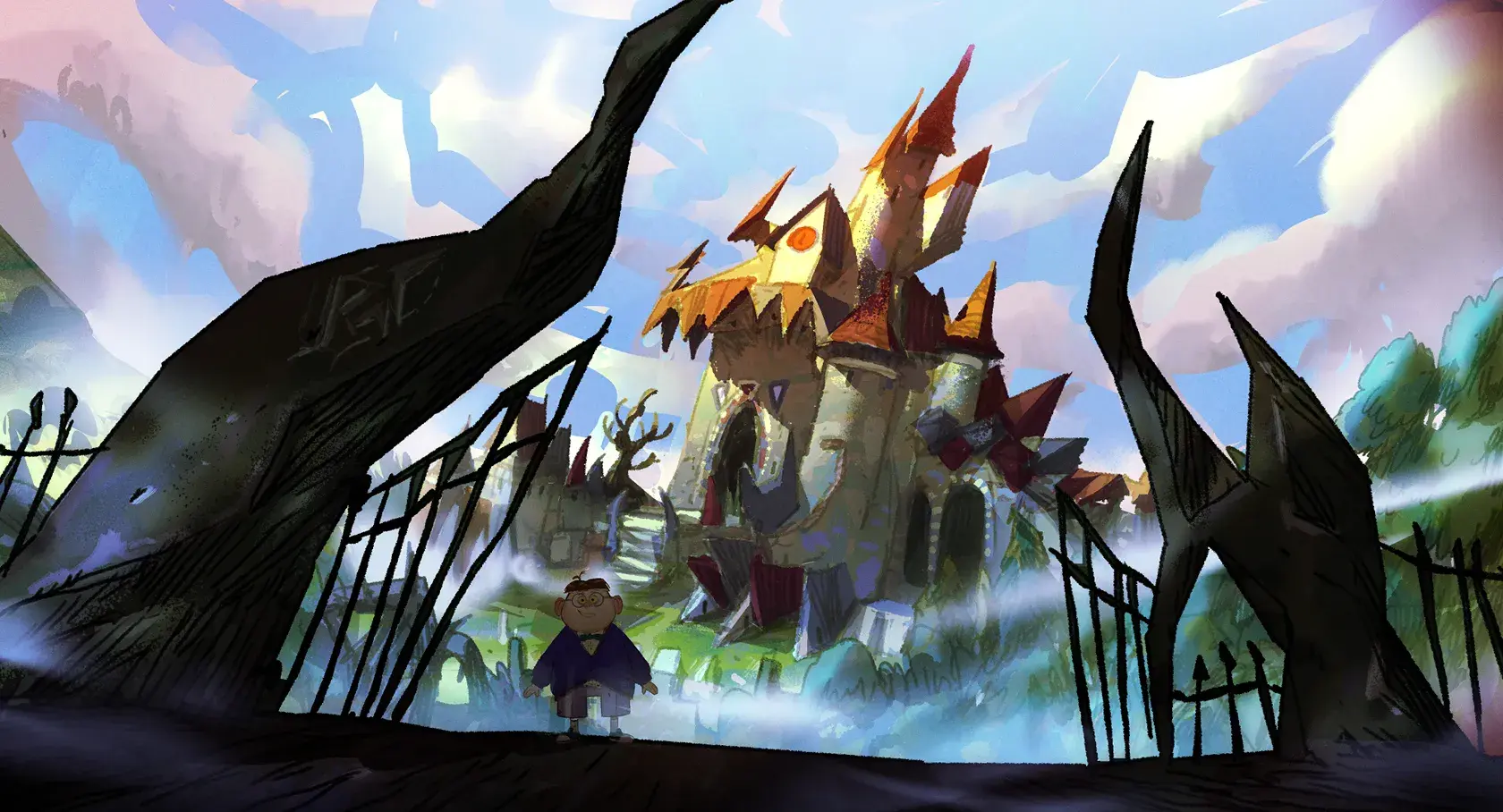
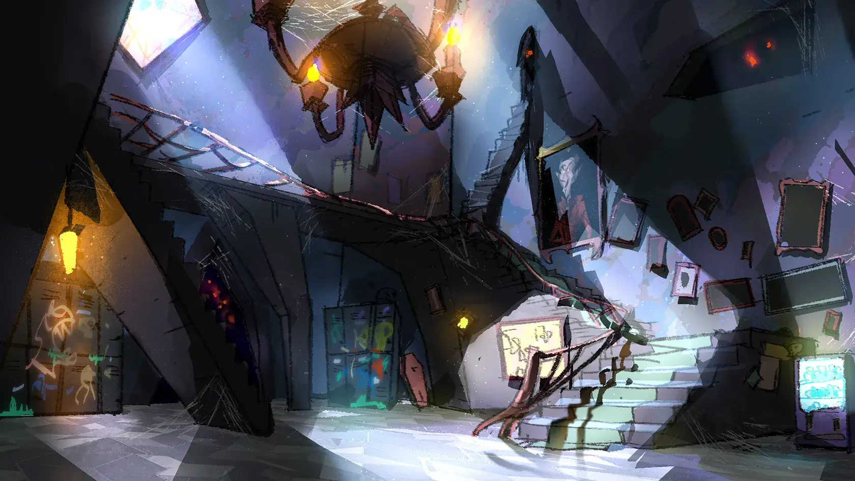
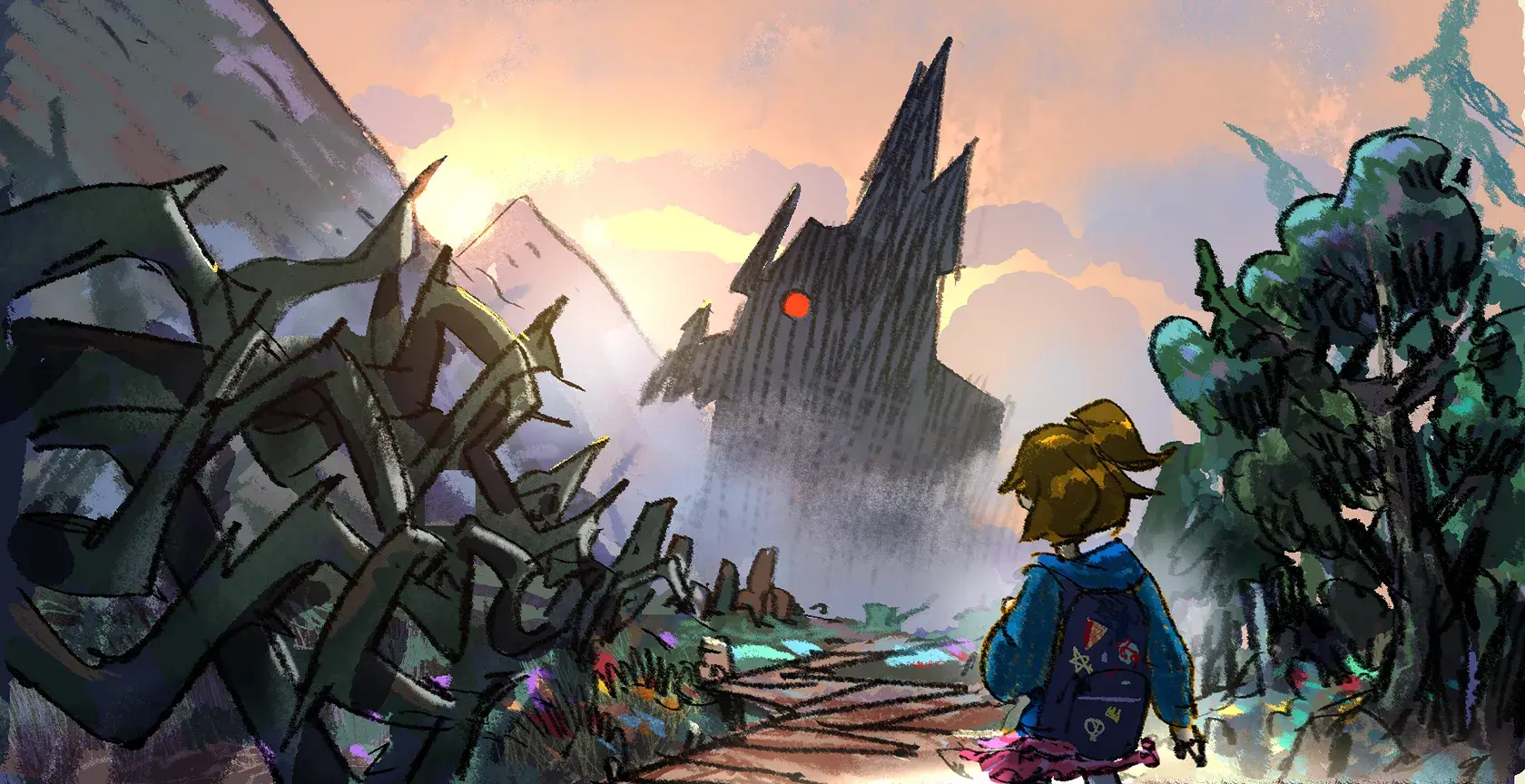
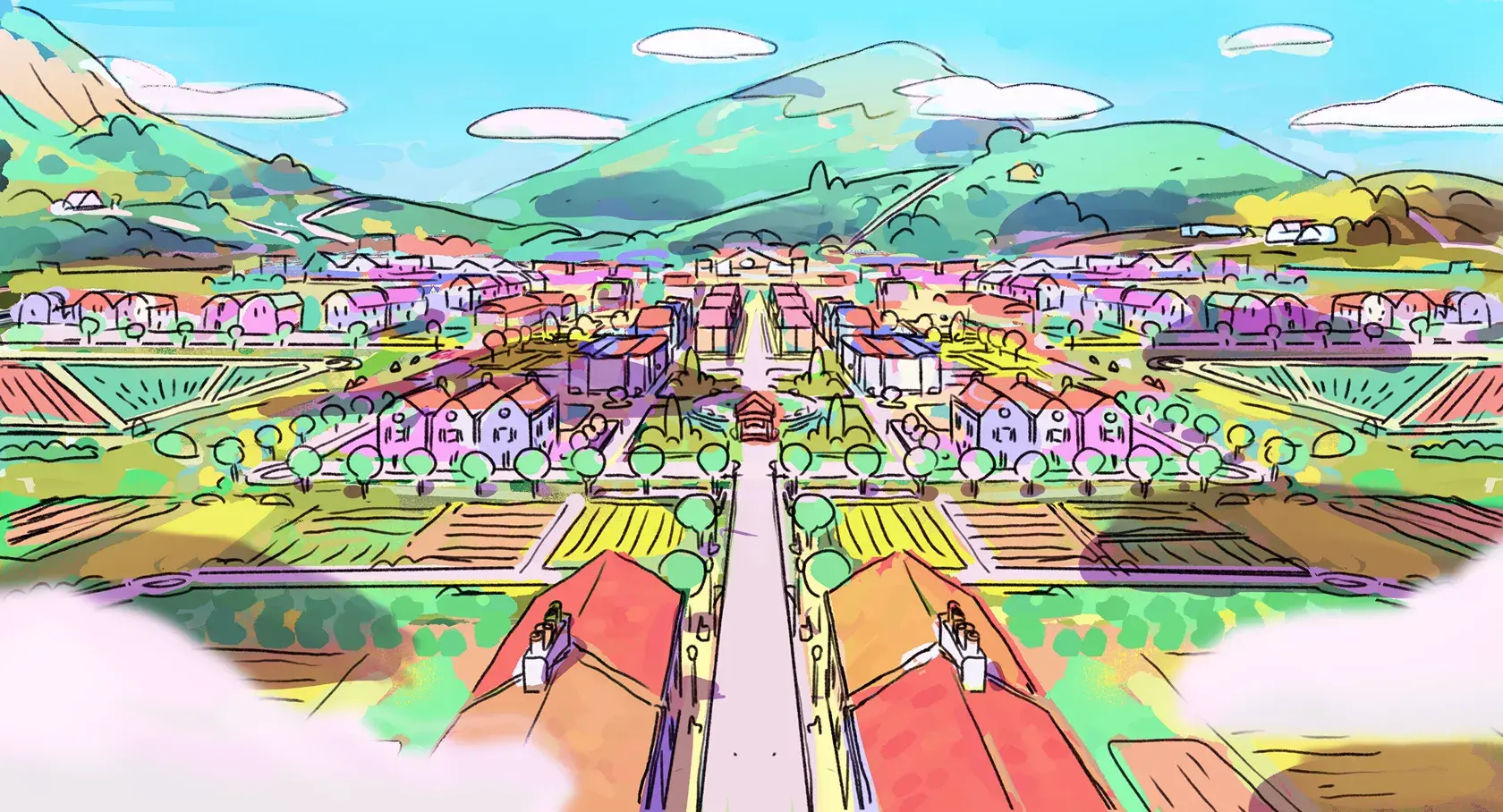
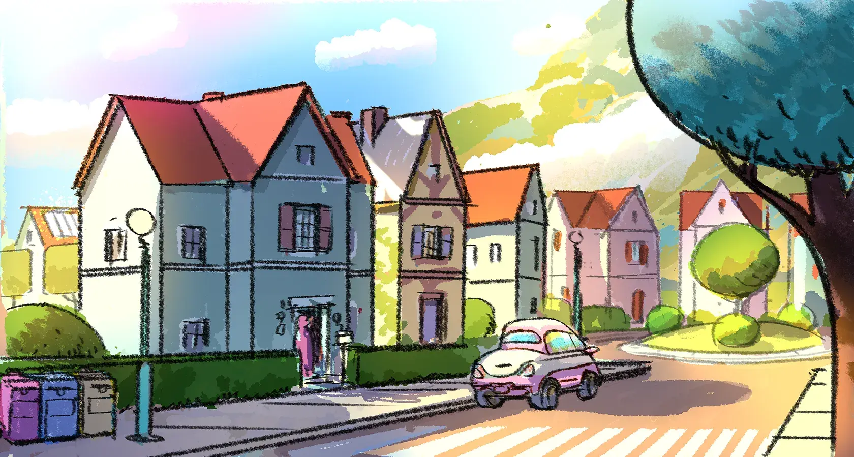
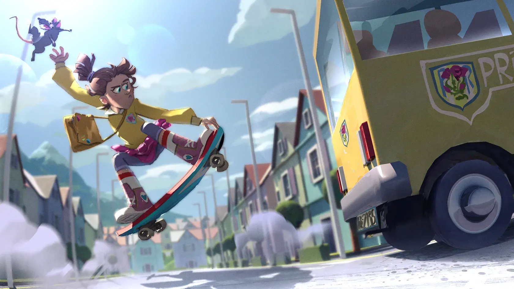
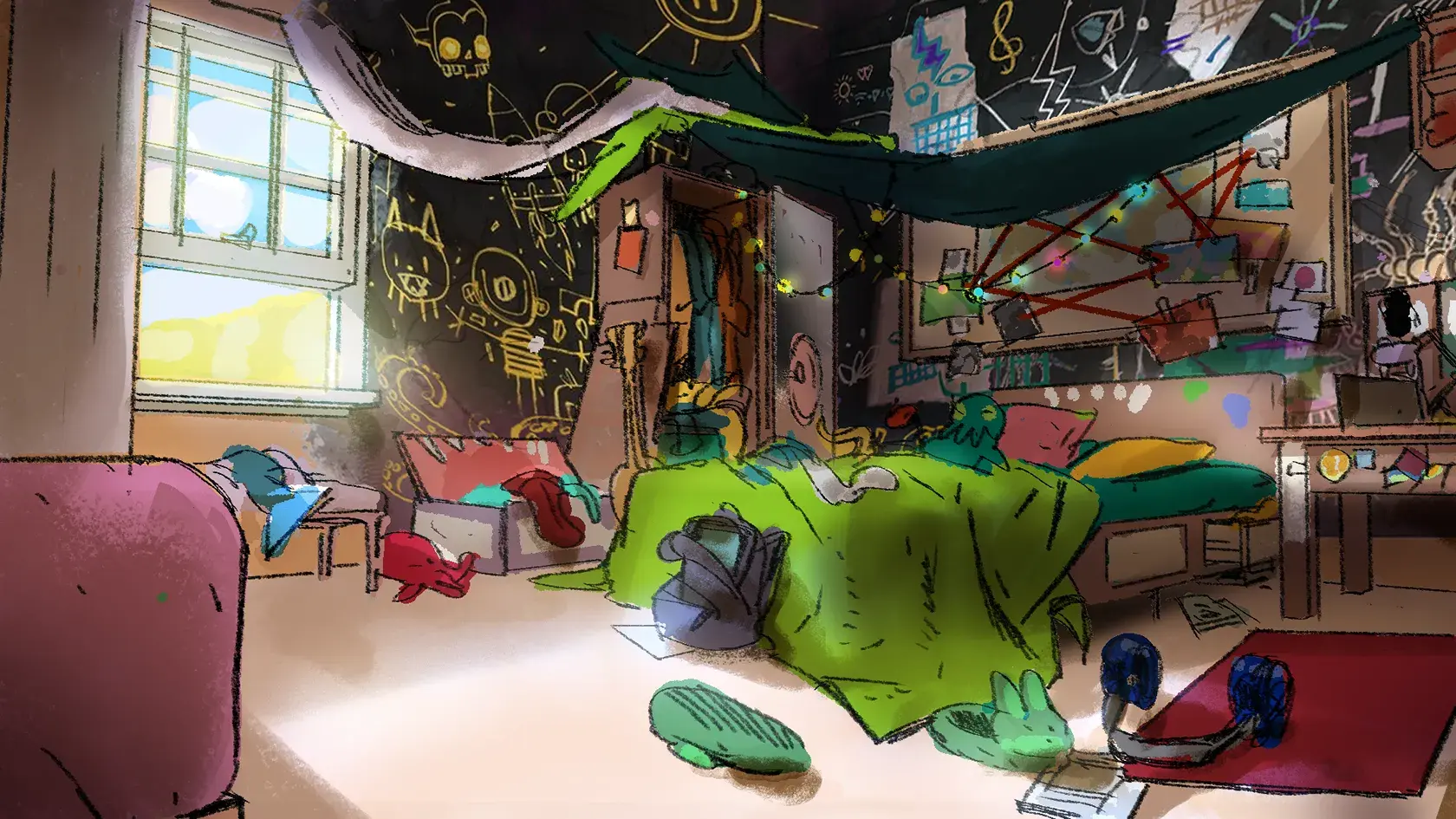
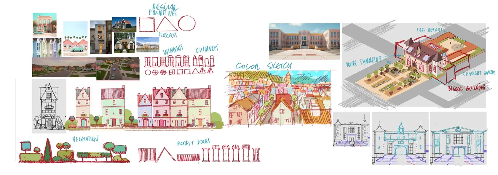
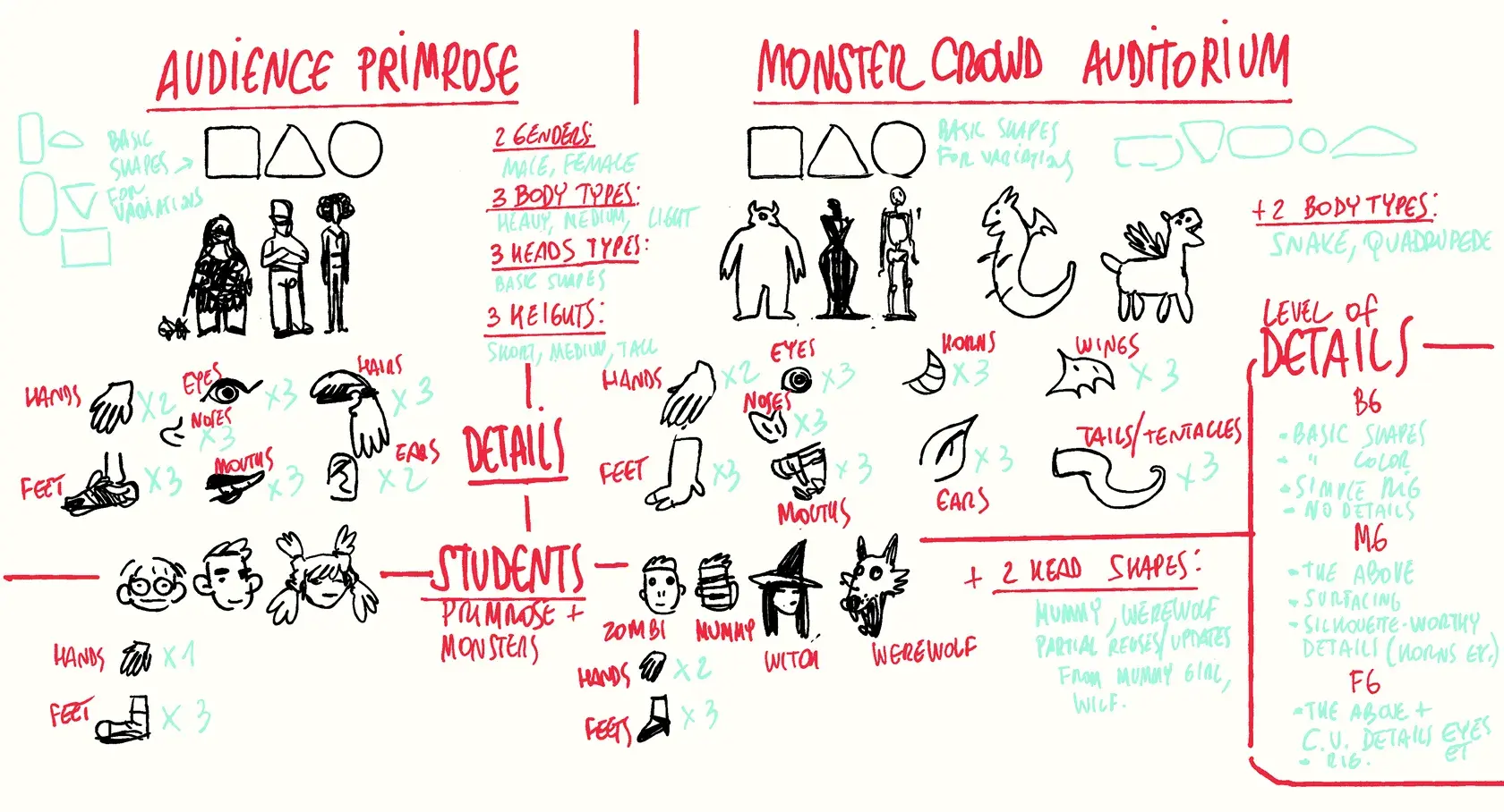
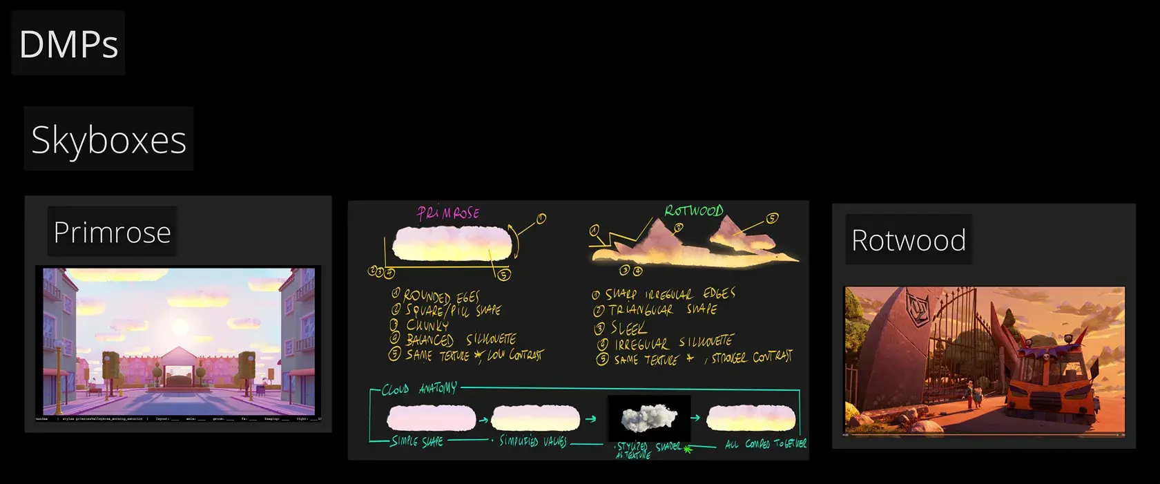
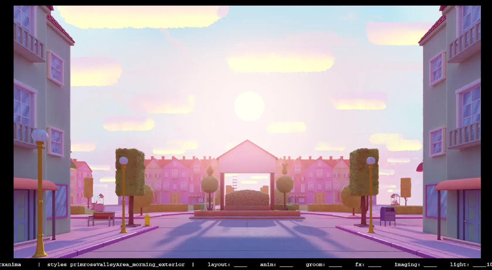
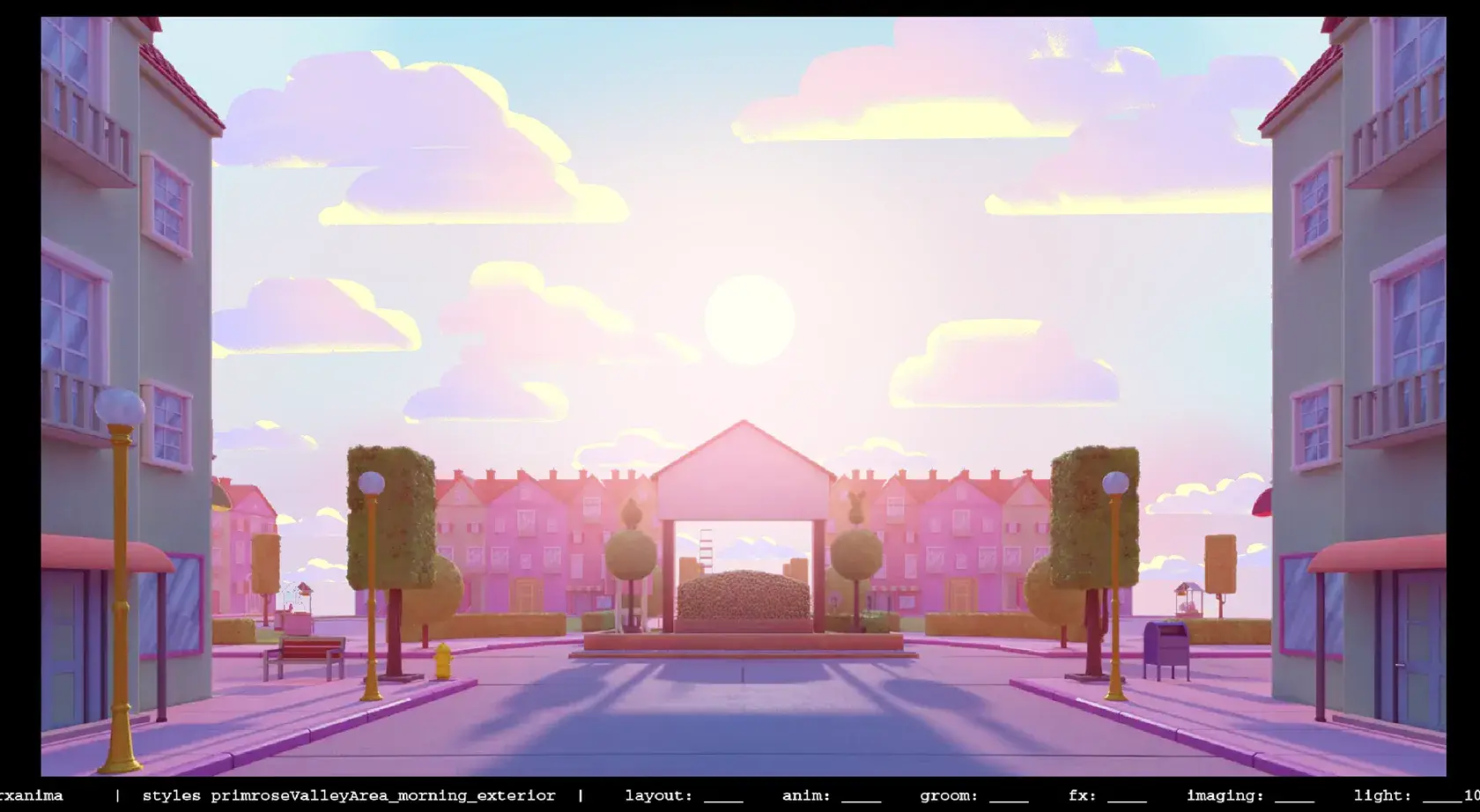
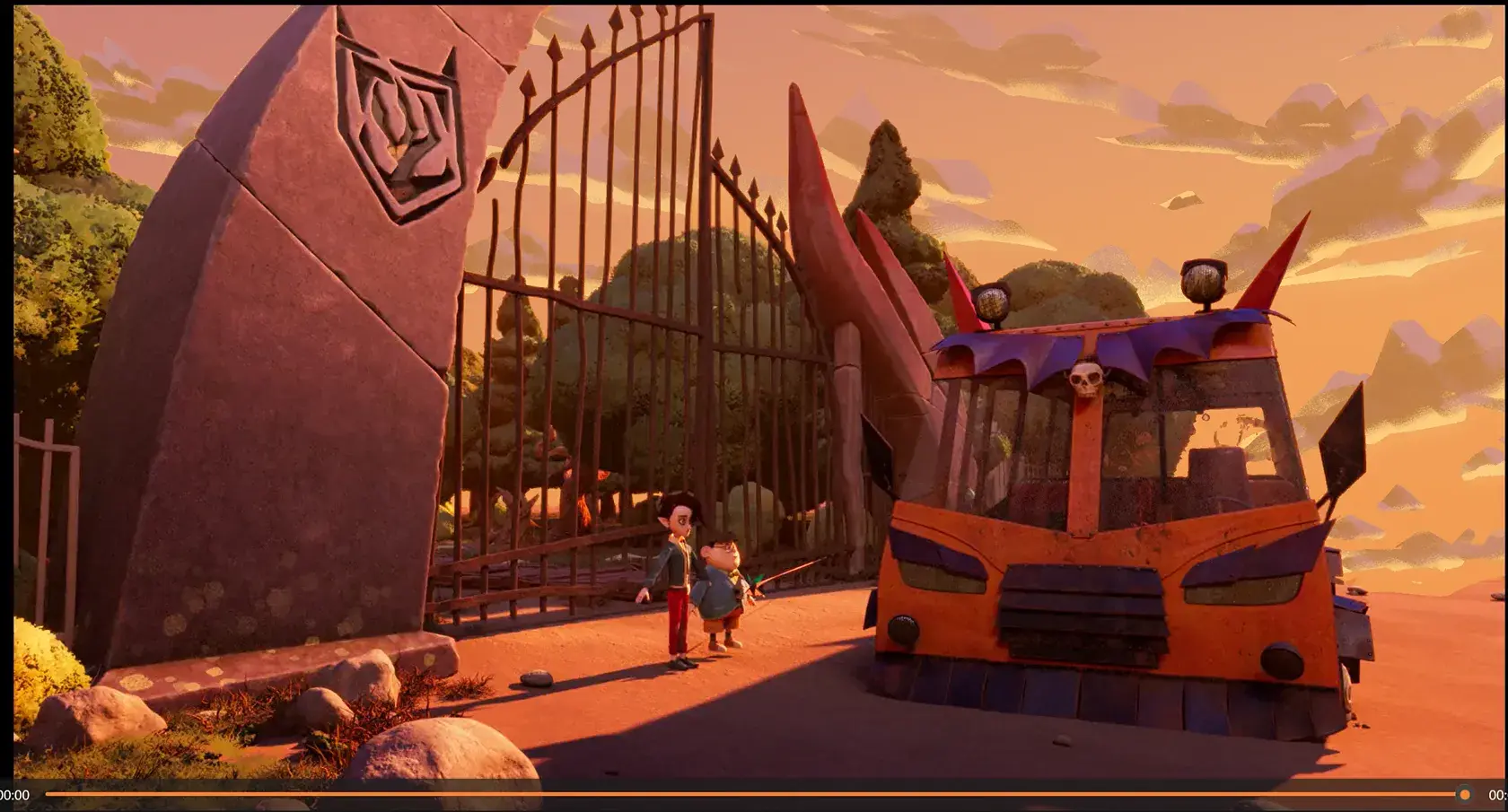
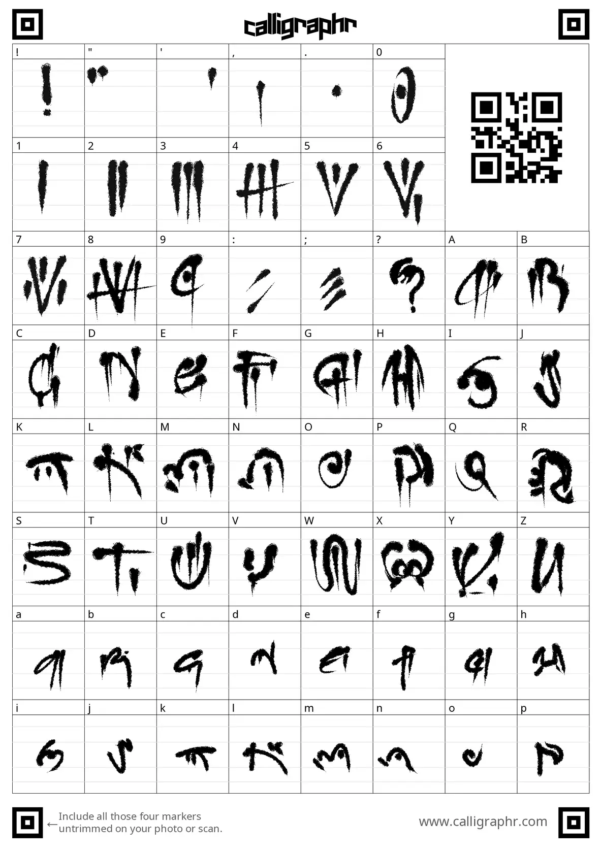
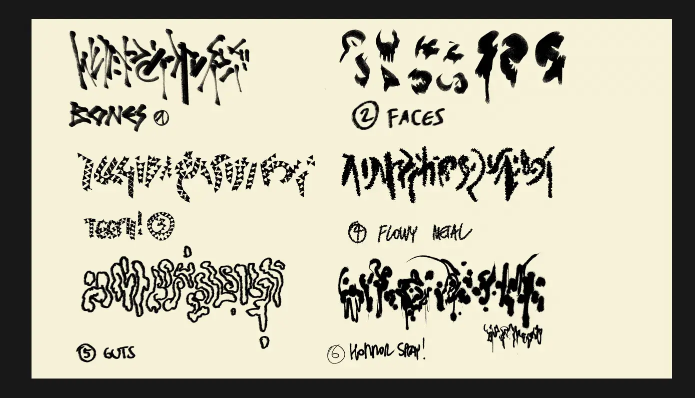
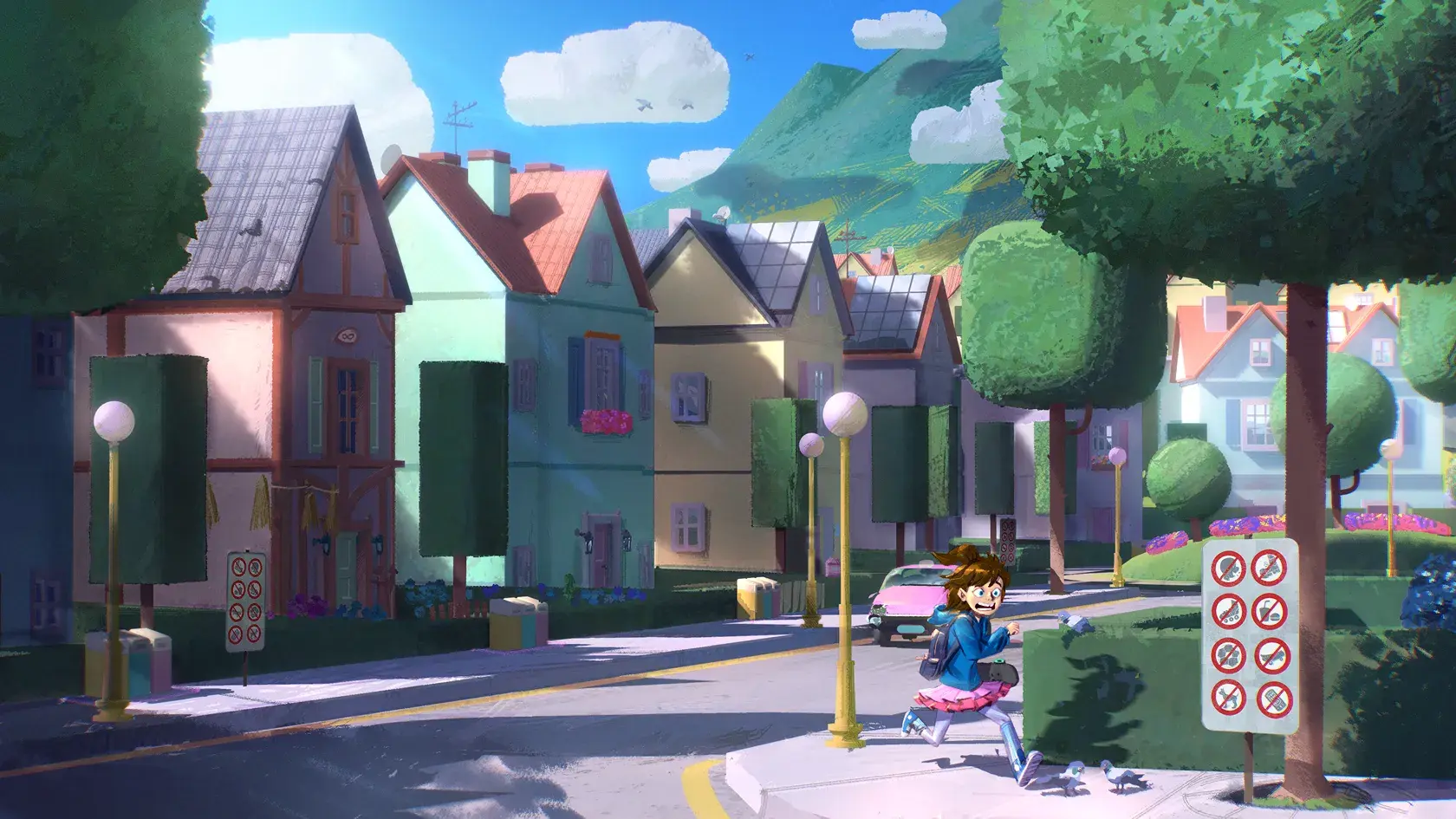
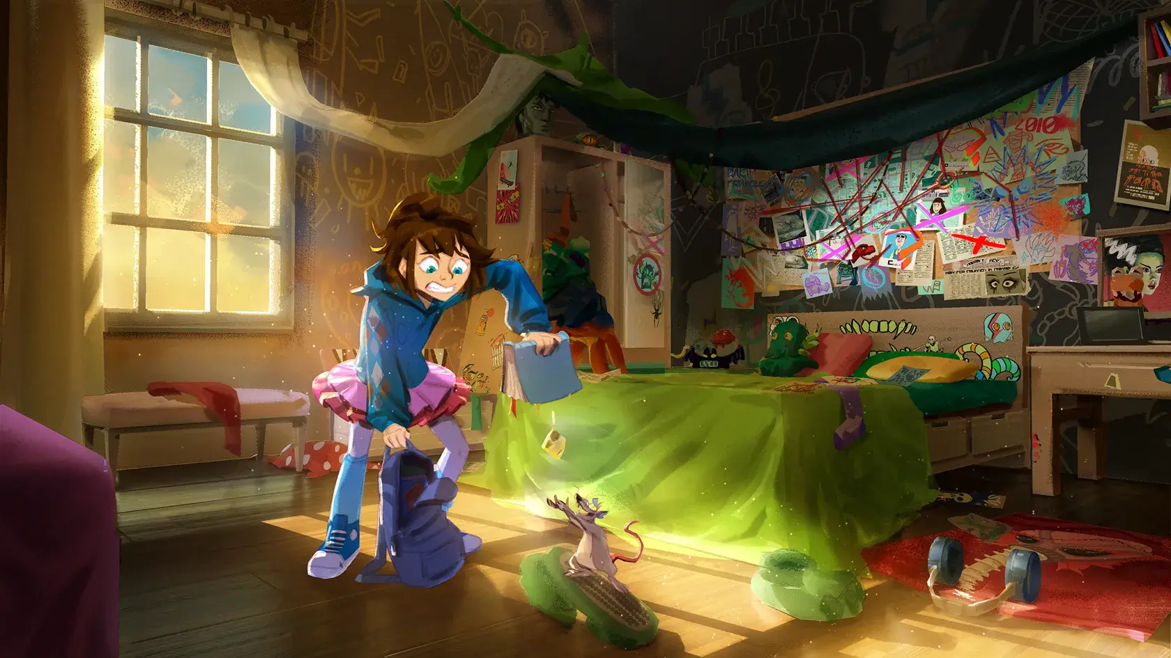
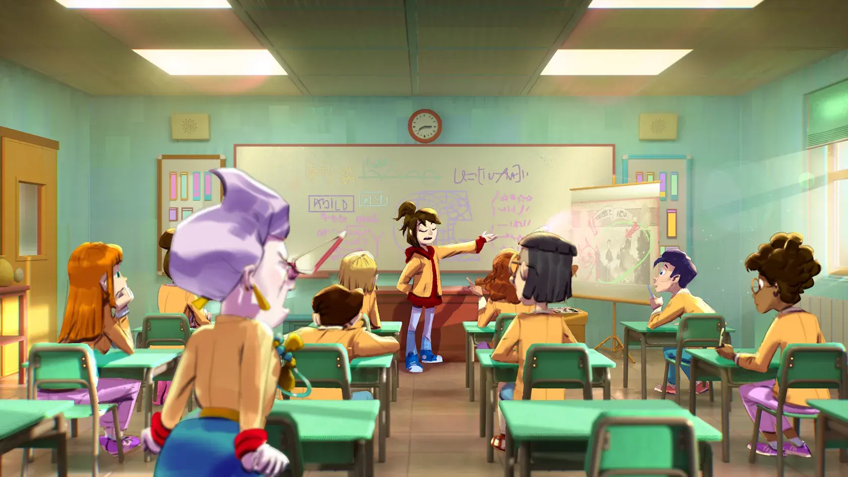
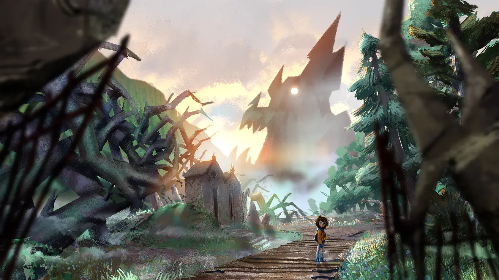
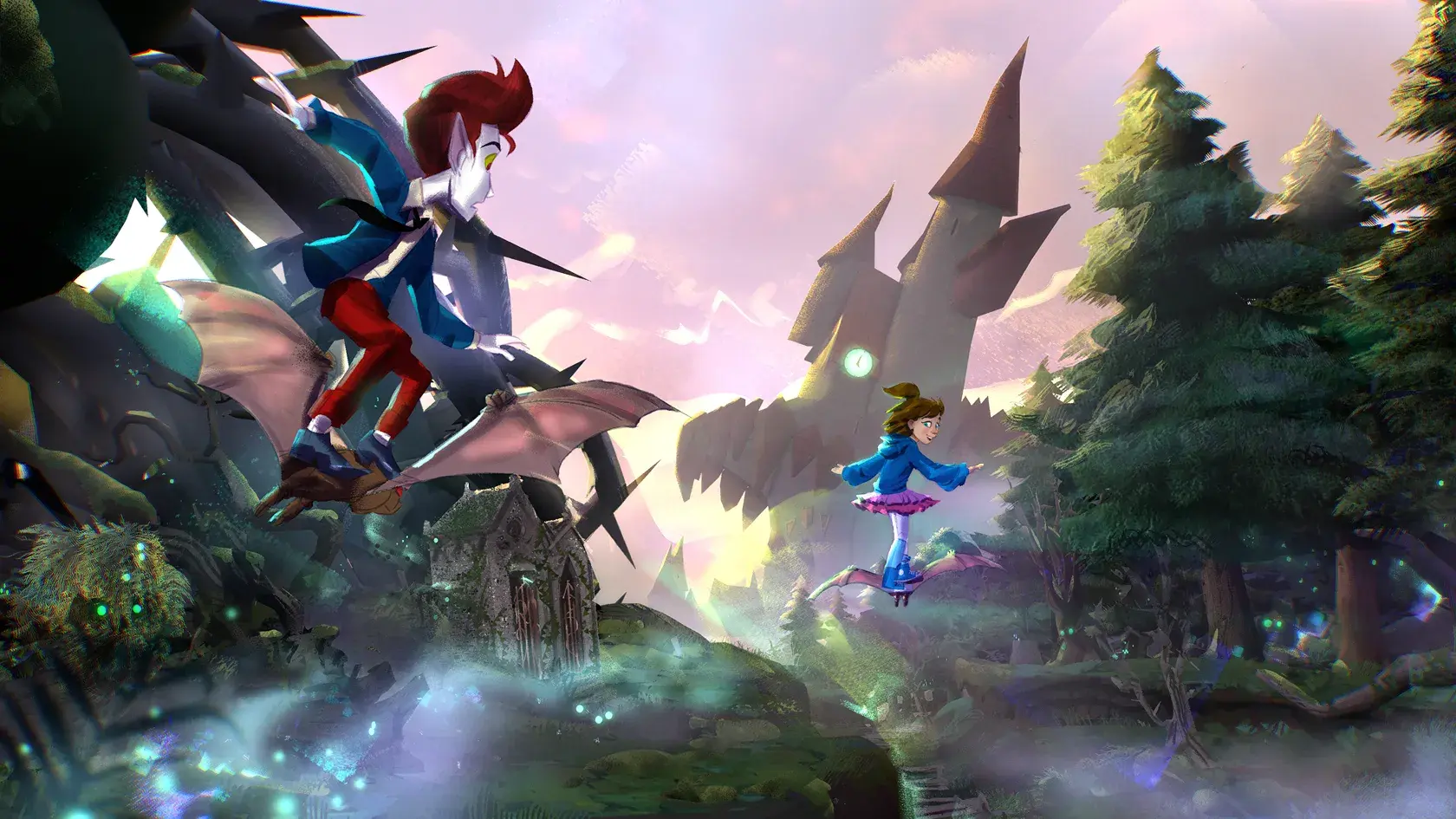
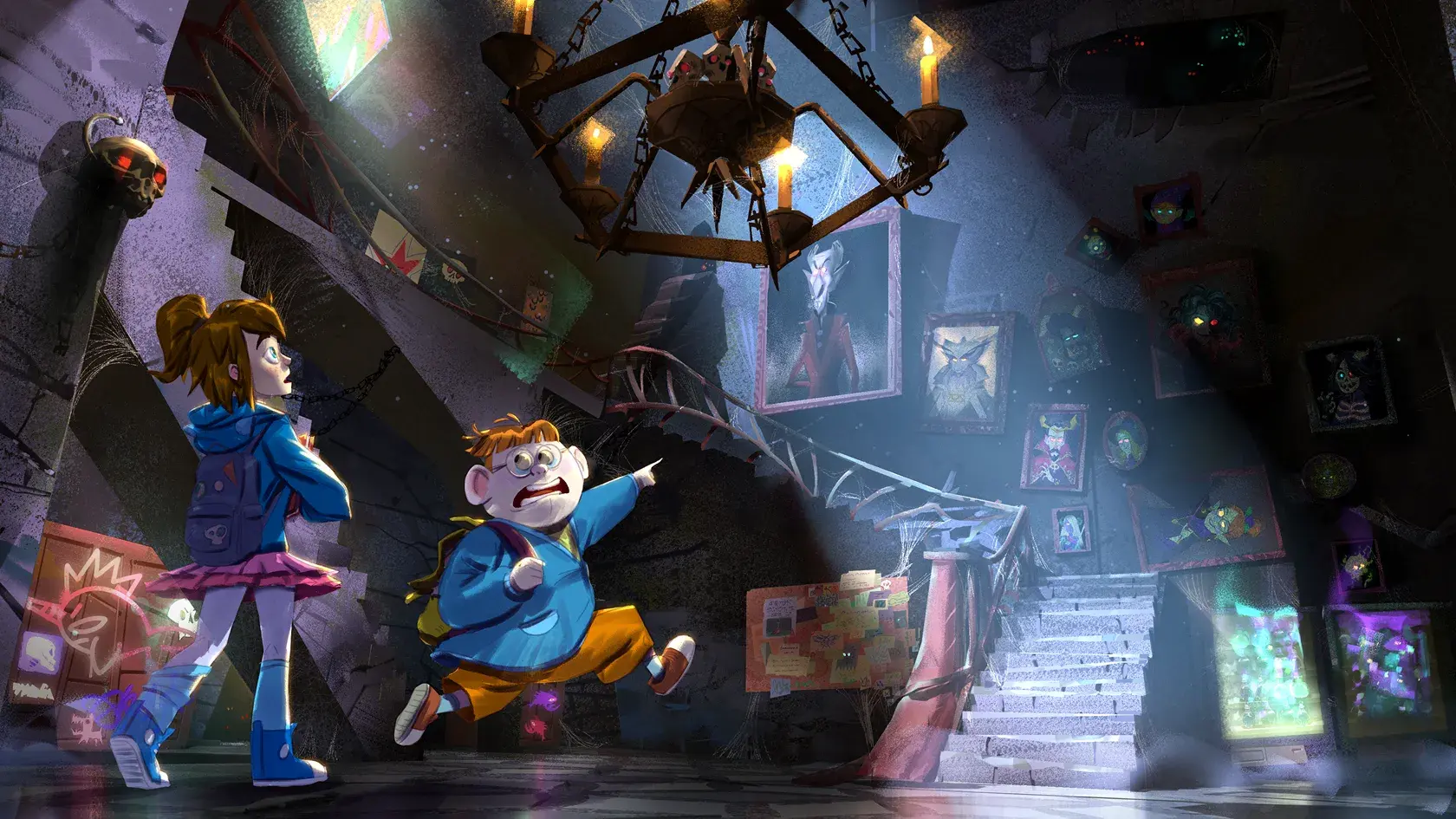
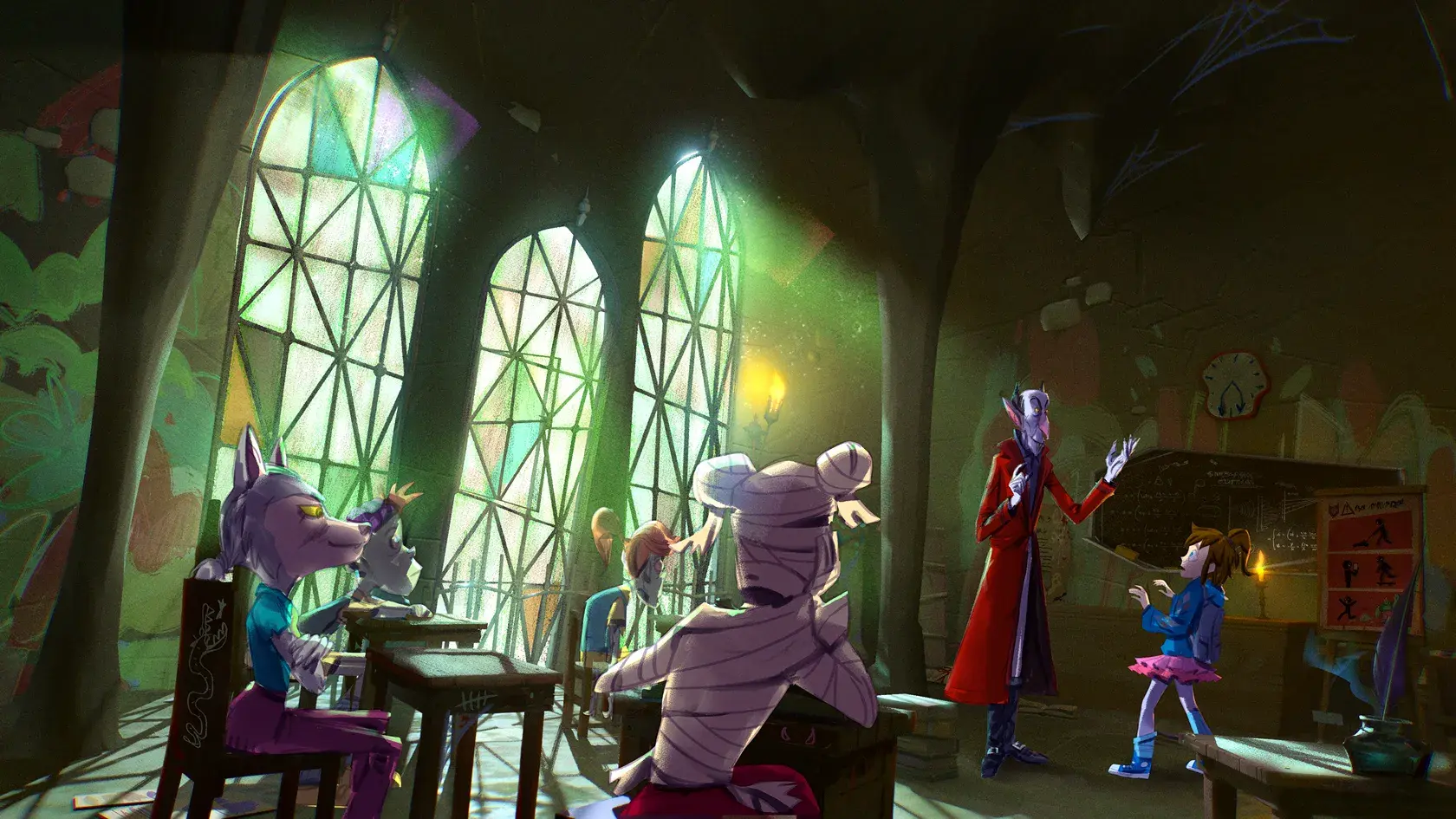
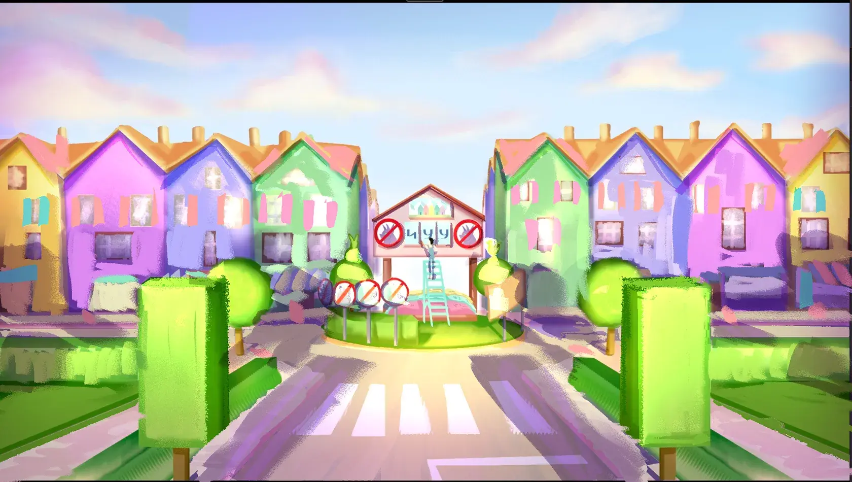
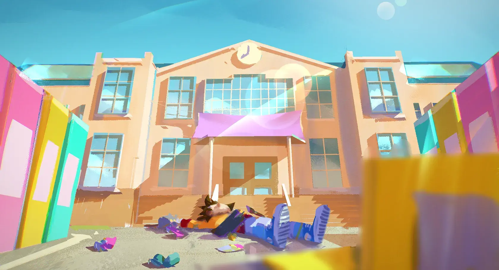
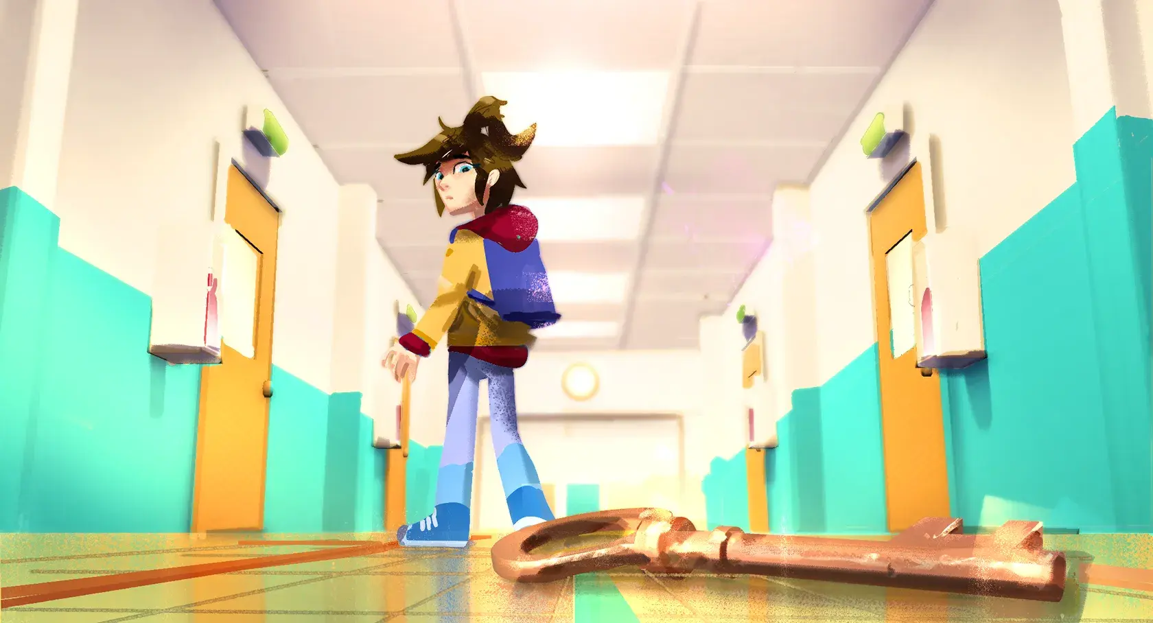
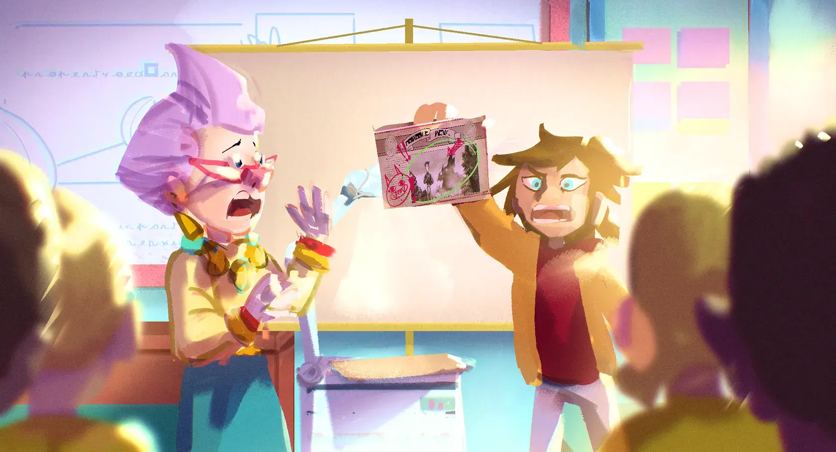
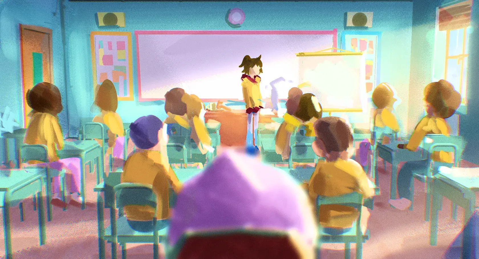
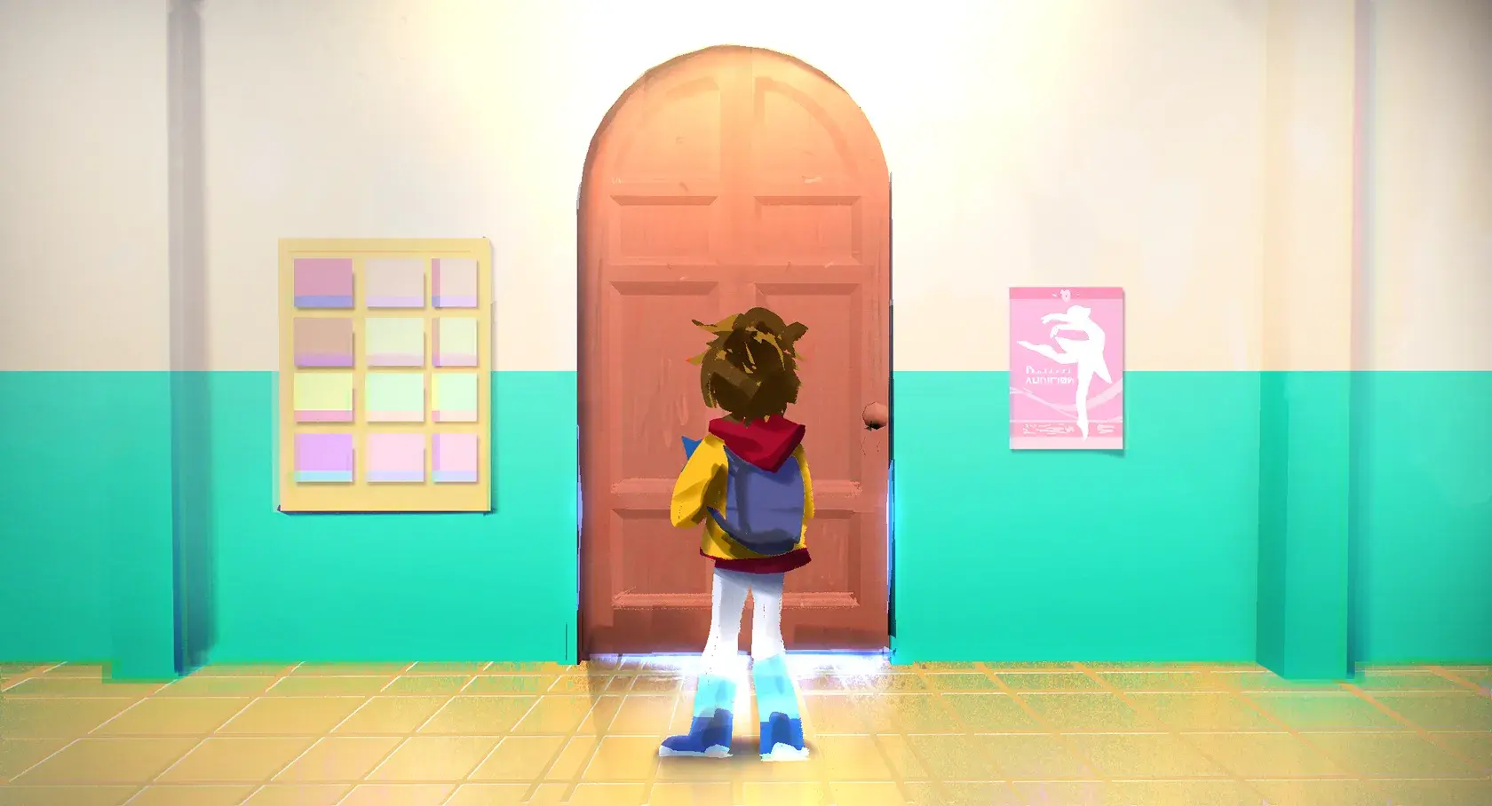
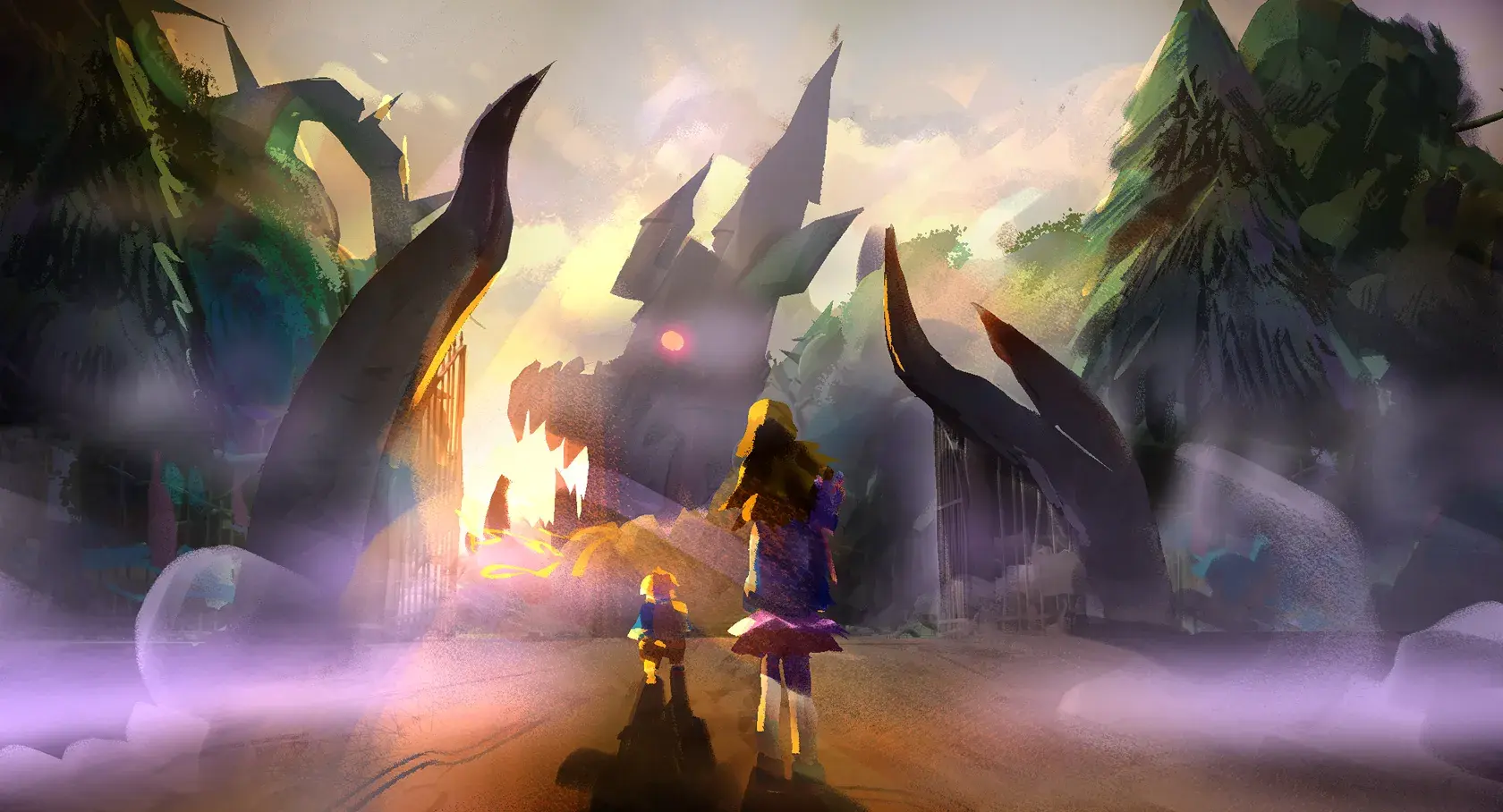
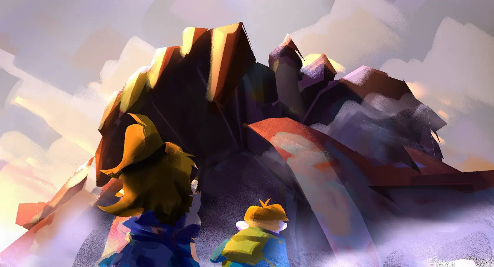
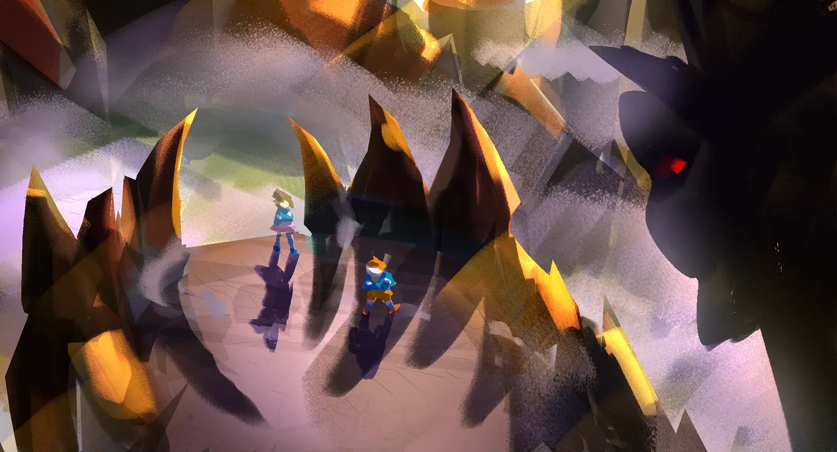
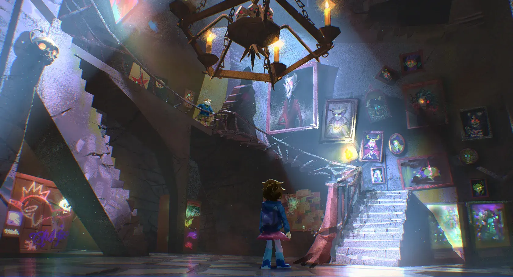
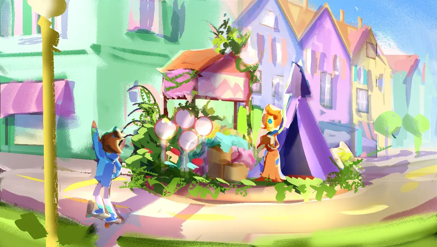
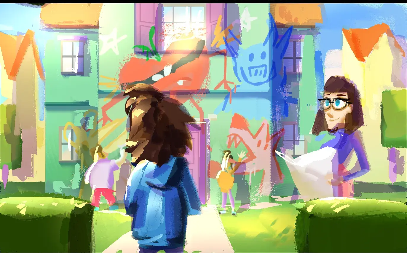
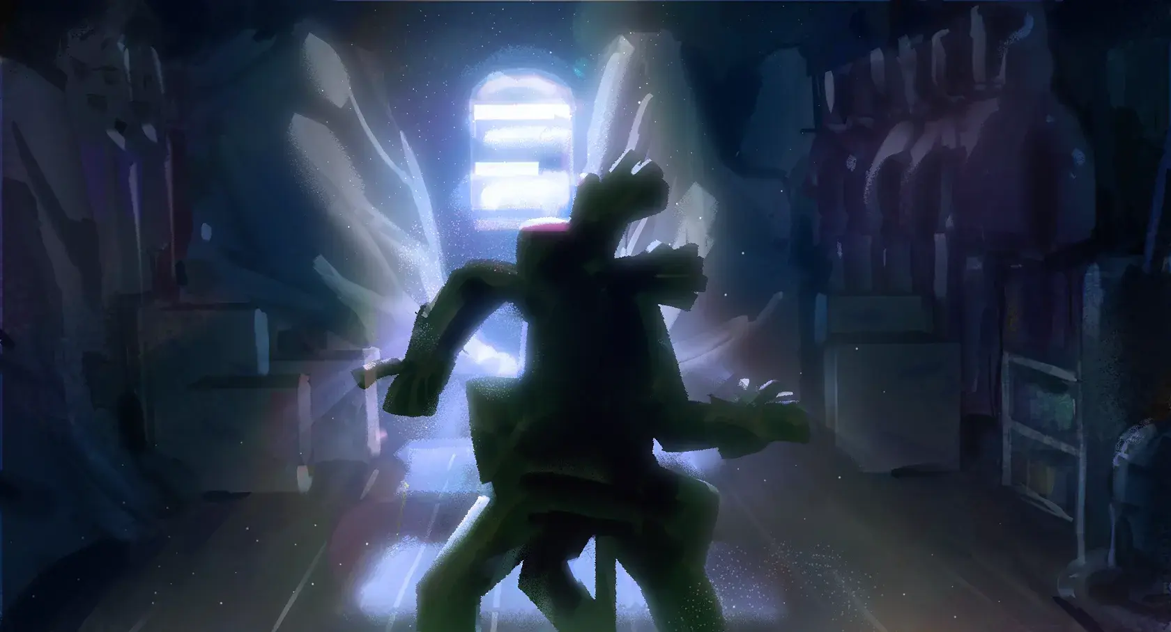
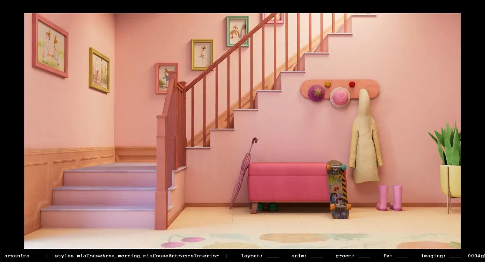
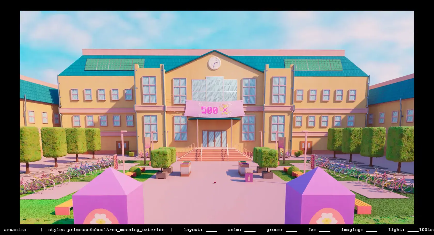
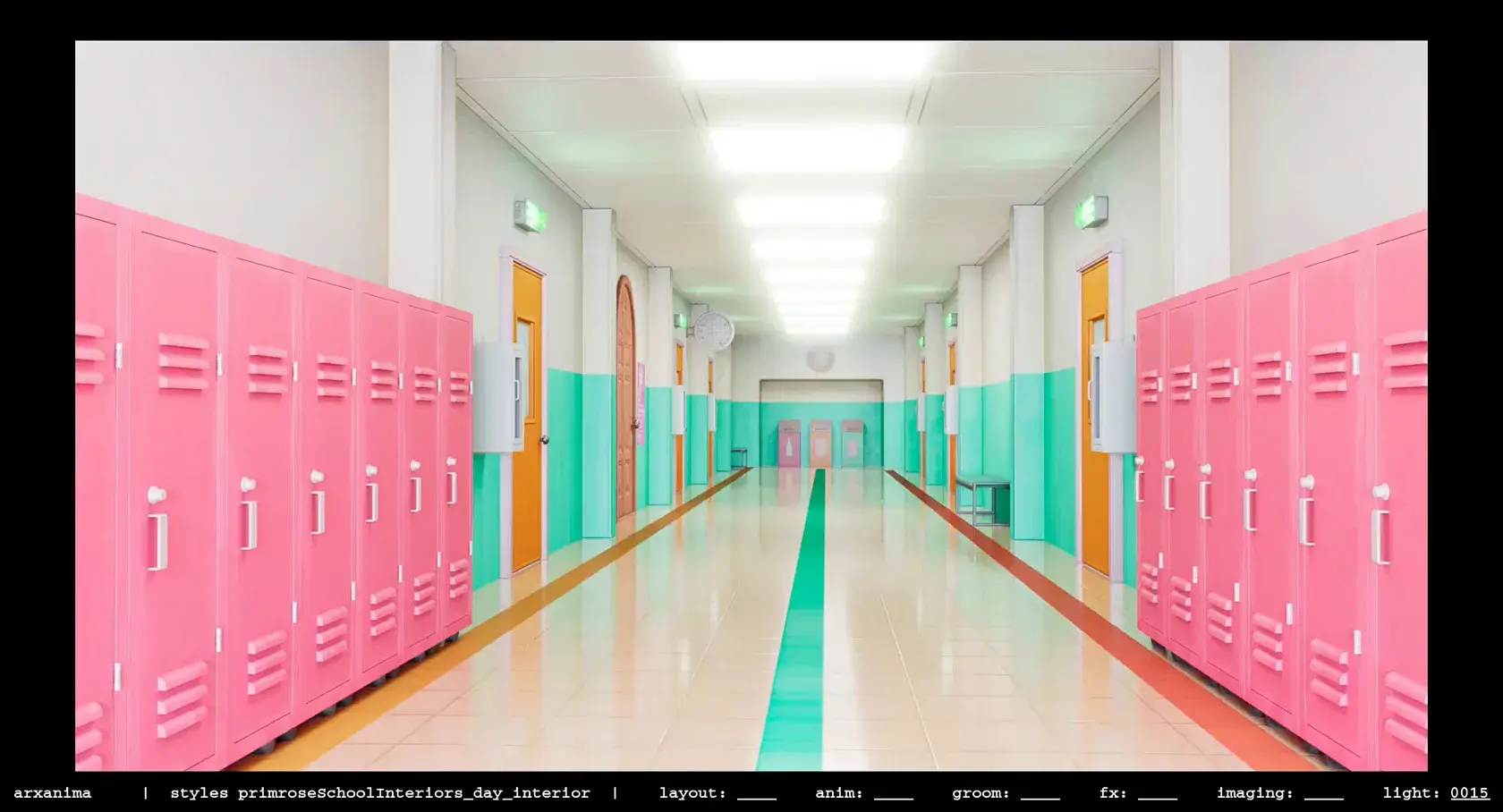
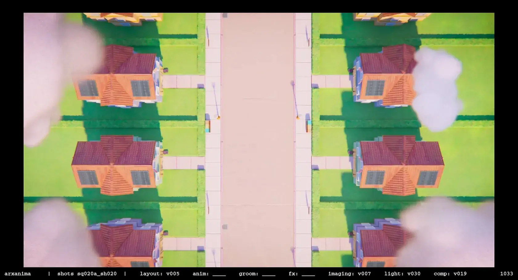
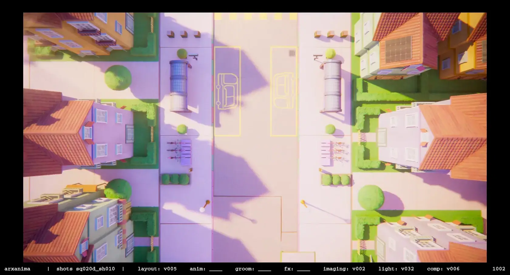
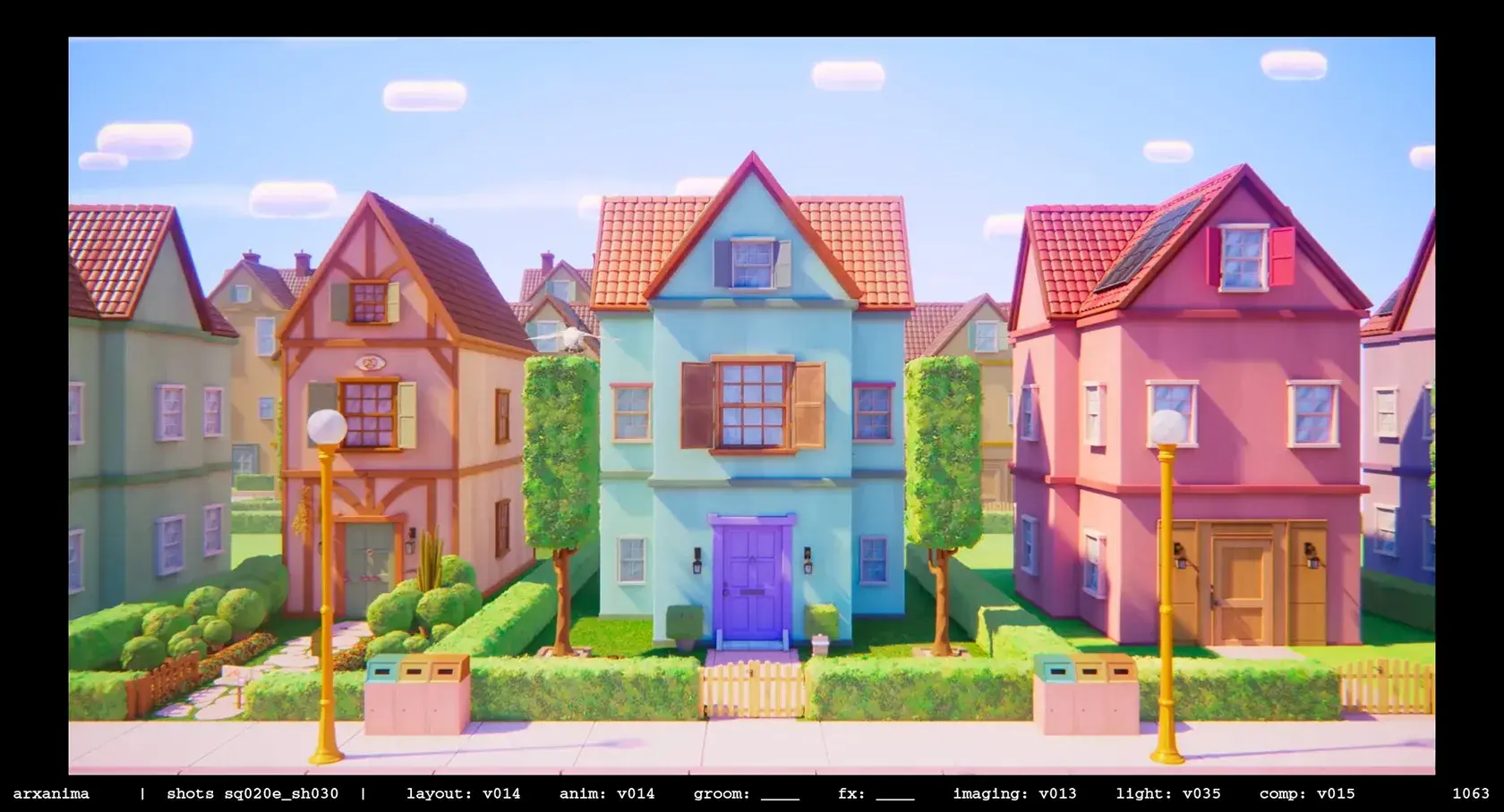
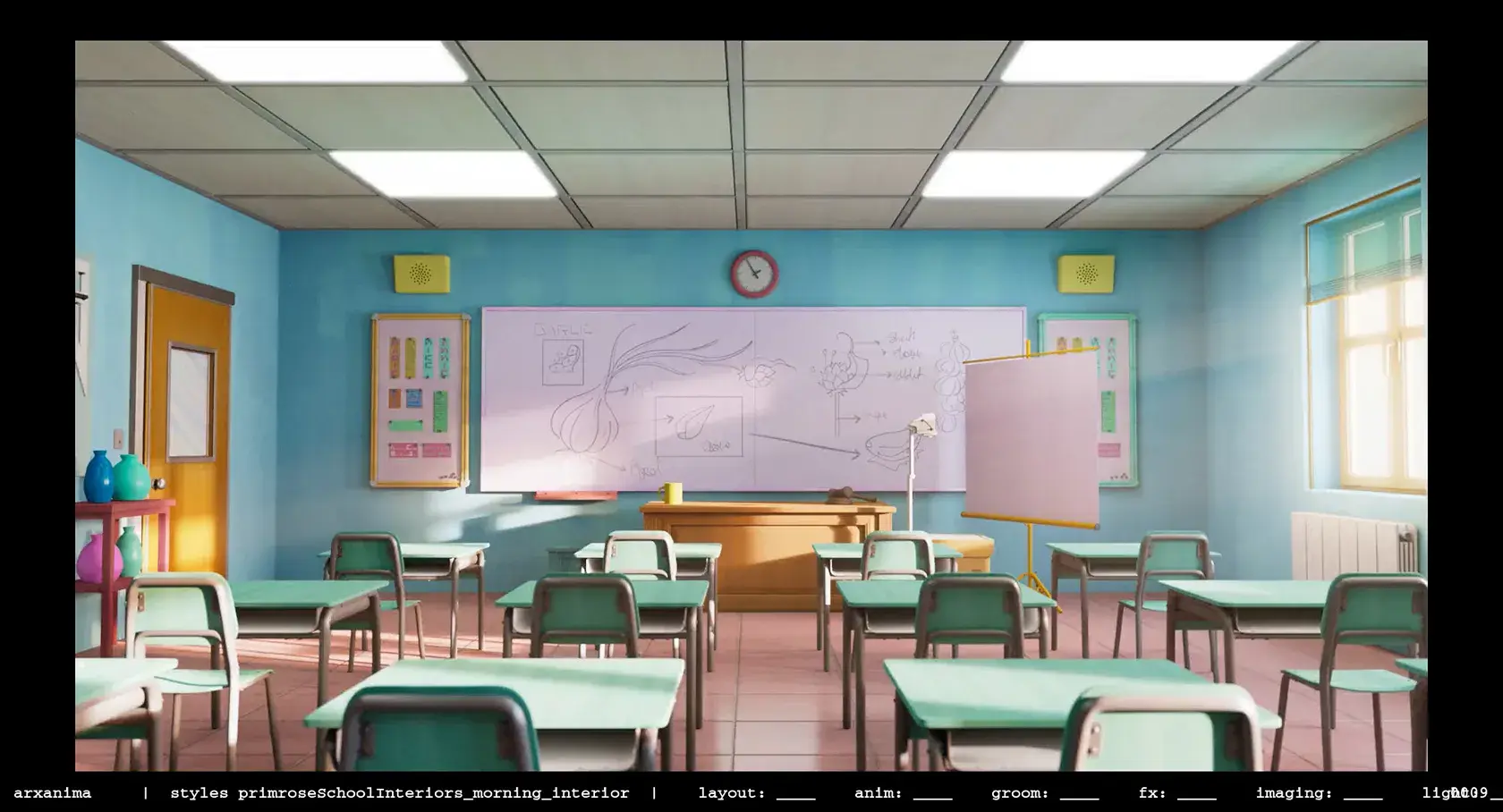
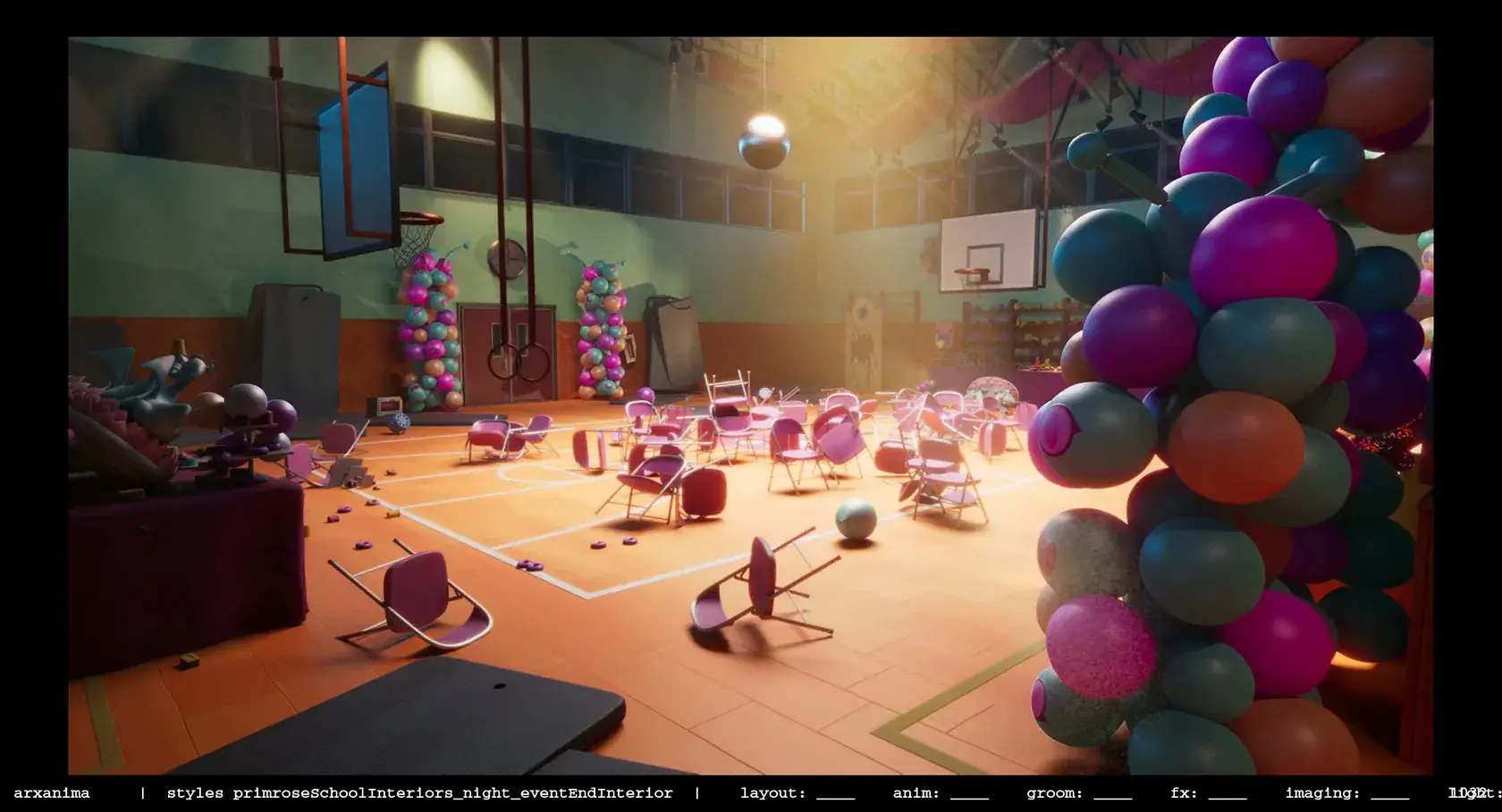
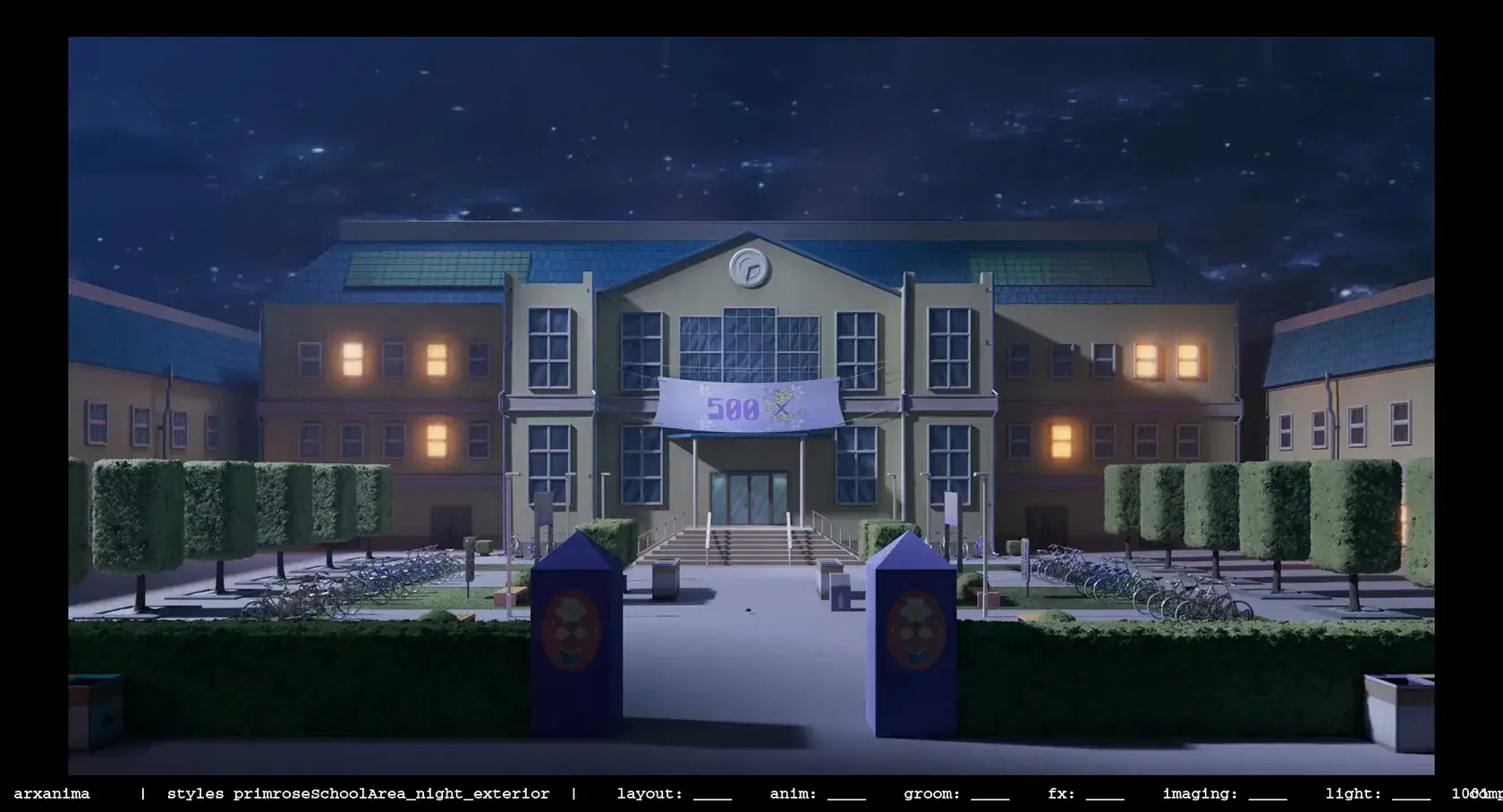
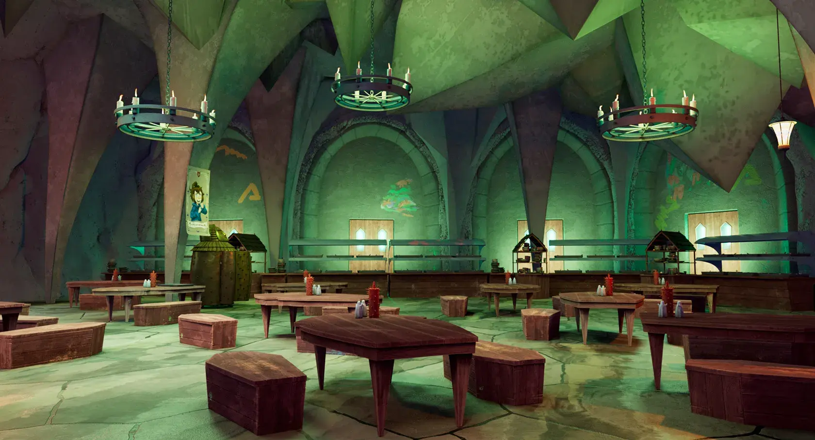
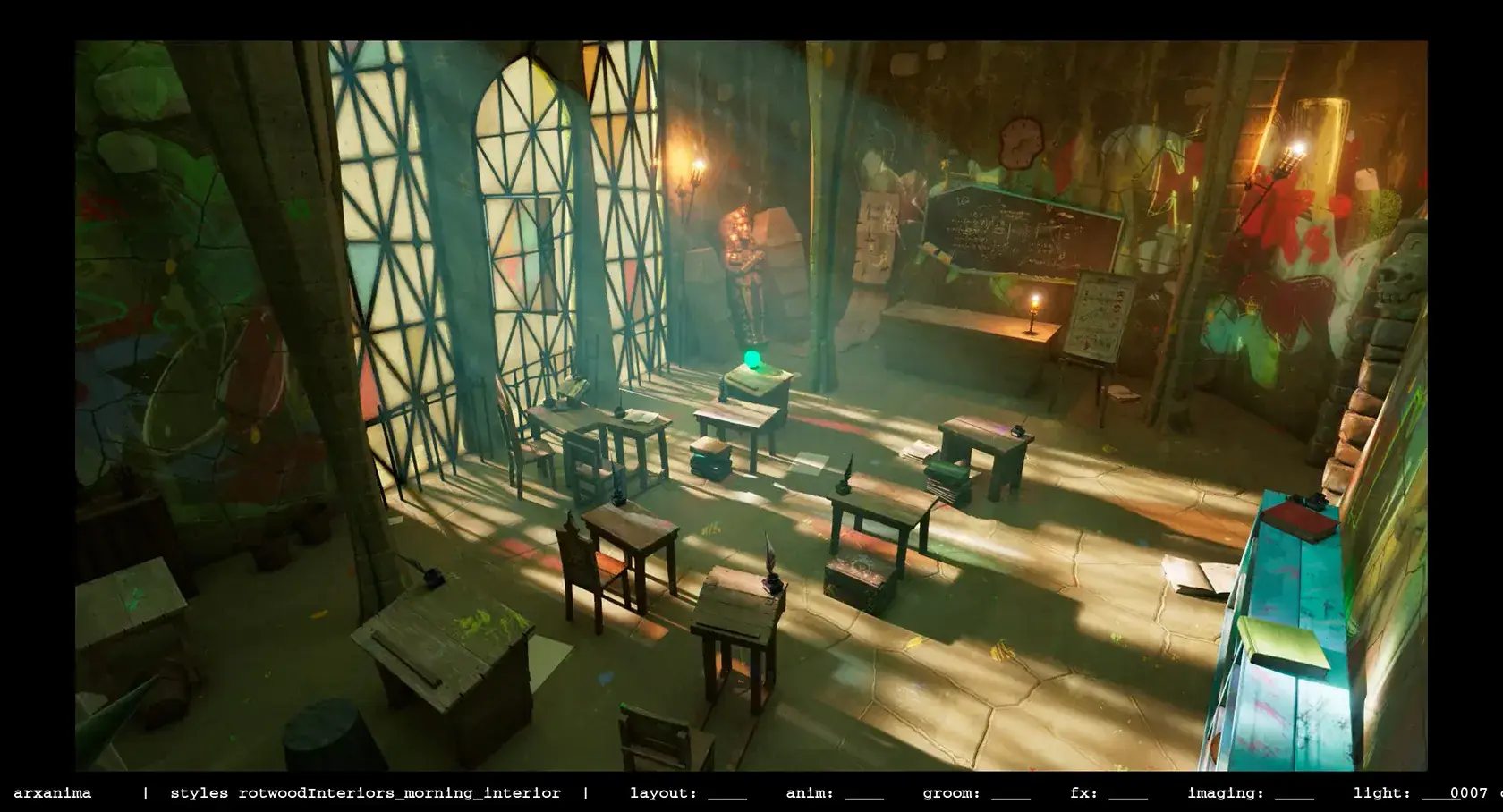
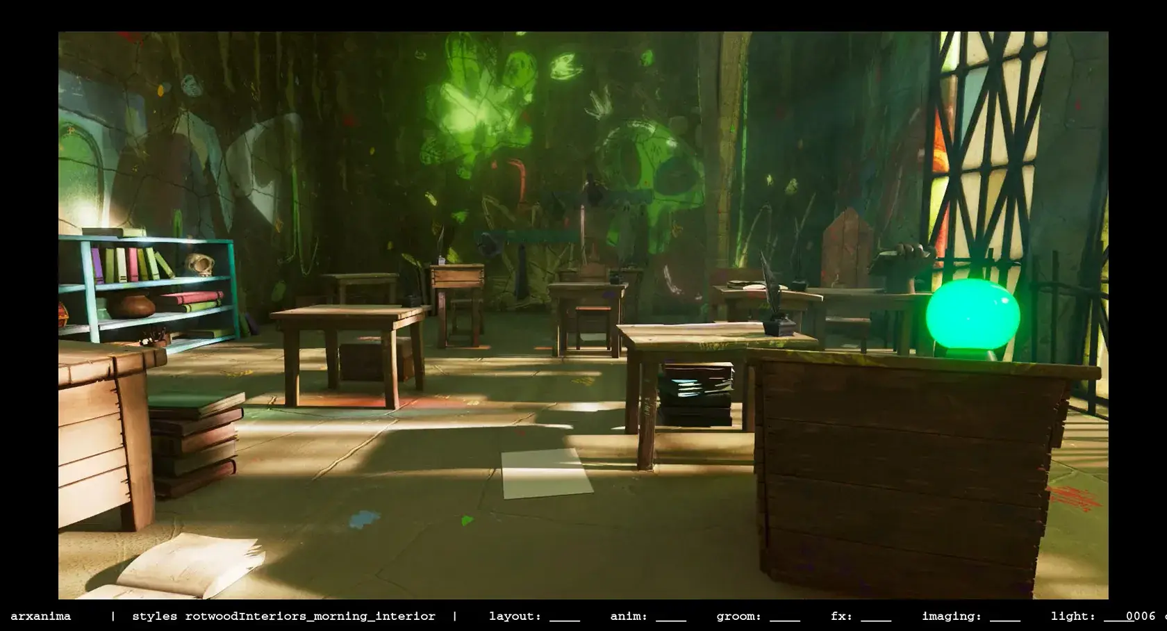
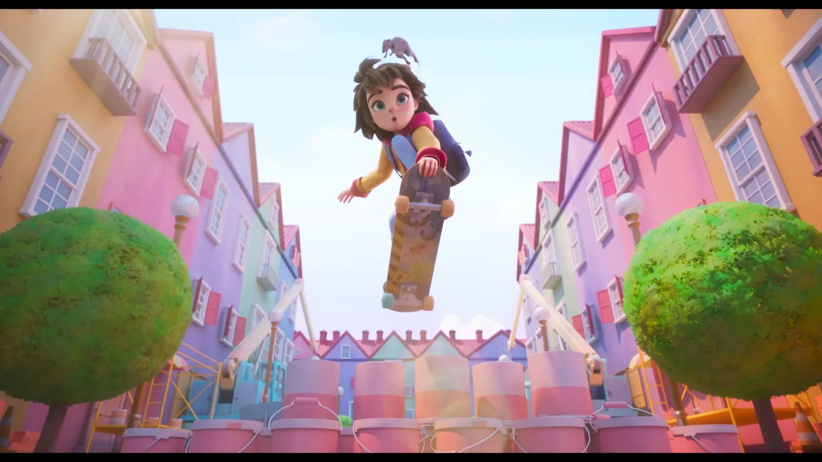
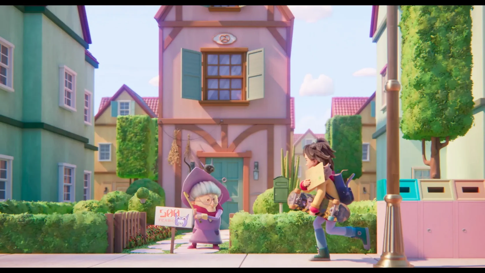
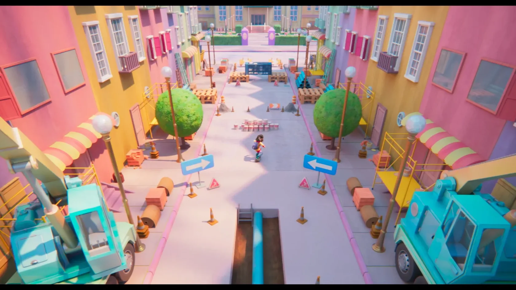
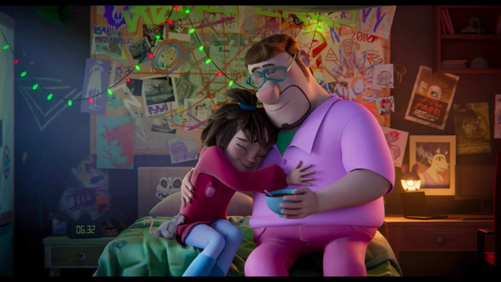
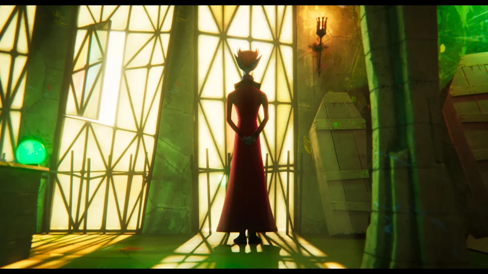
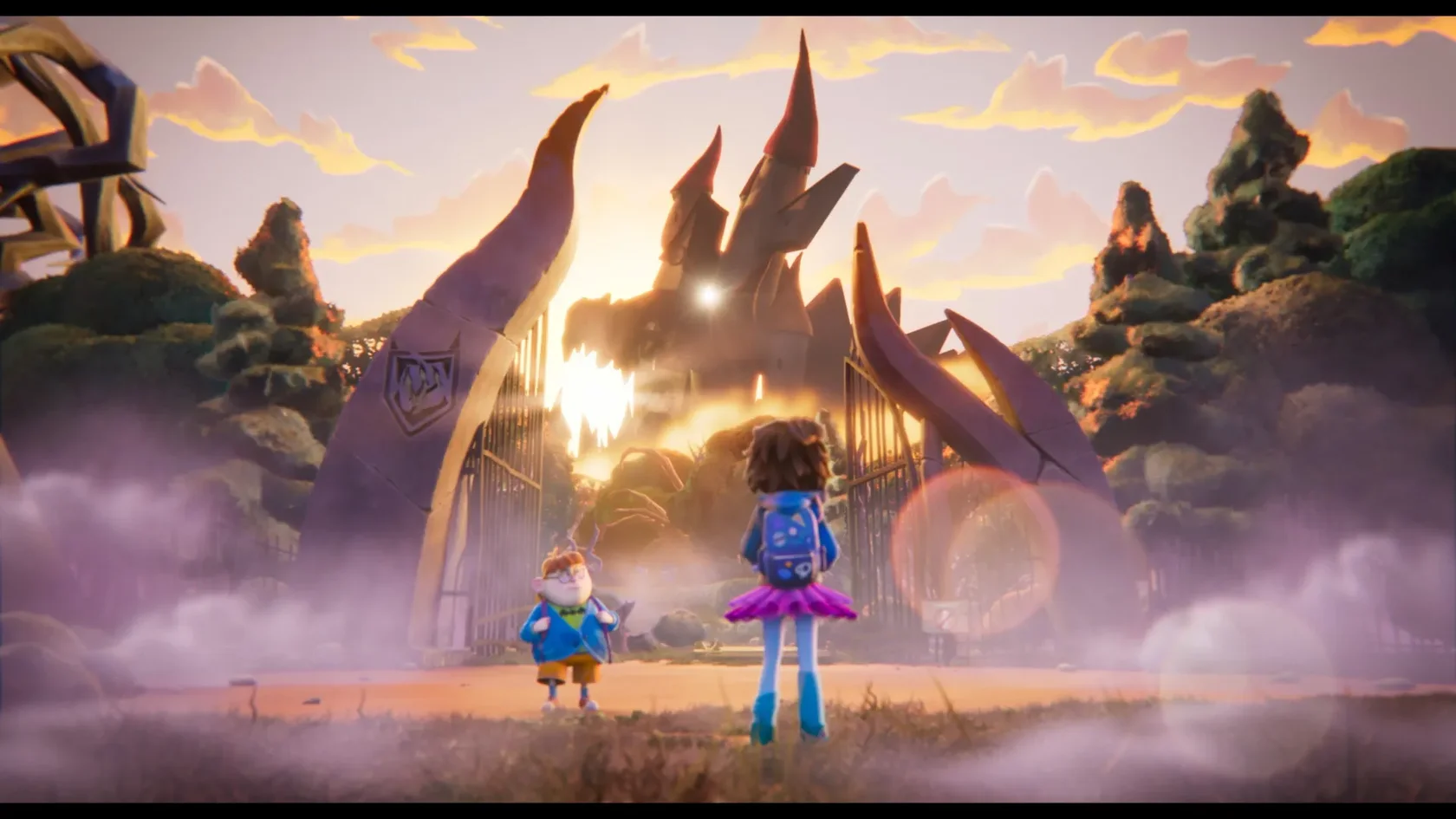
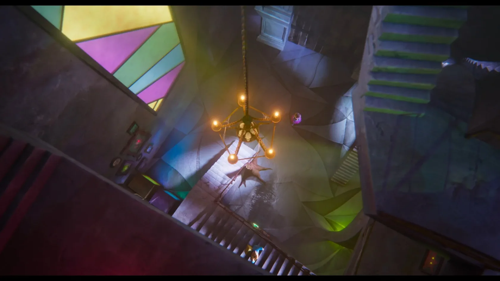
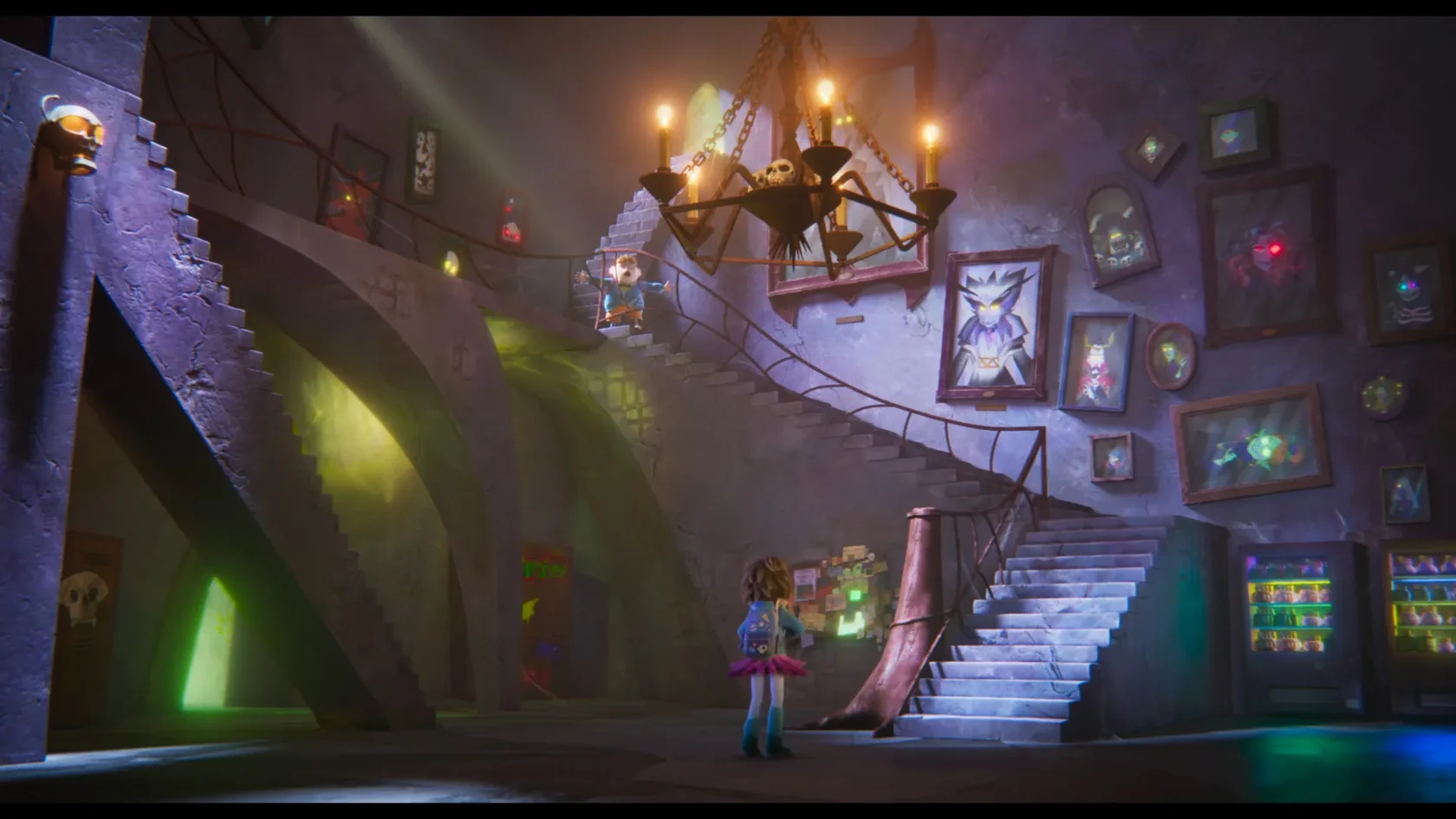
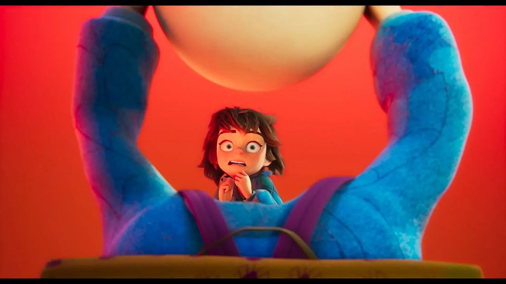
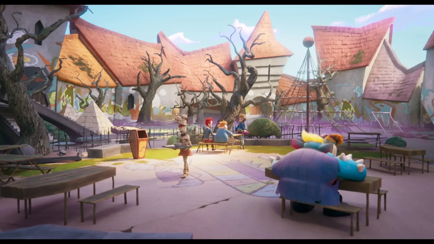
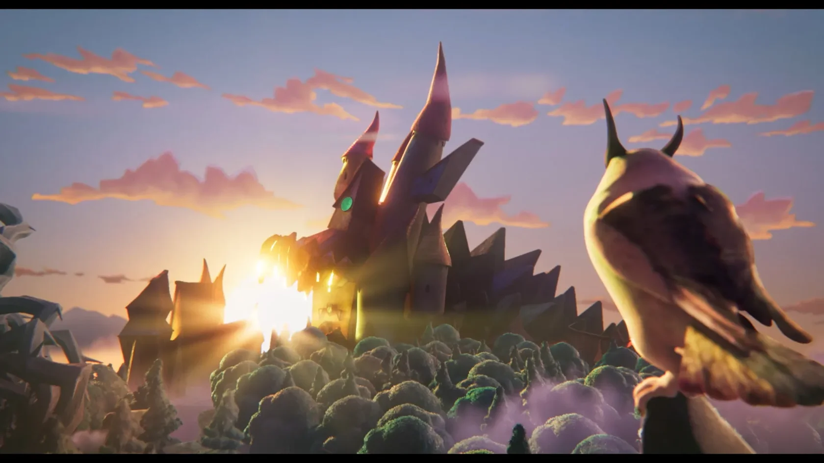
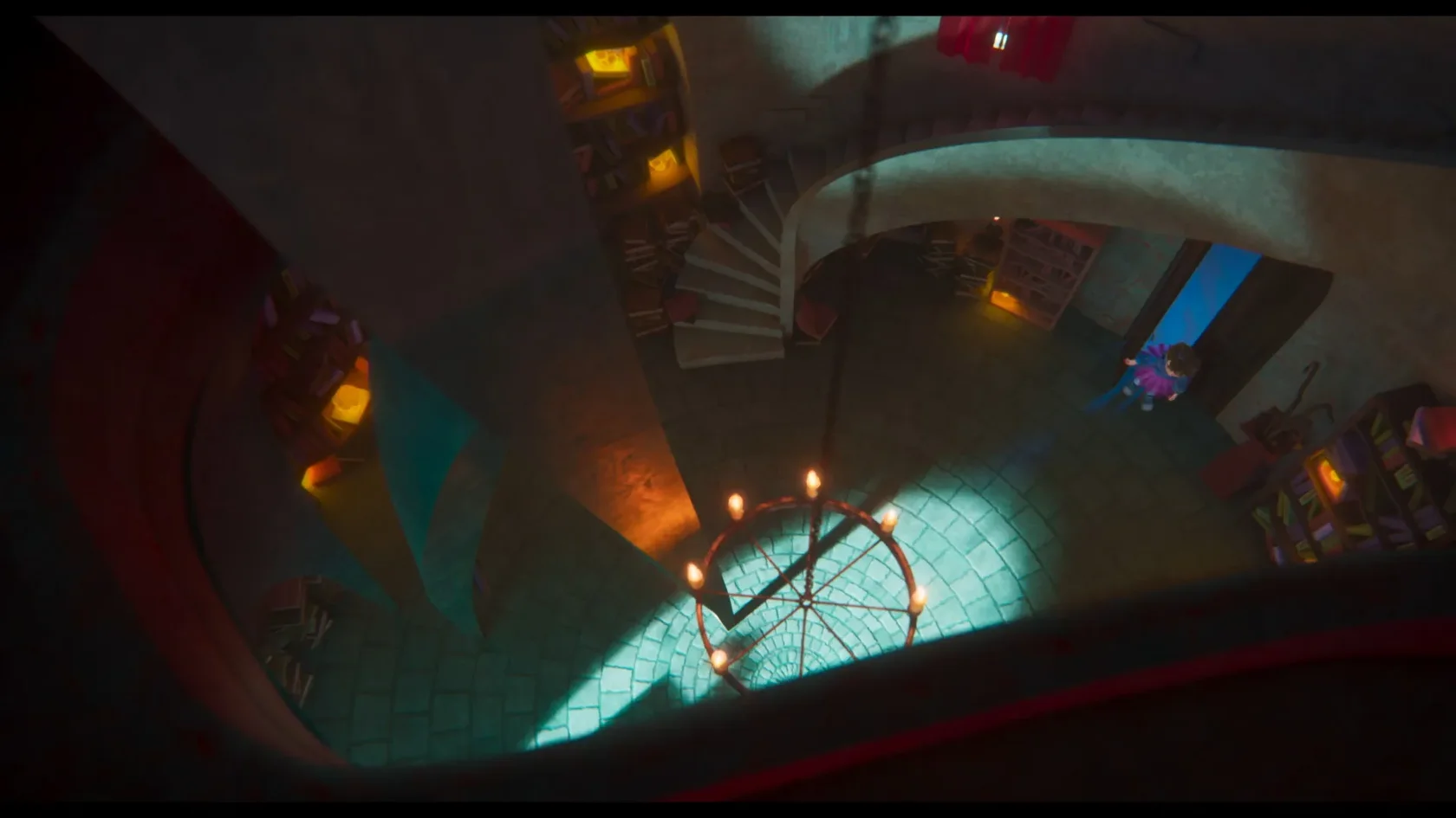
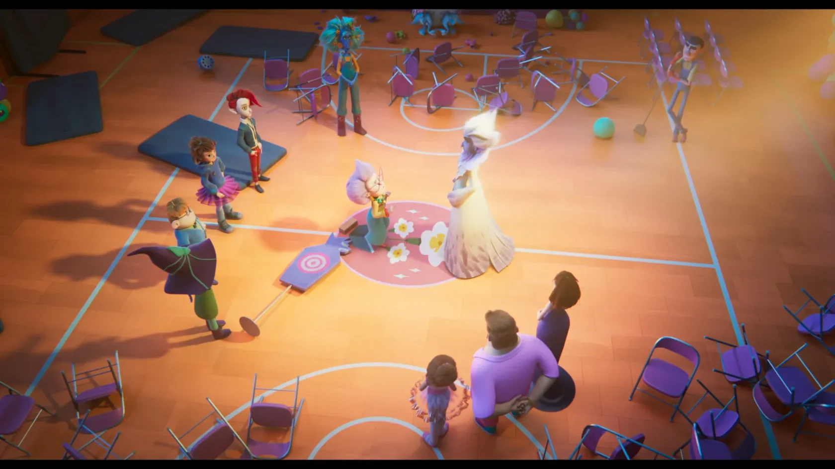
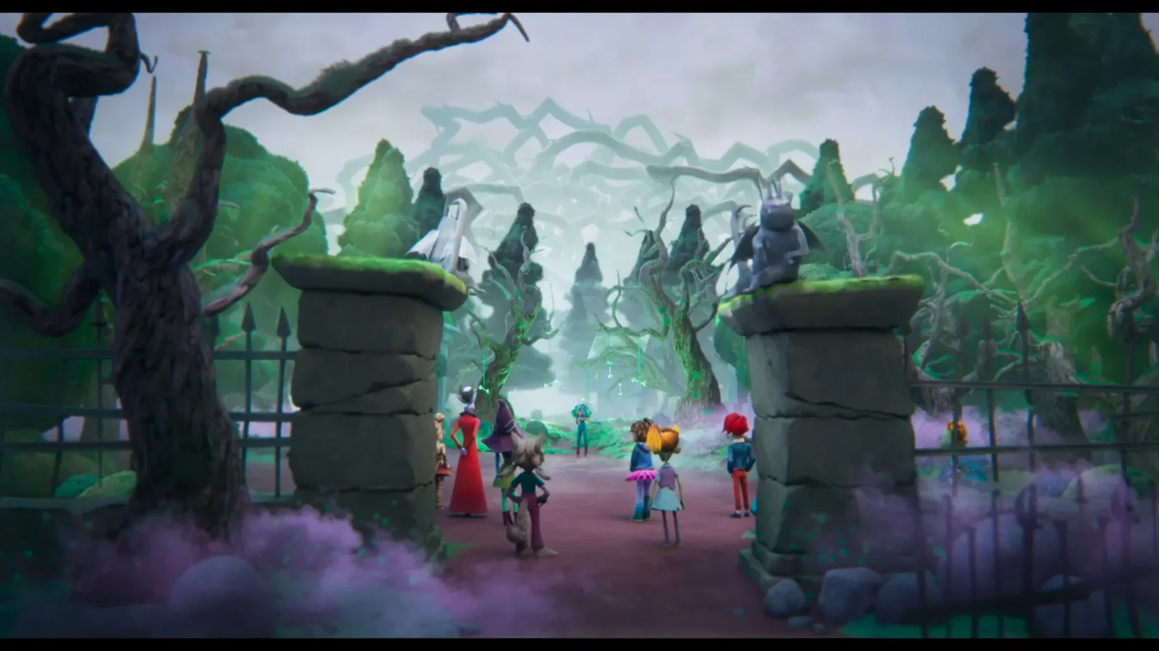
The film revolves around two parallel worlds,Primrose and Rotwood, where one is orderly, controlled, and evoking cotton-candy vibes, the latter is a chaotic, brutalist-inspired, neogothic fun mess.
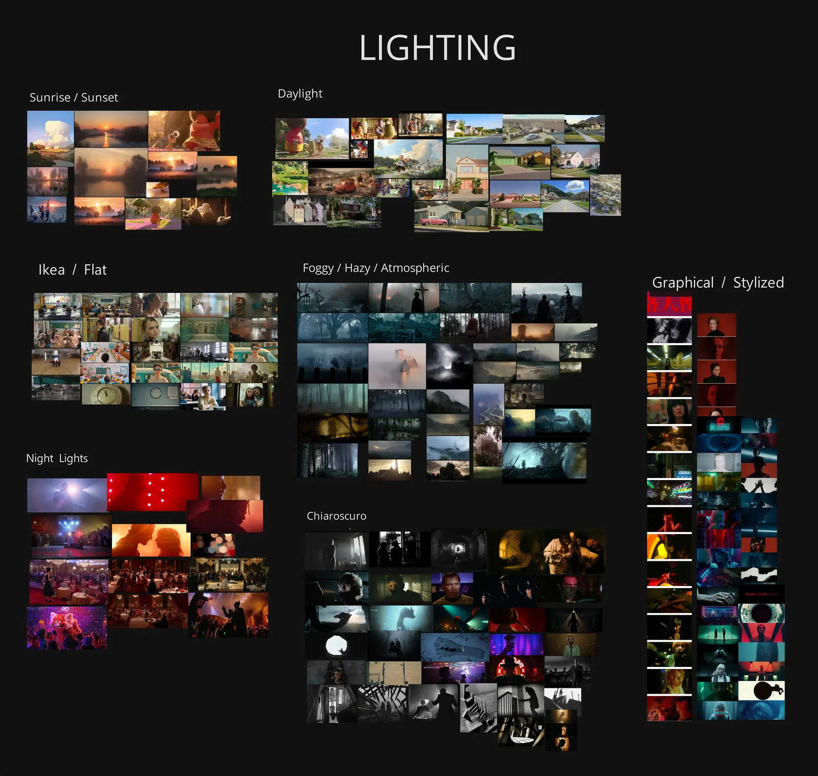
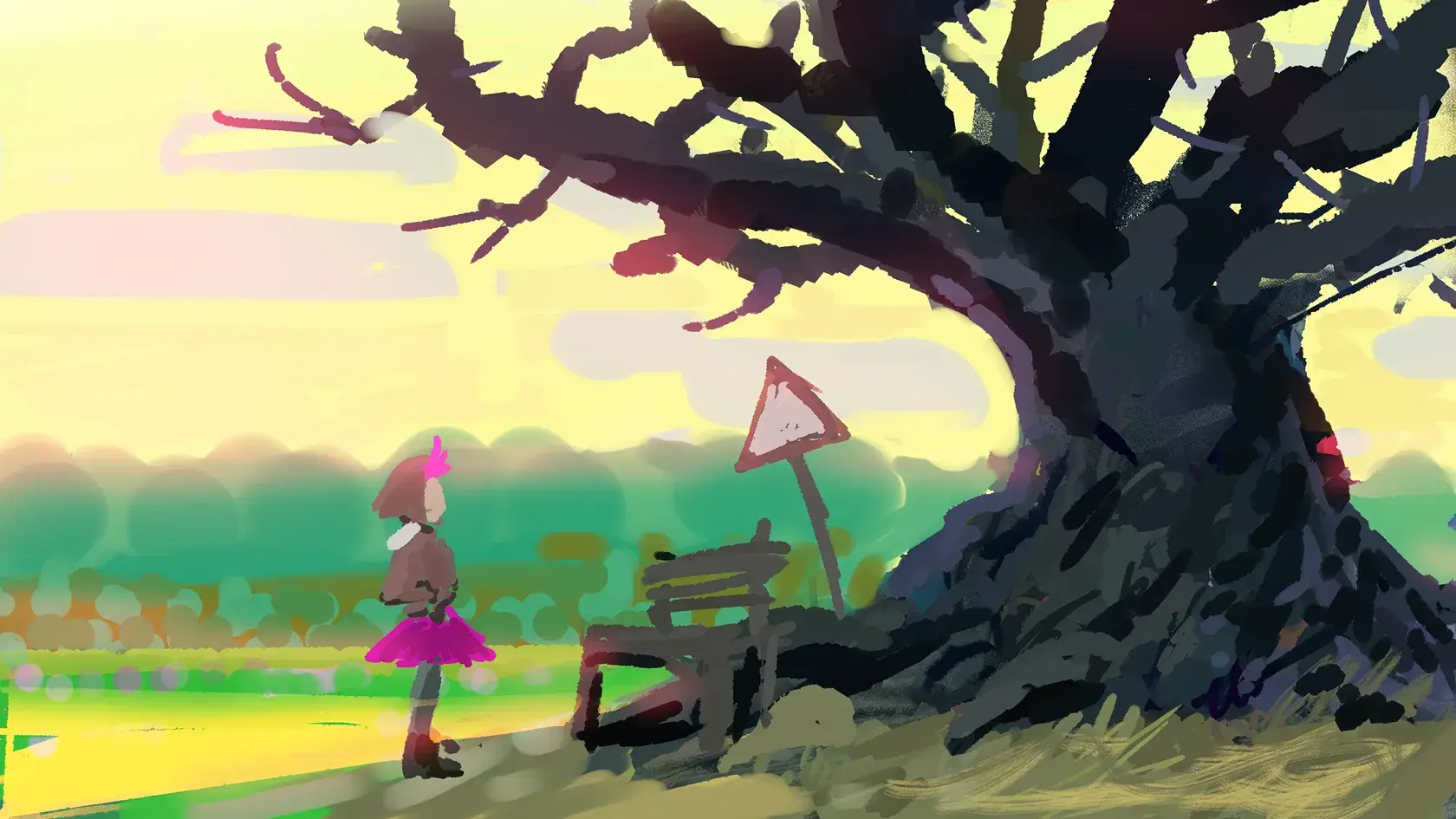
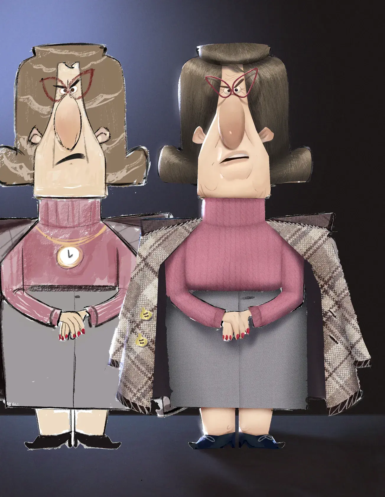
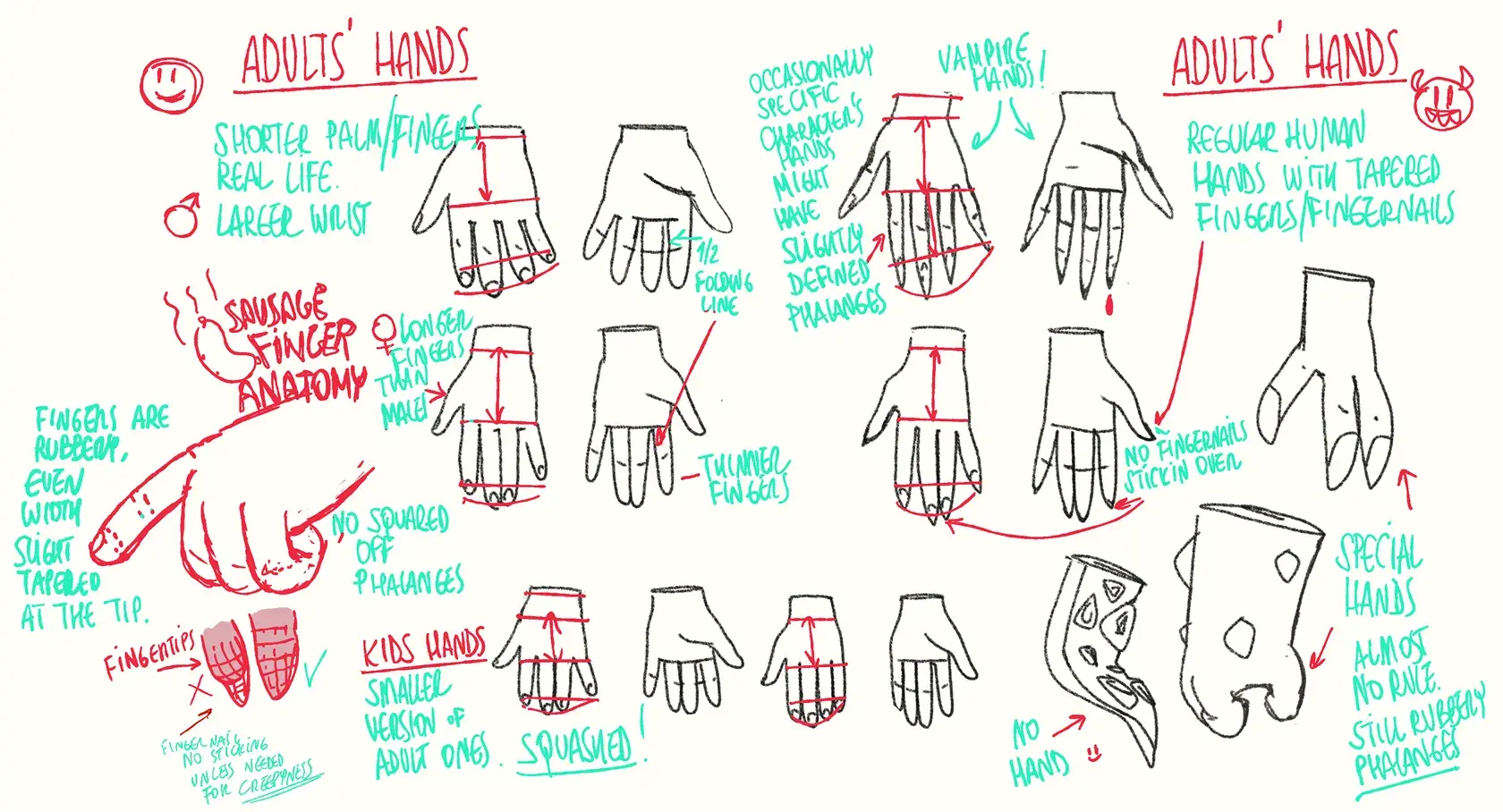
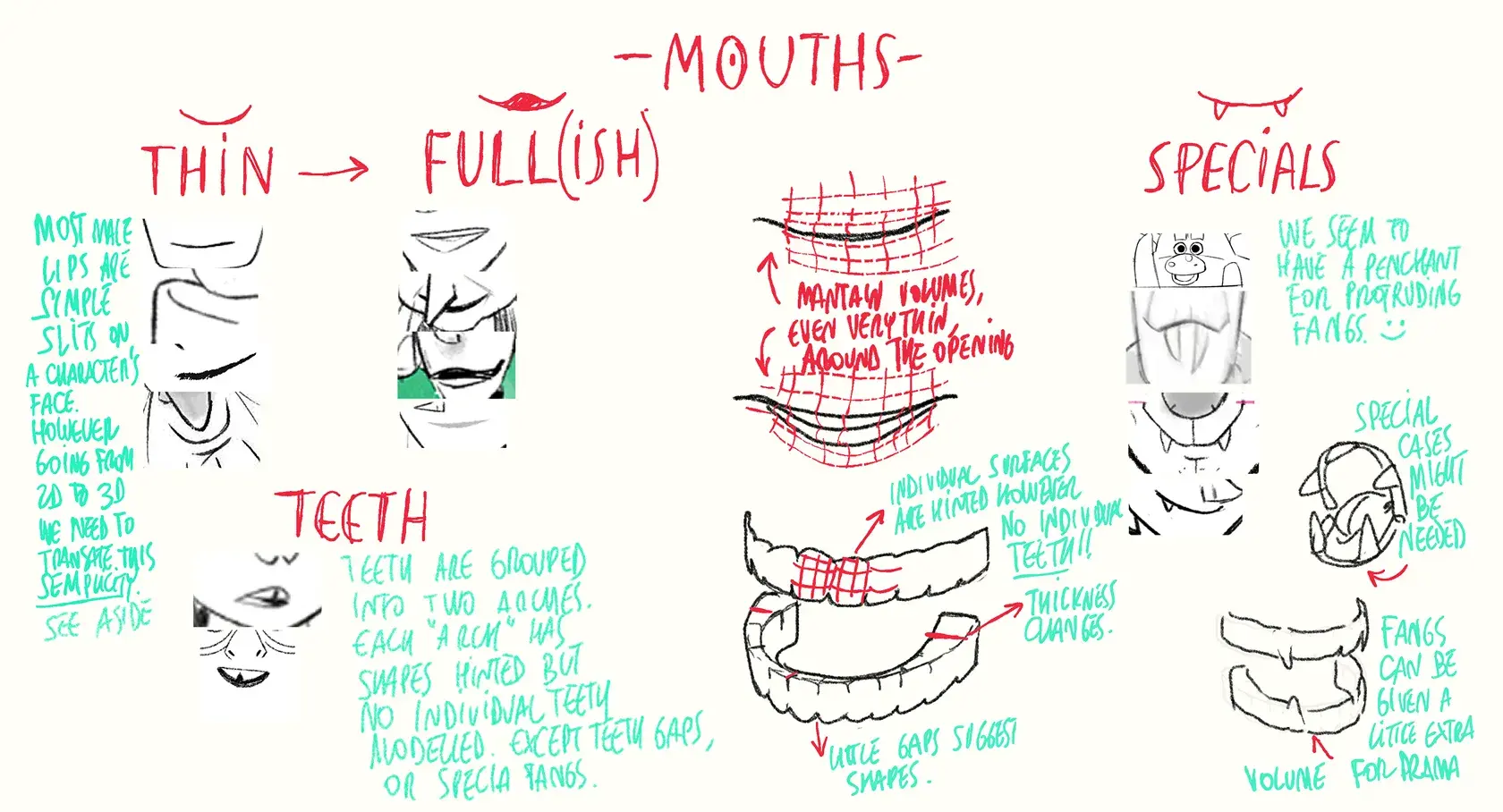
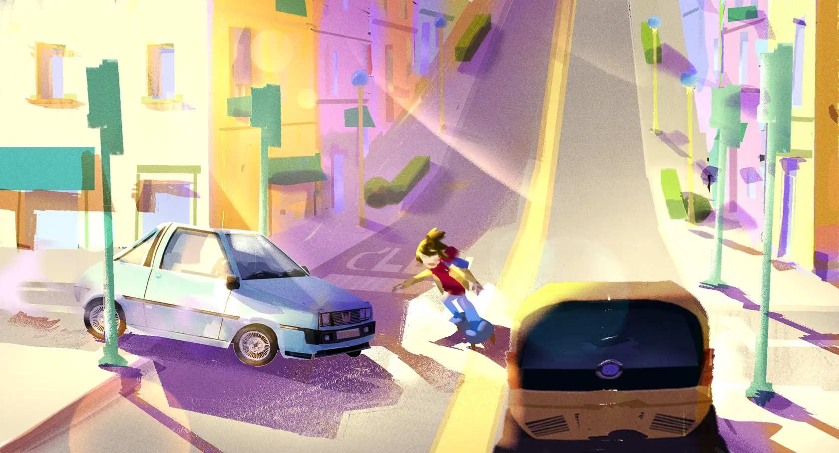
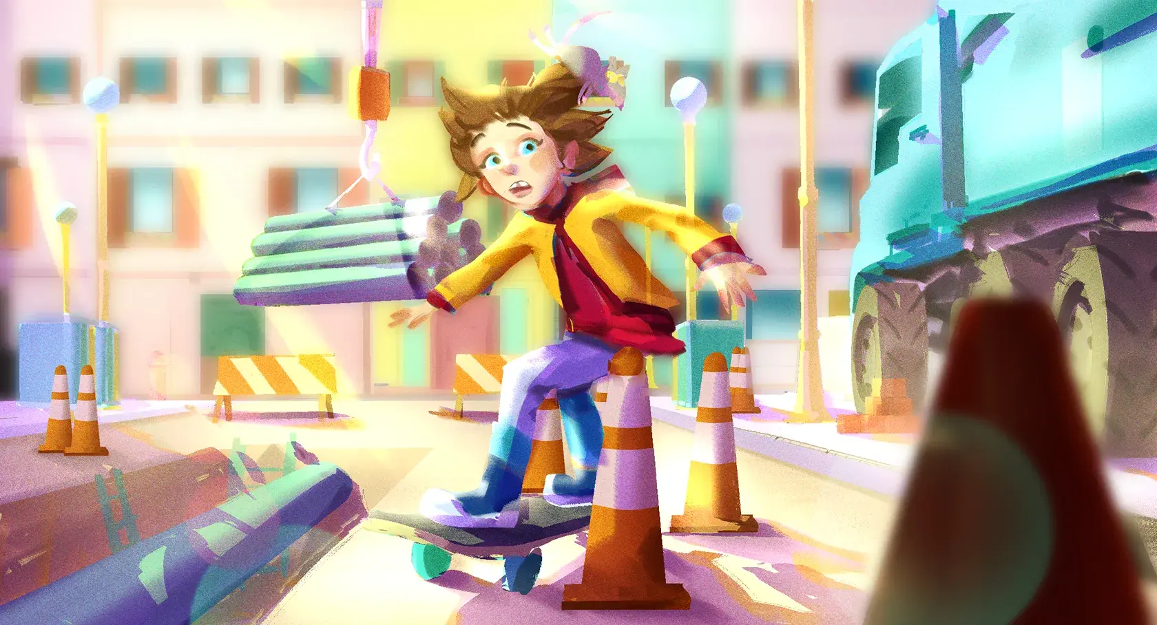
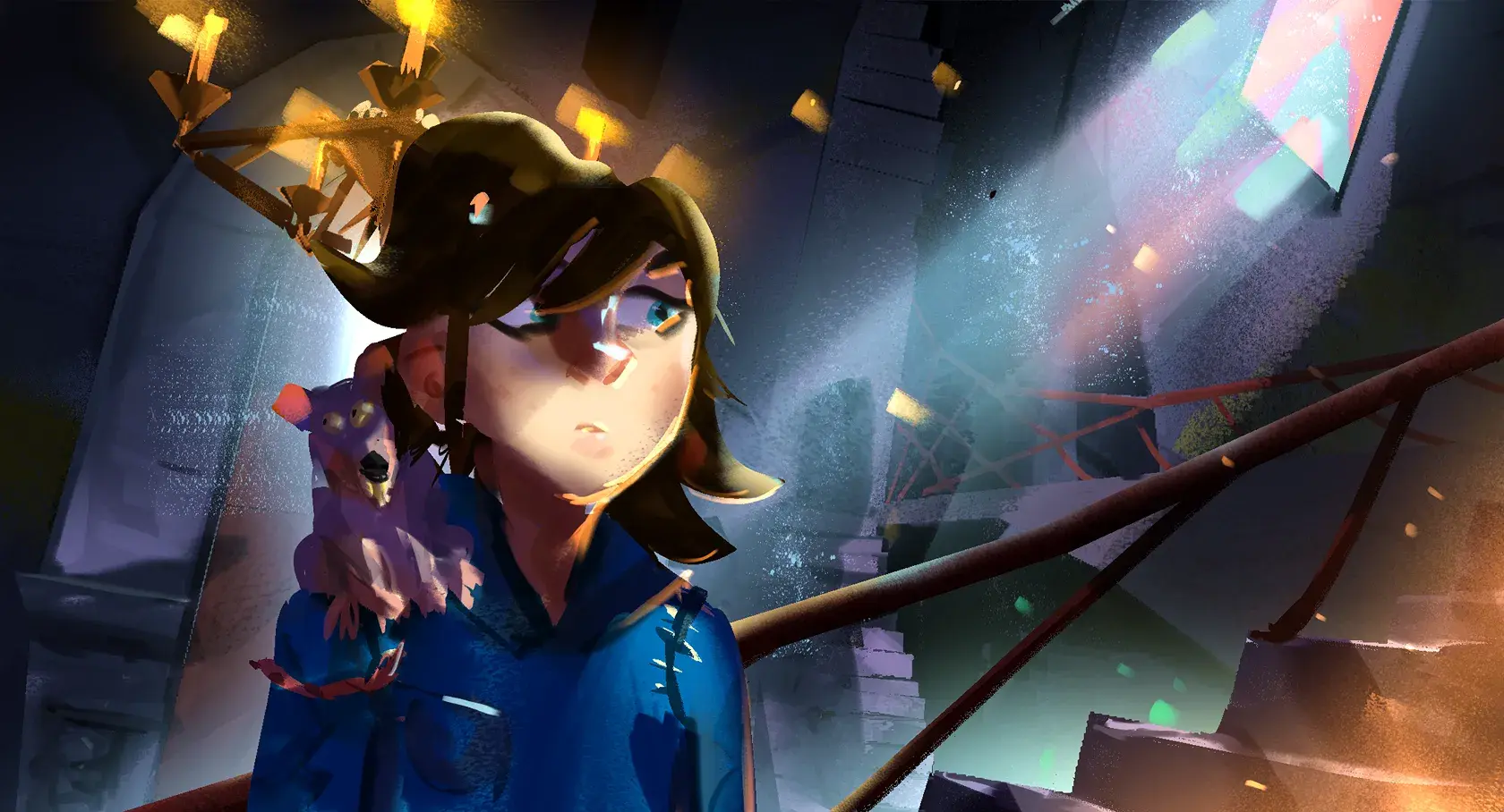
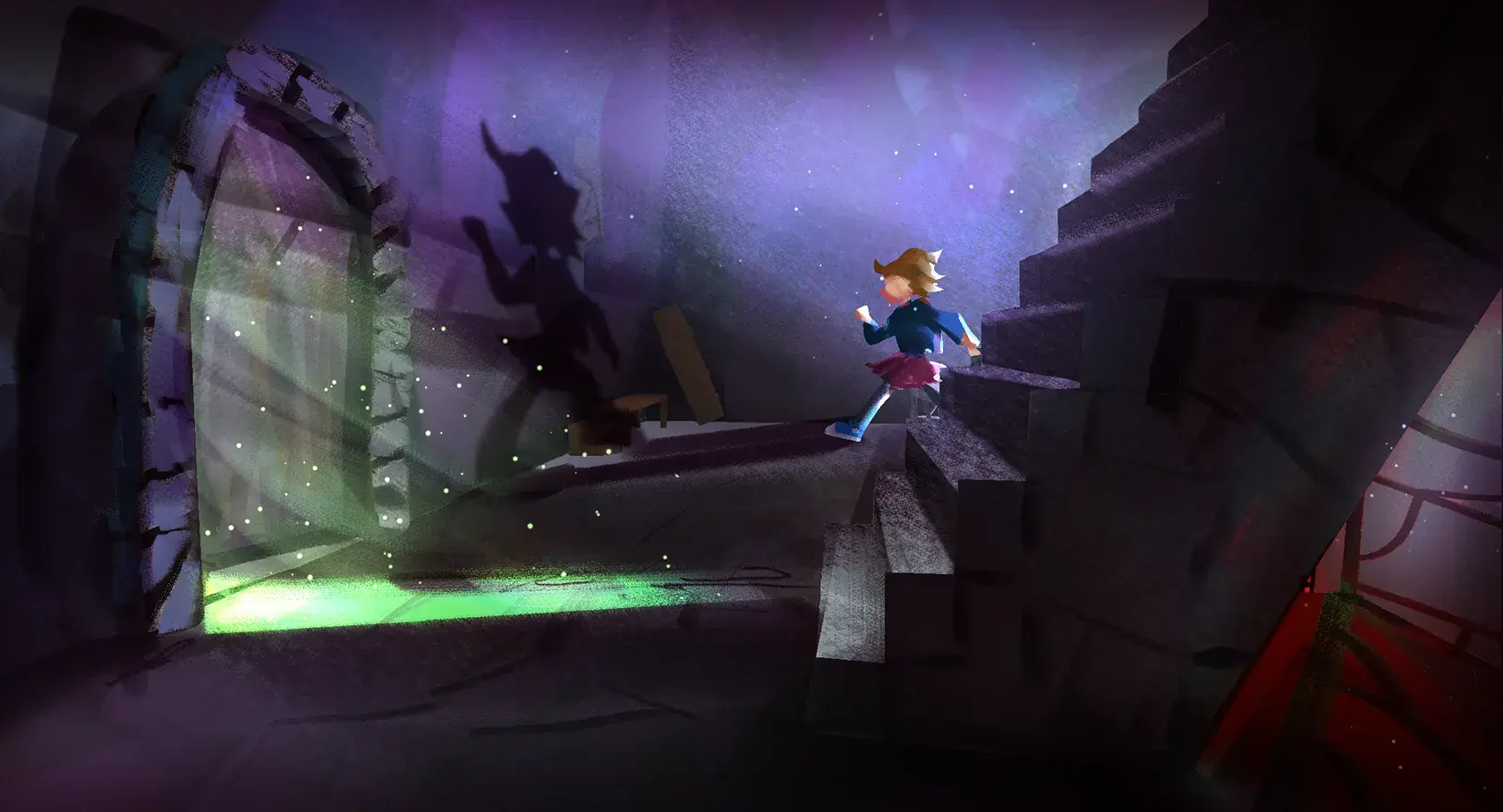
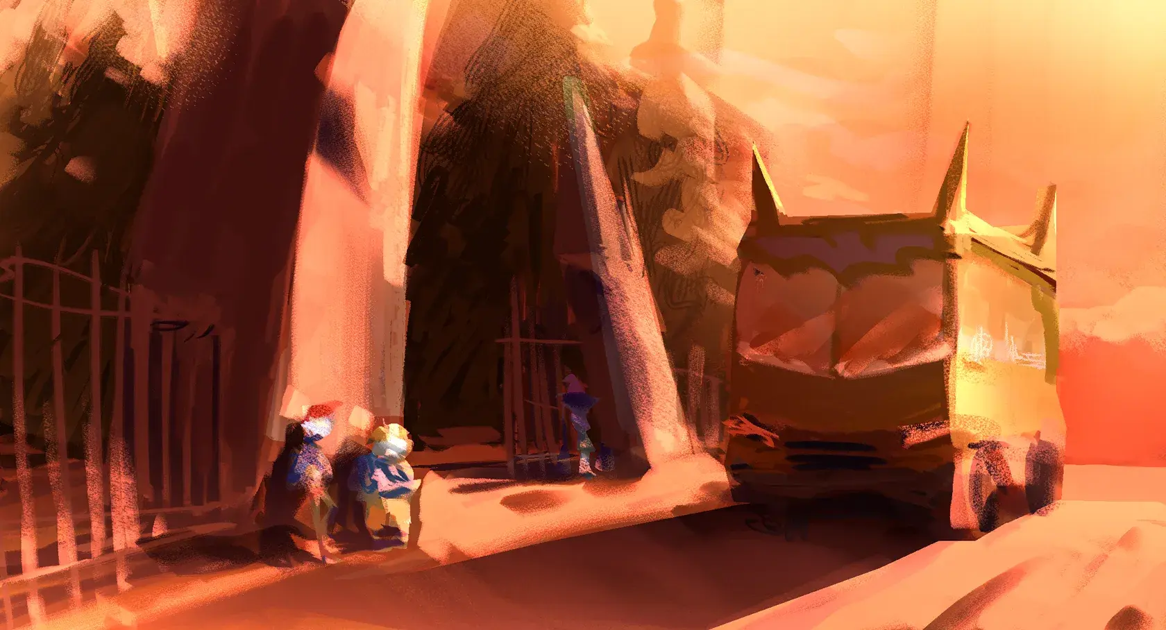
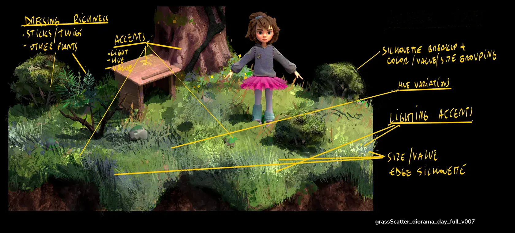
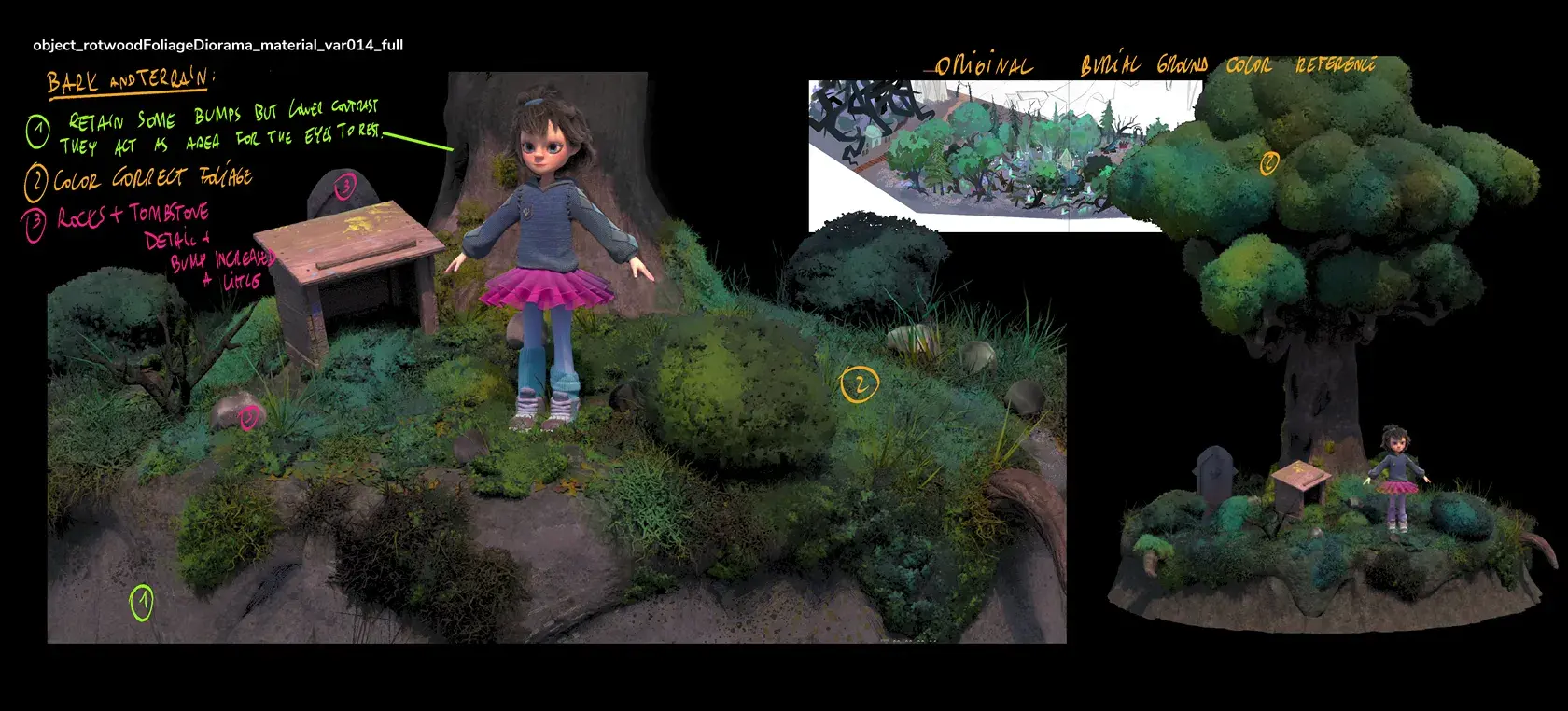
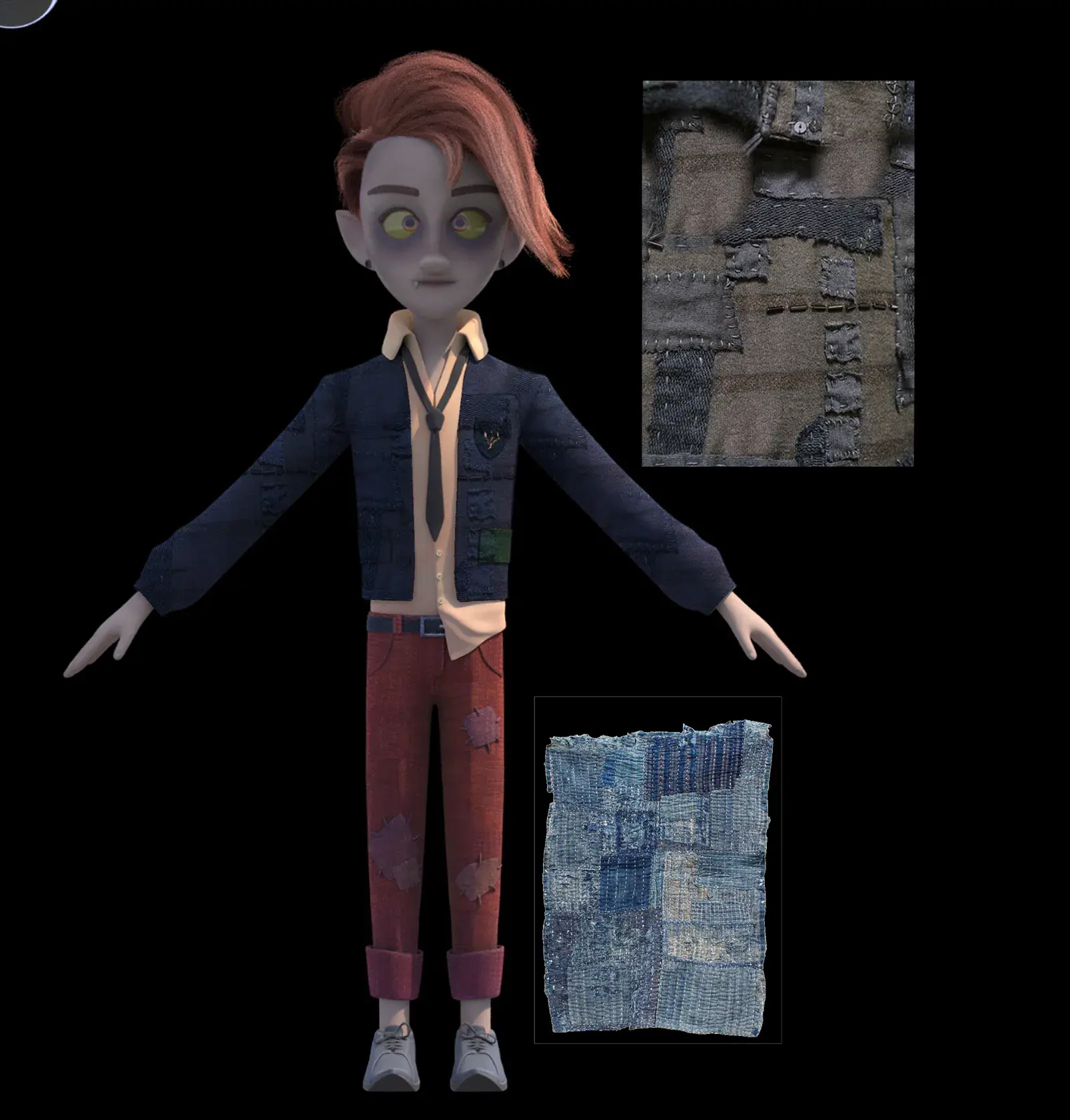
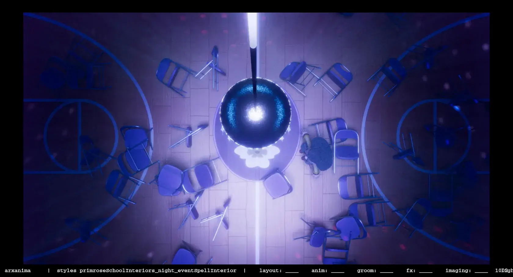
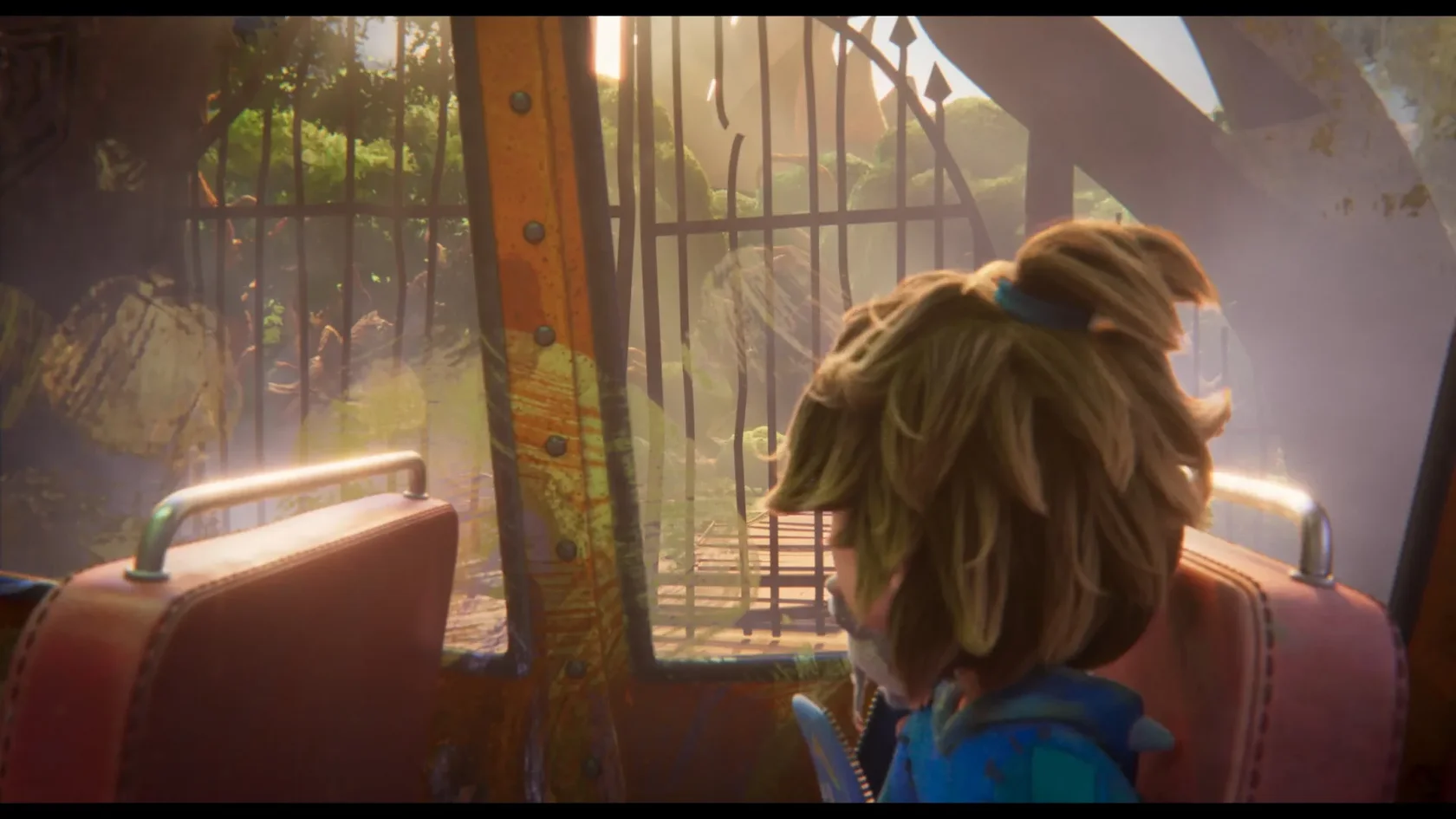
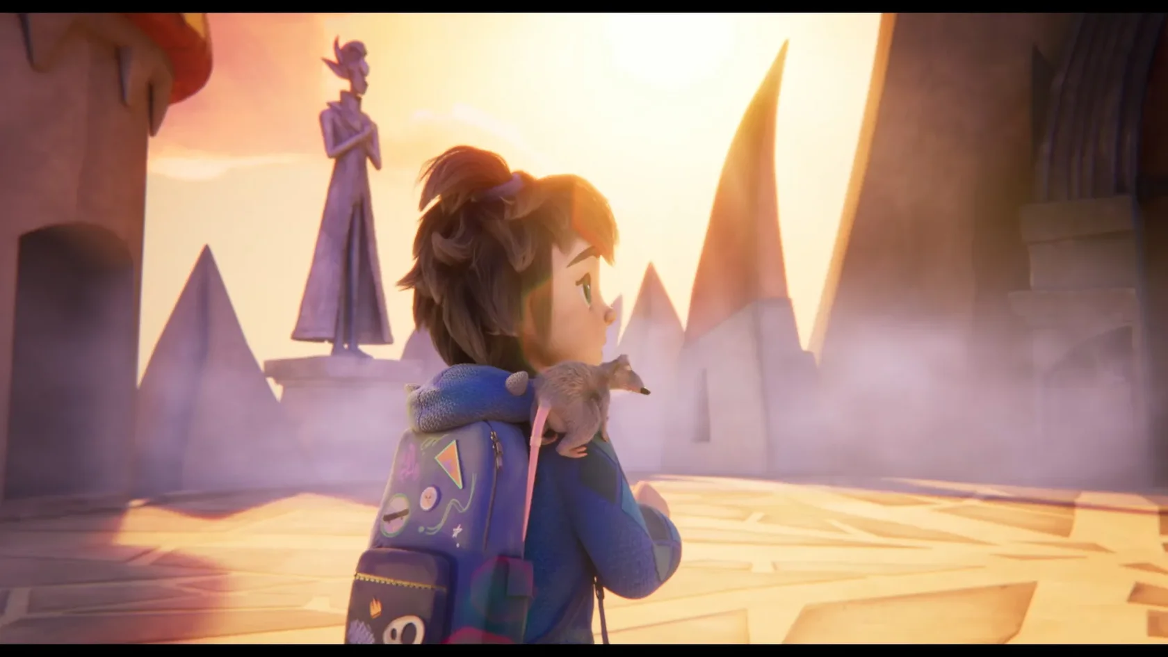
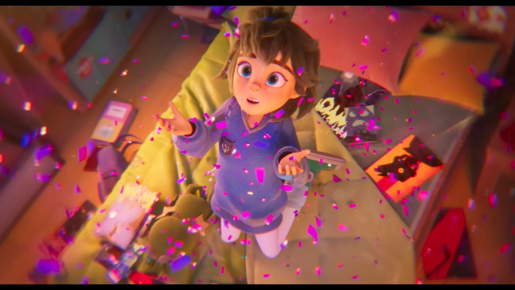
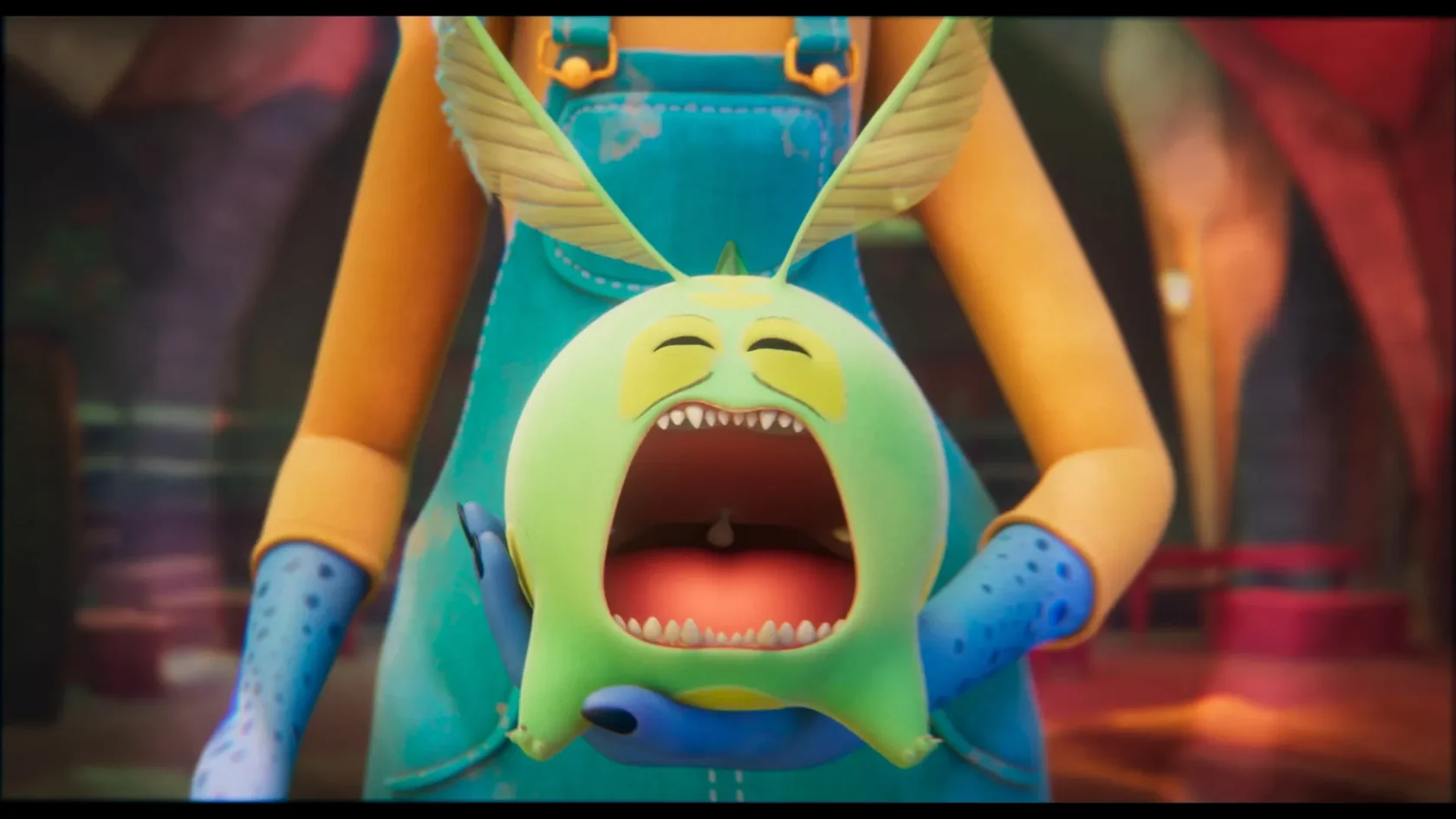
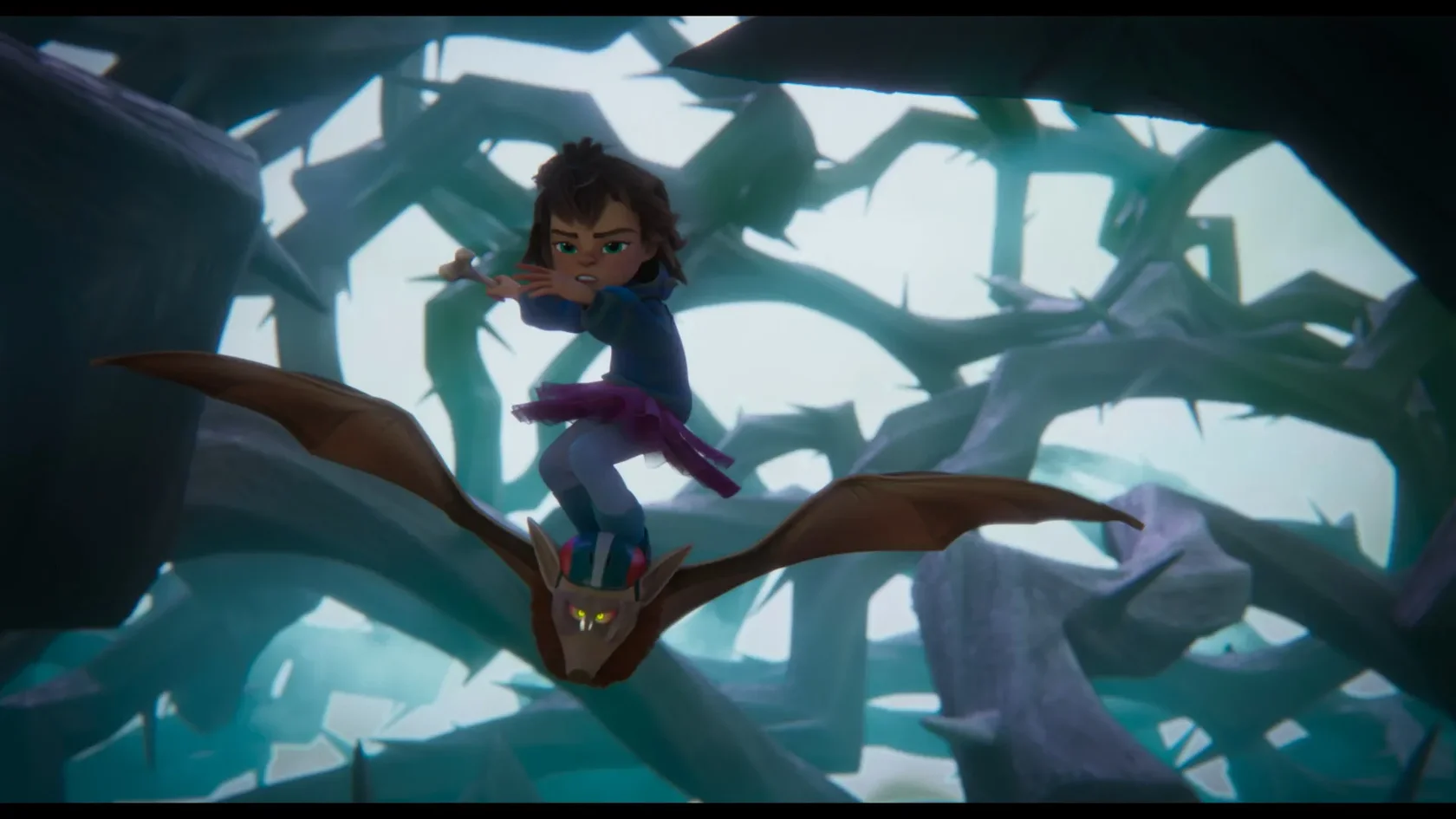
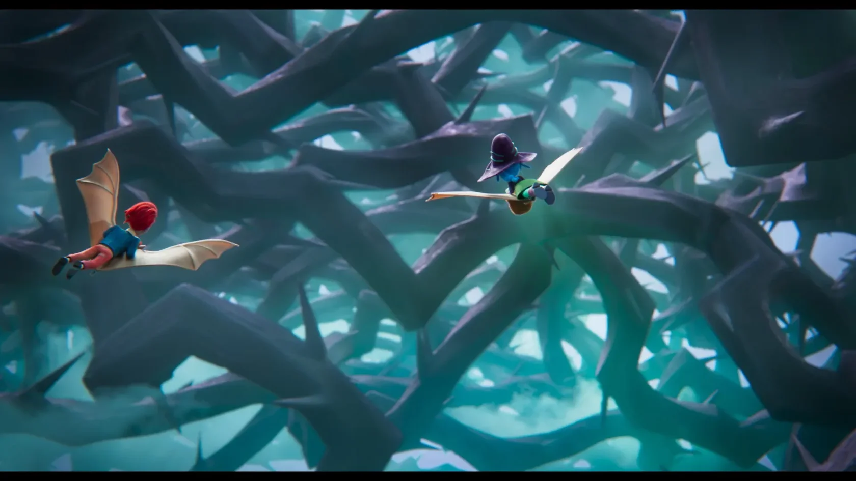
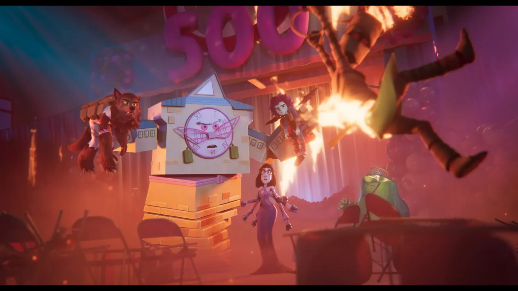
So it was very important to develop a distinct design language for both. Given the budget constraint , we decided very early on in the development process to go for a stylised look that would convey these aesthetic and narrative points while maintaining the highest possible production values. We therefore decided to work with simple shapes and stylised, contrasting shaders, placing a strong emphasis on lighting. The idea was to get closer to the tactile feel of stop motion, which was then also emphasised in animation, done in 2s and cinematography.
Key Art
Color Script
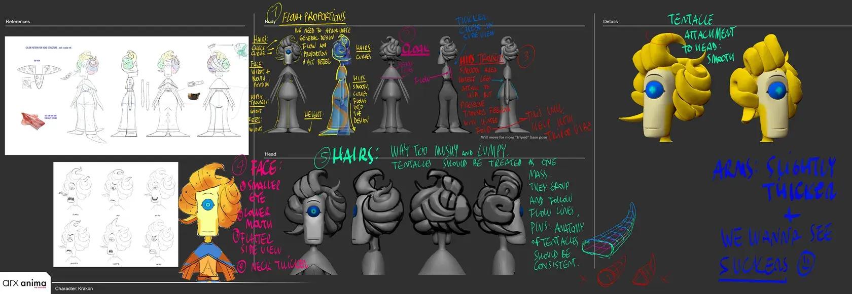
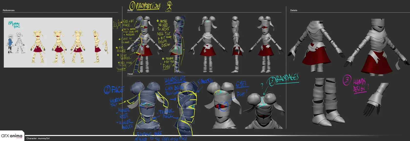
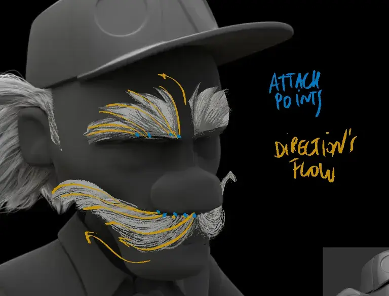
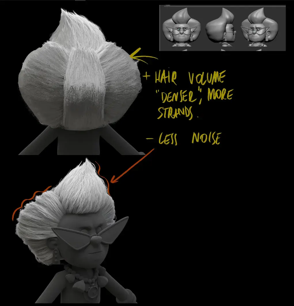
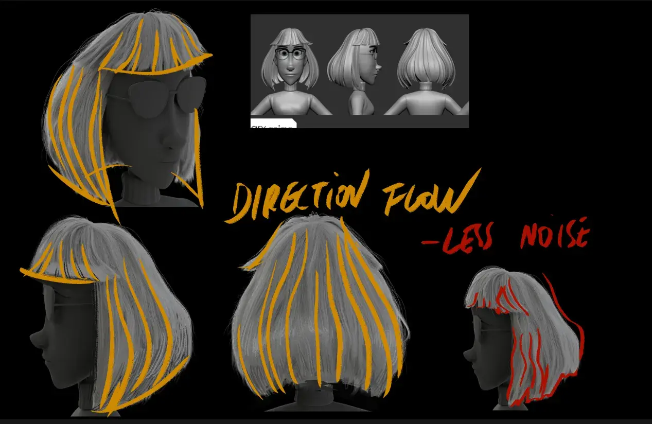
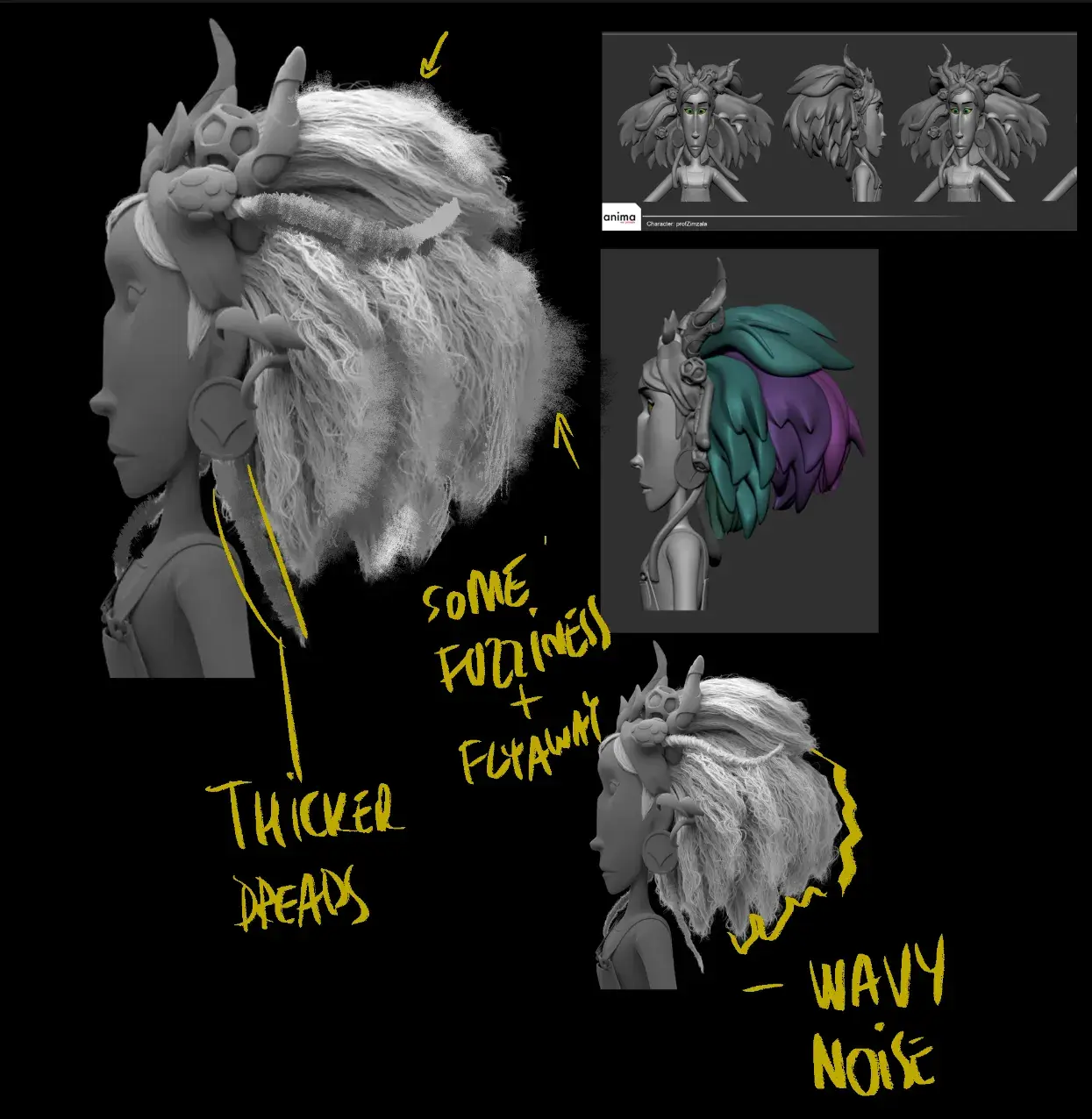
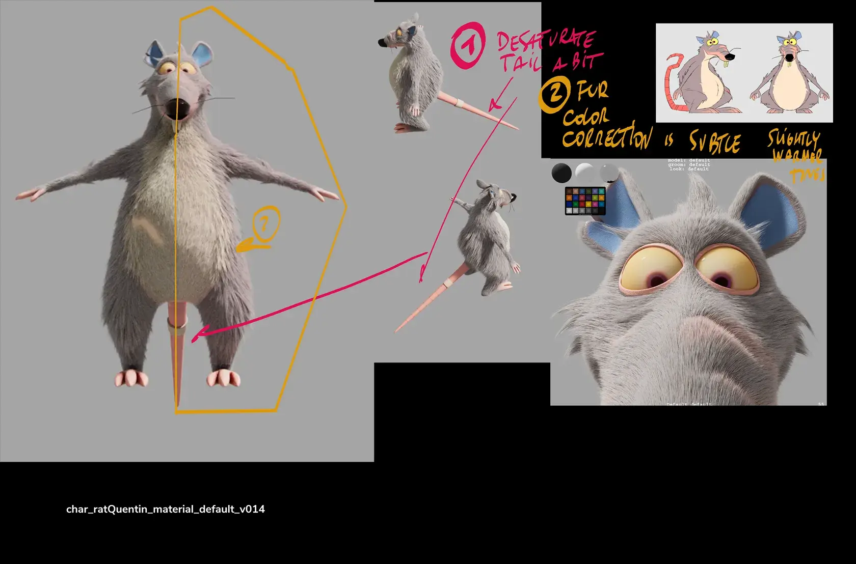
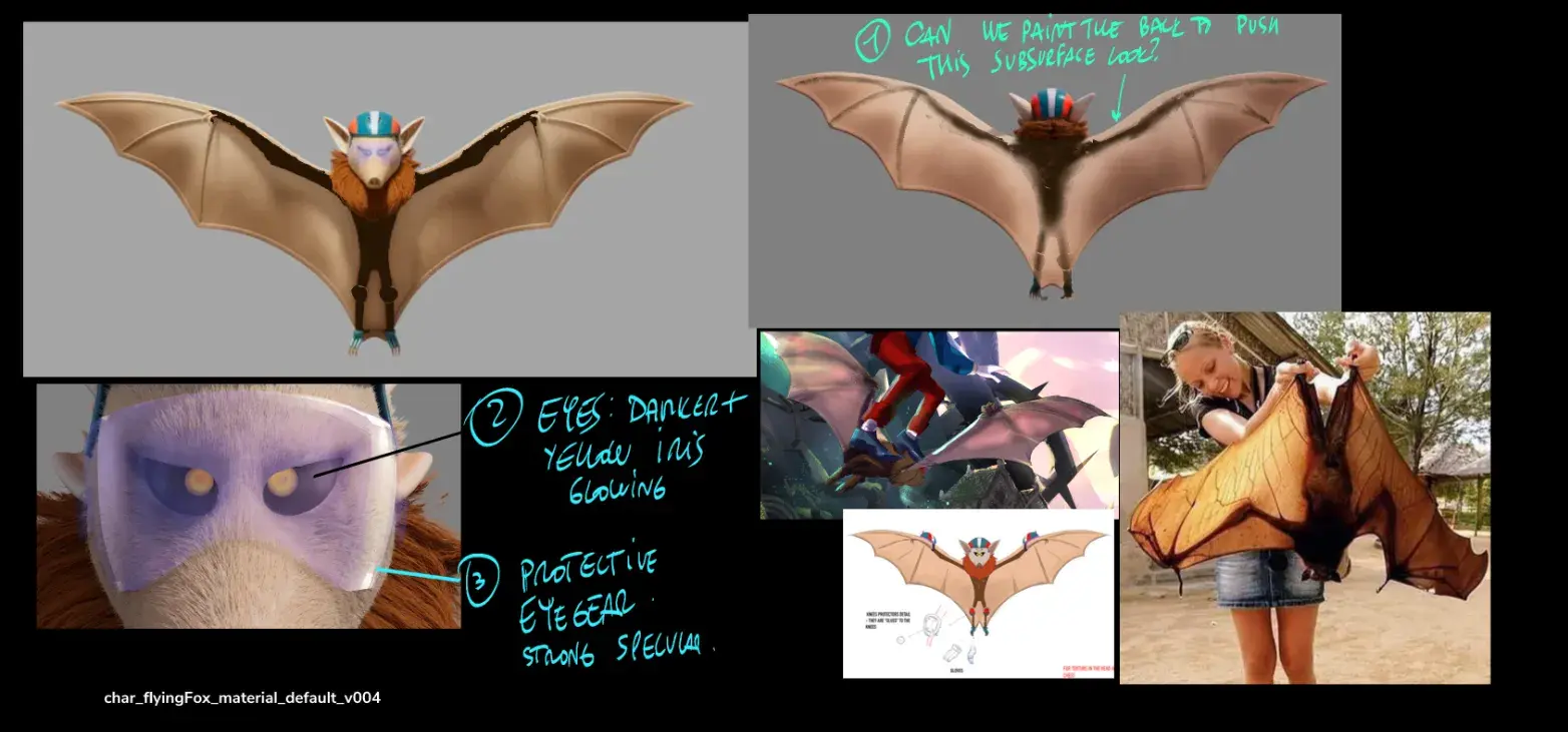
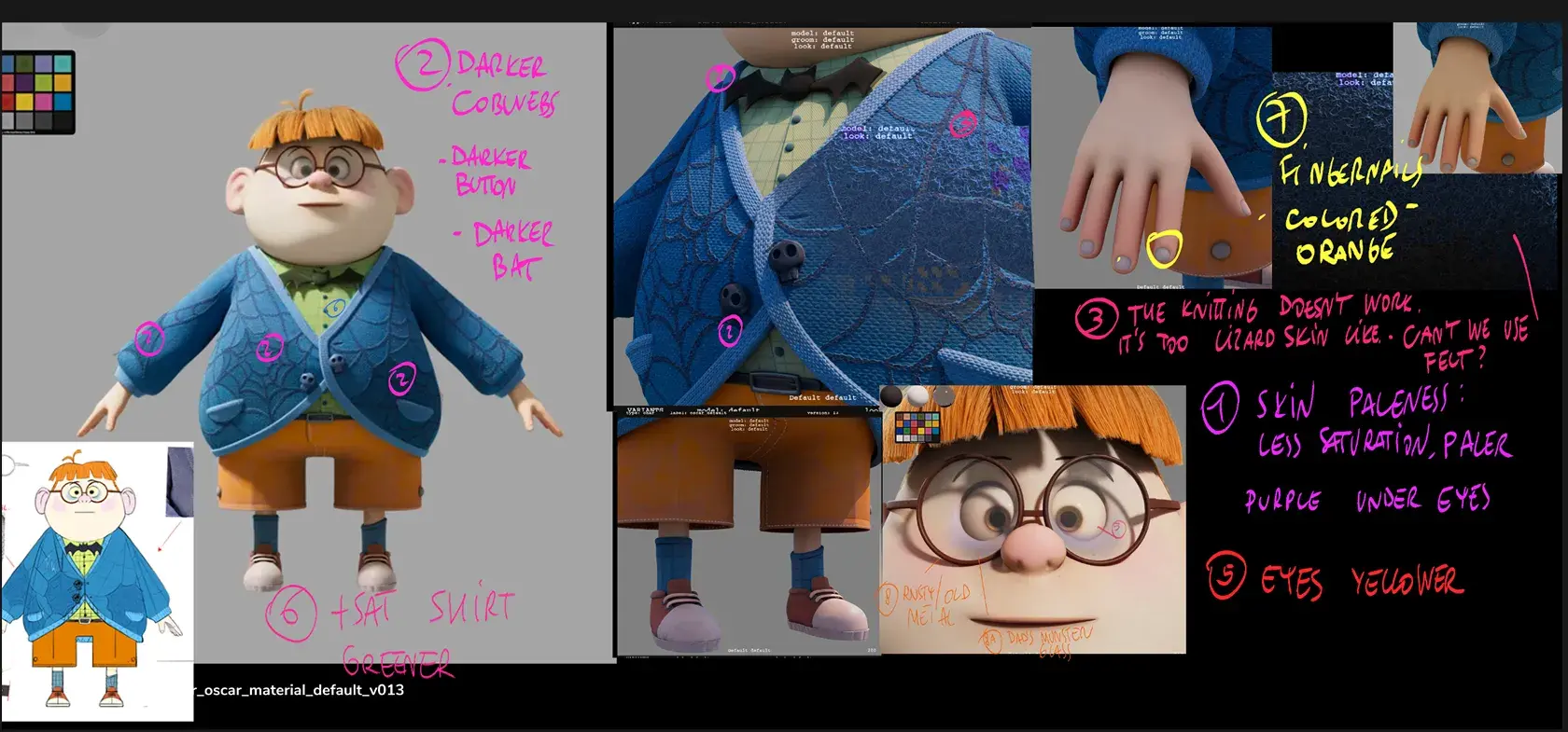
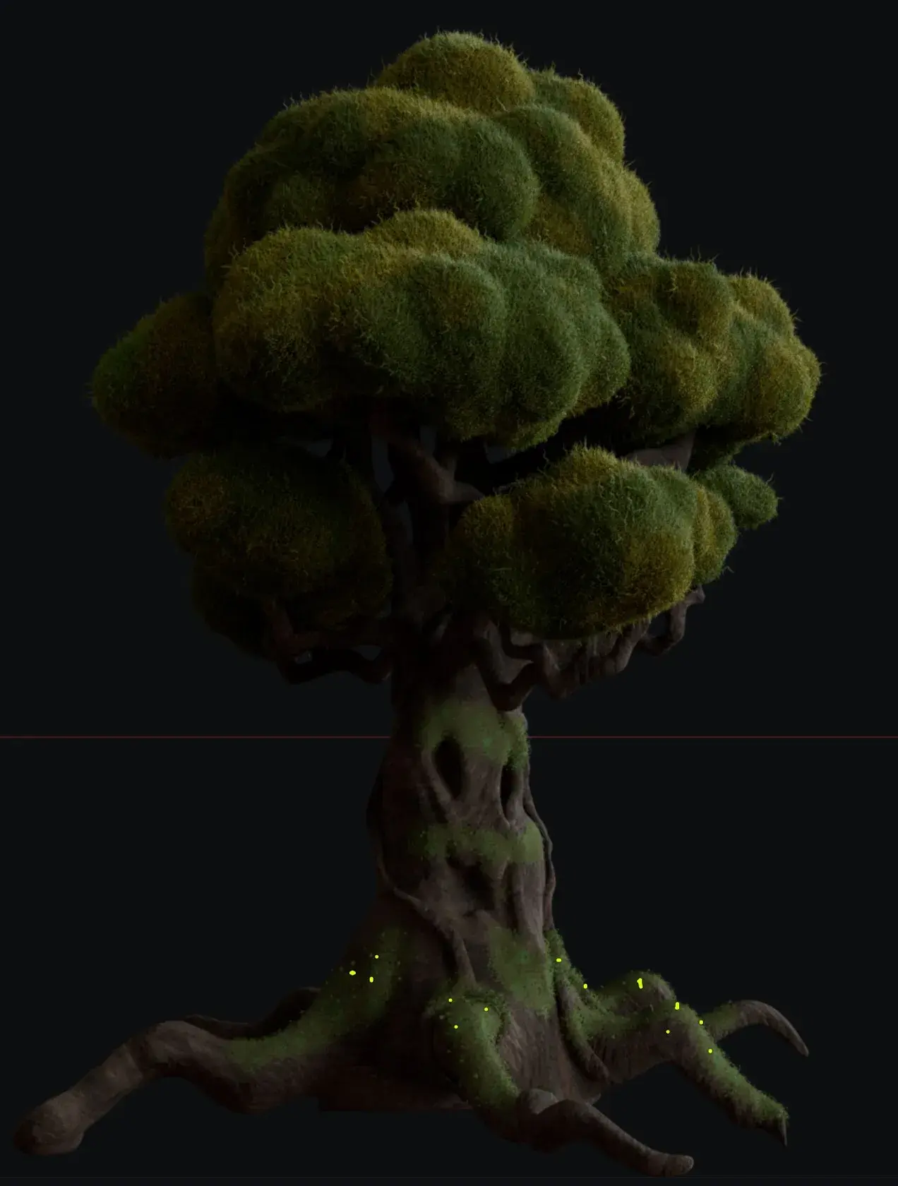
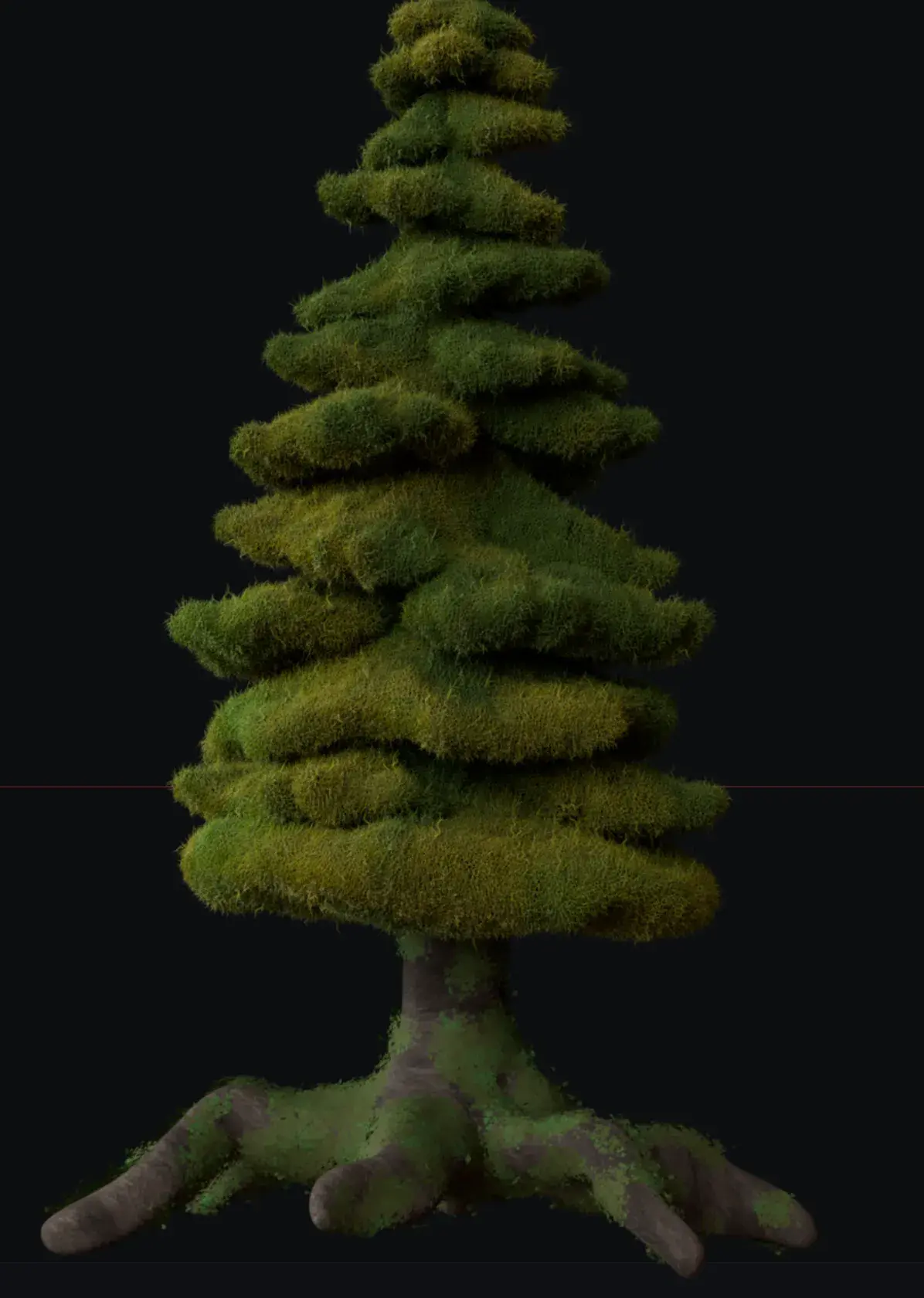
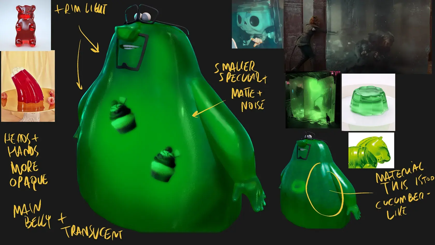
Modelling, Grooming, Shading, Lighting...
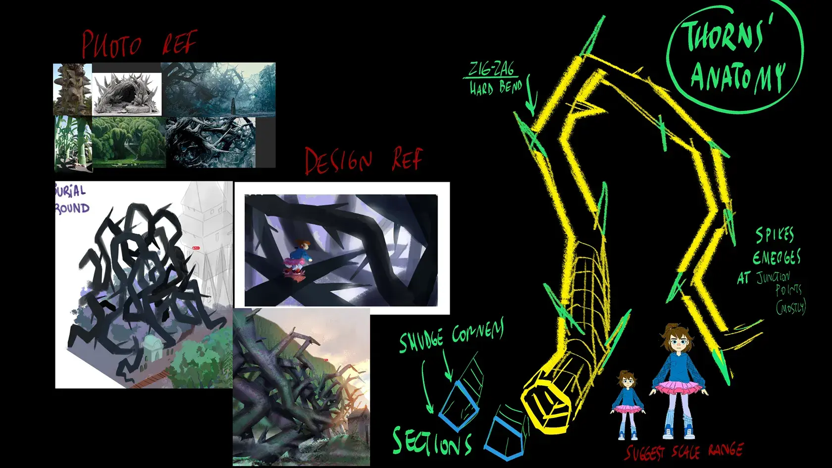
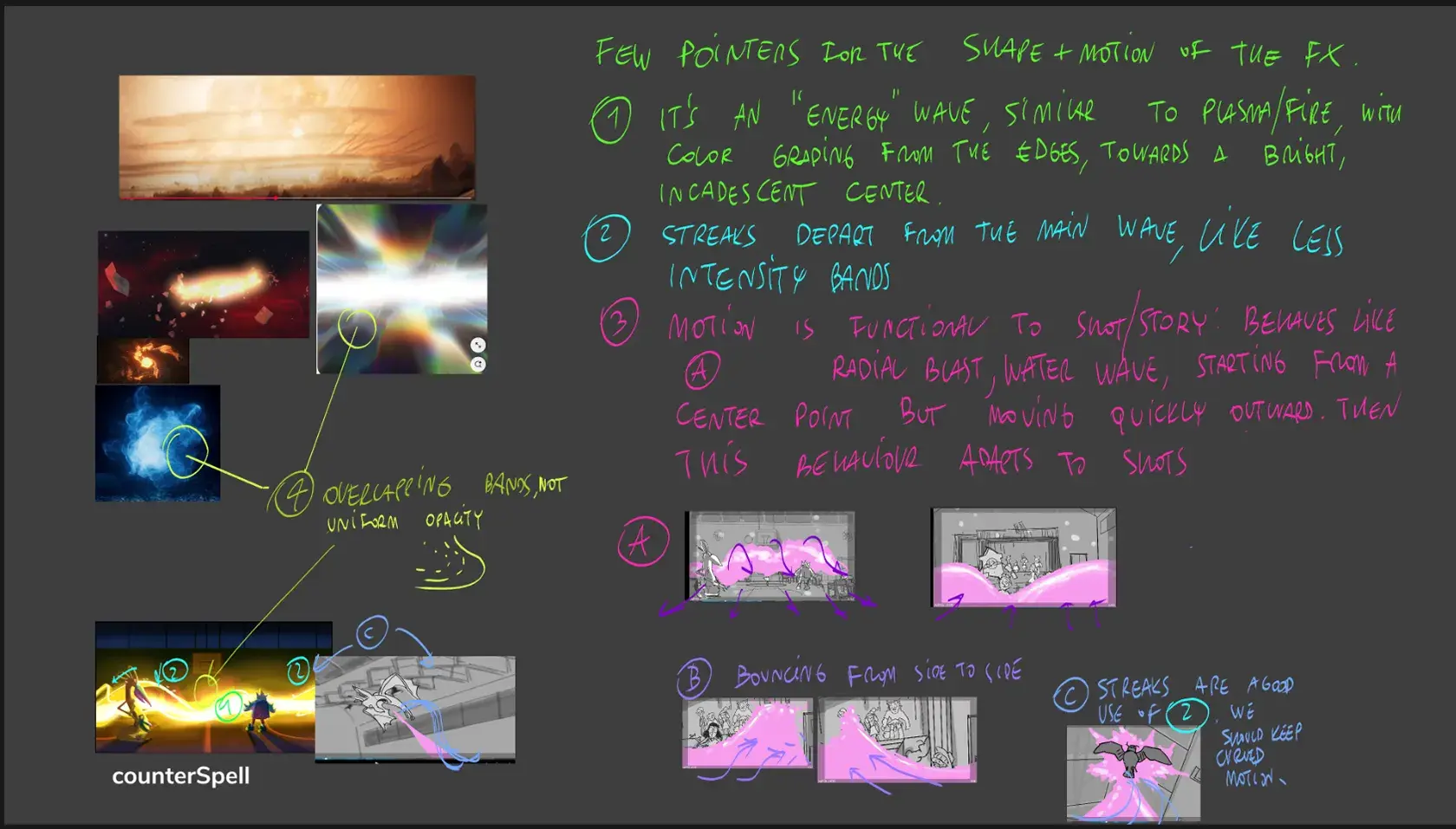
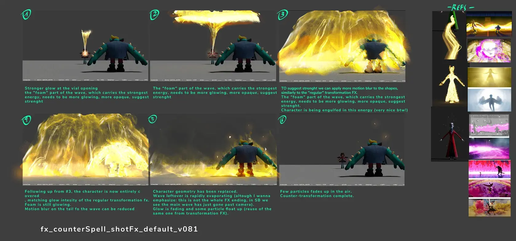
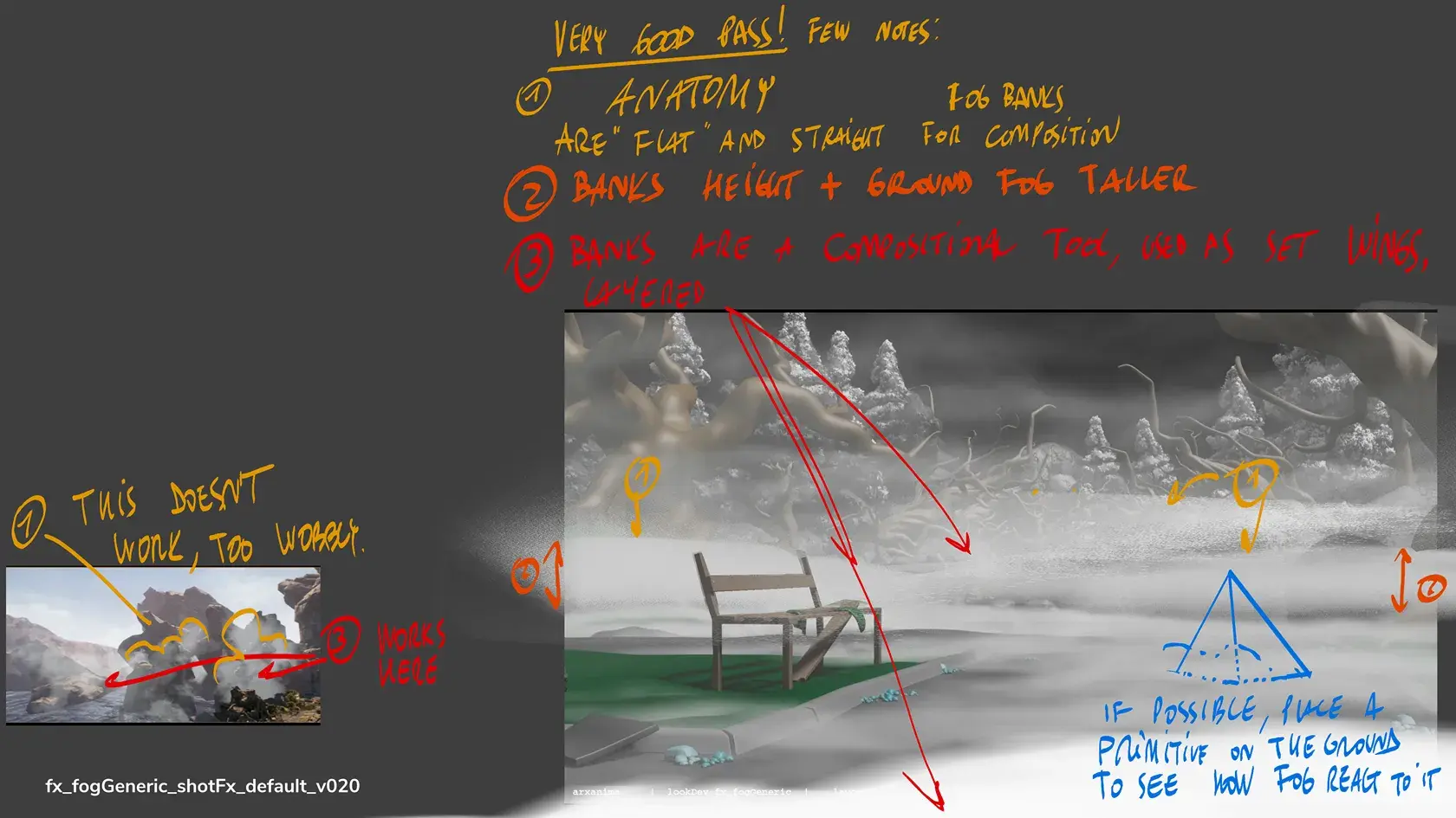
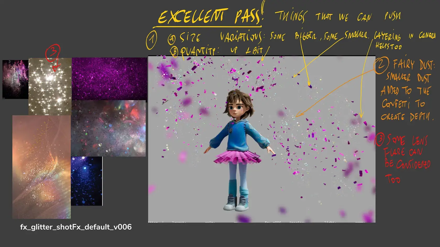
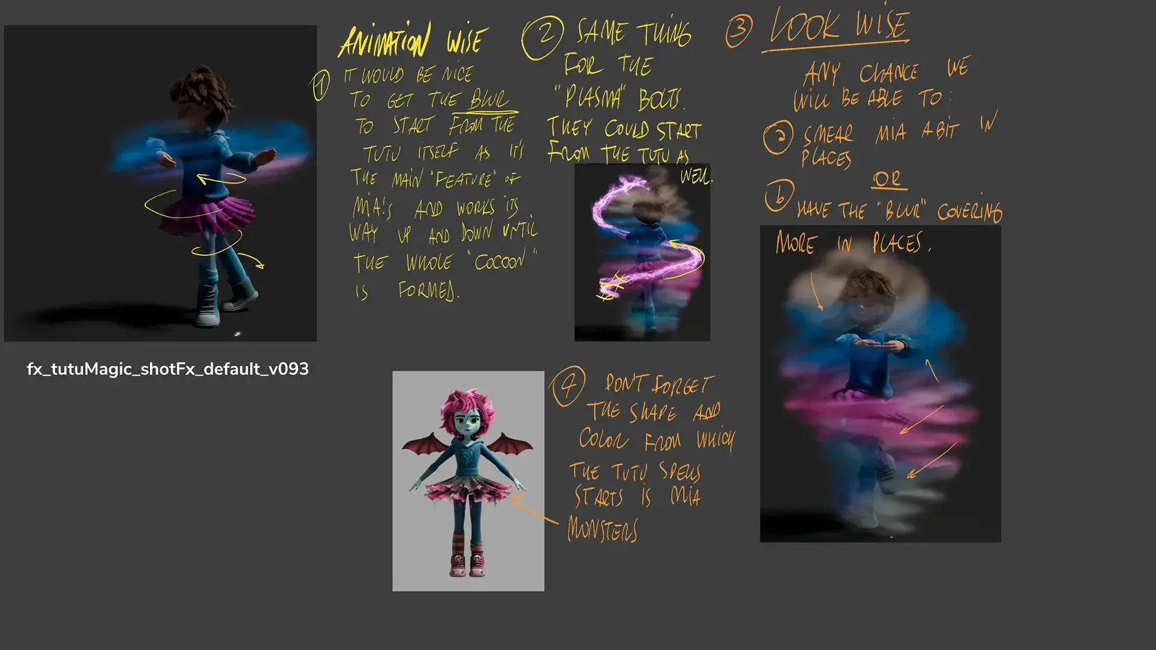
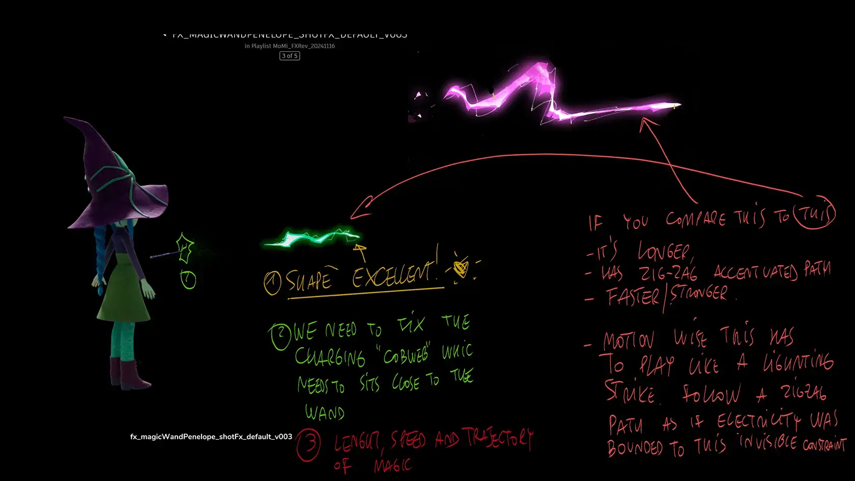
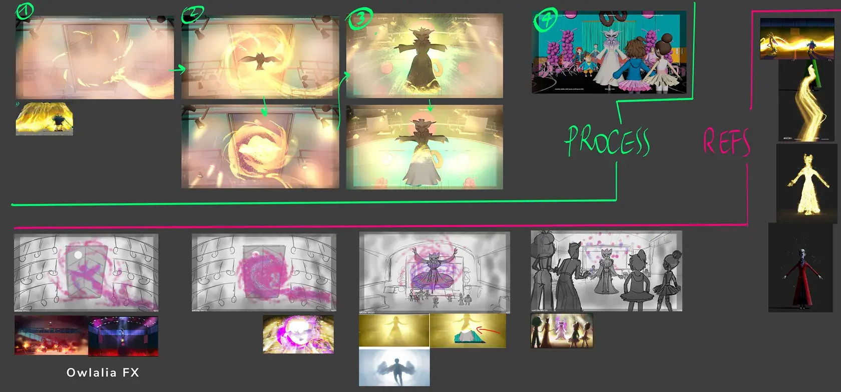
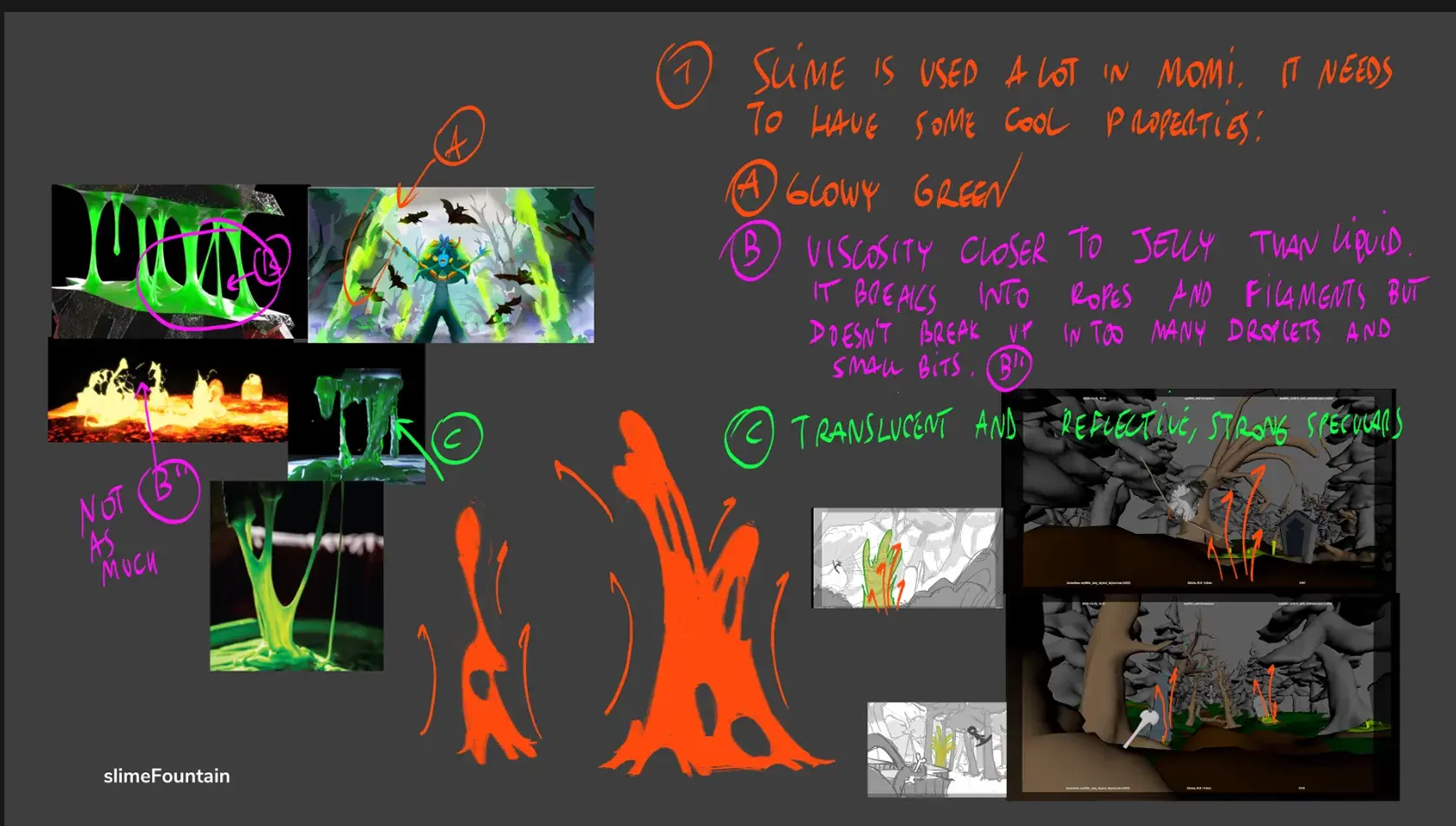
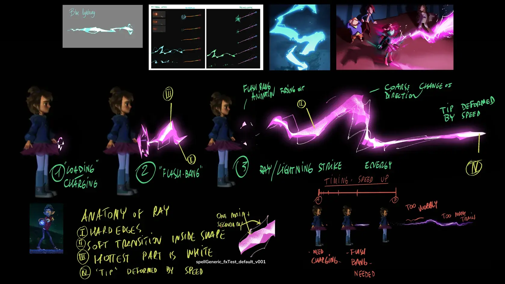
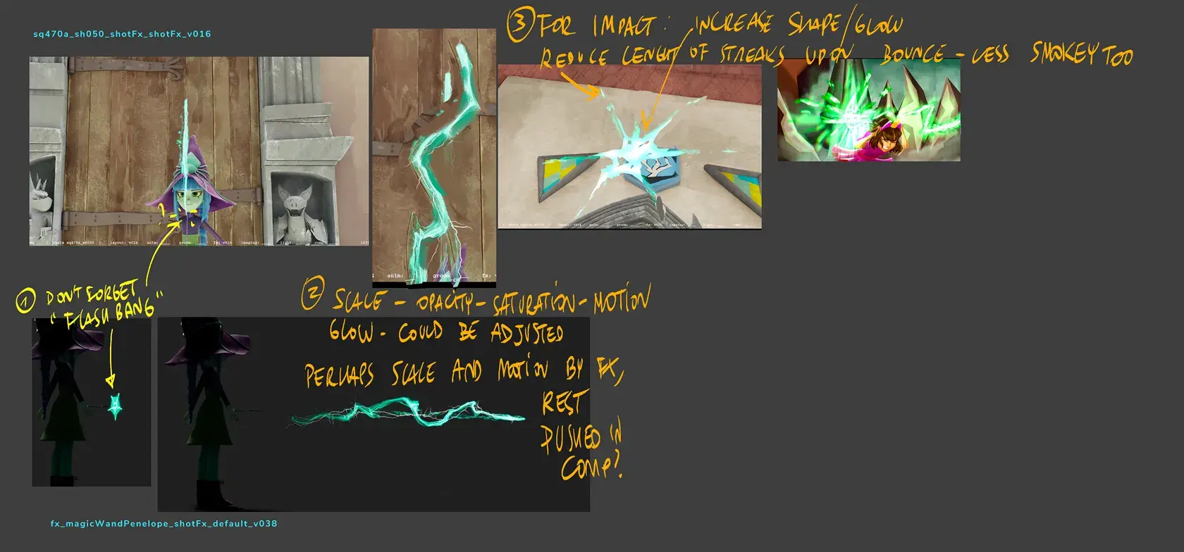
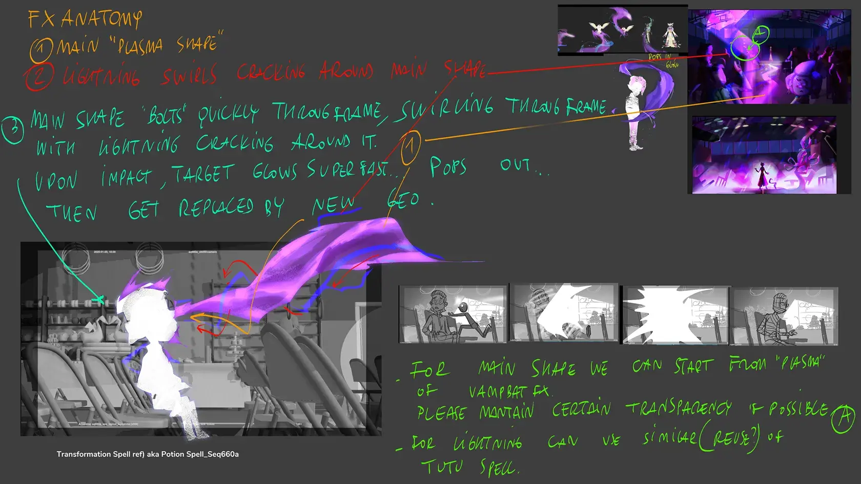
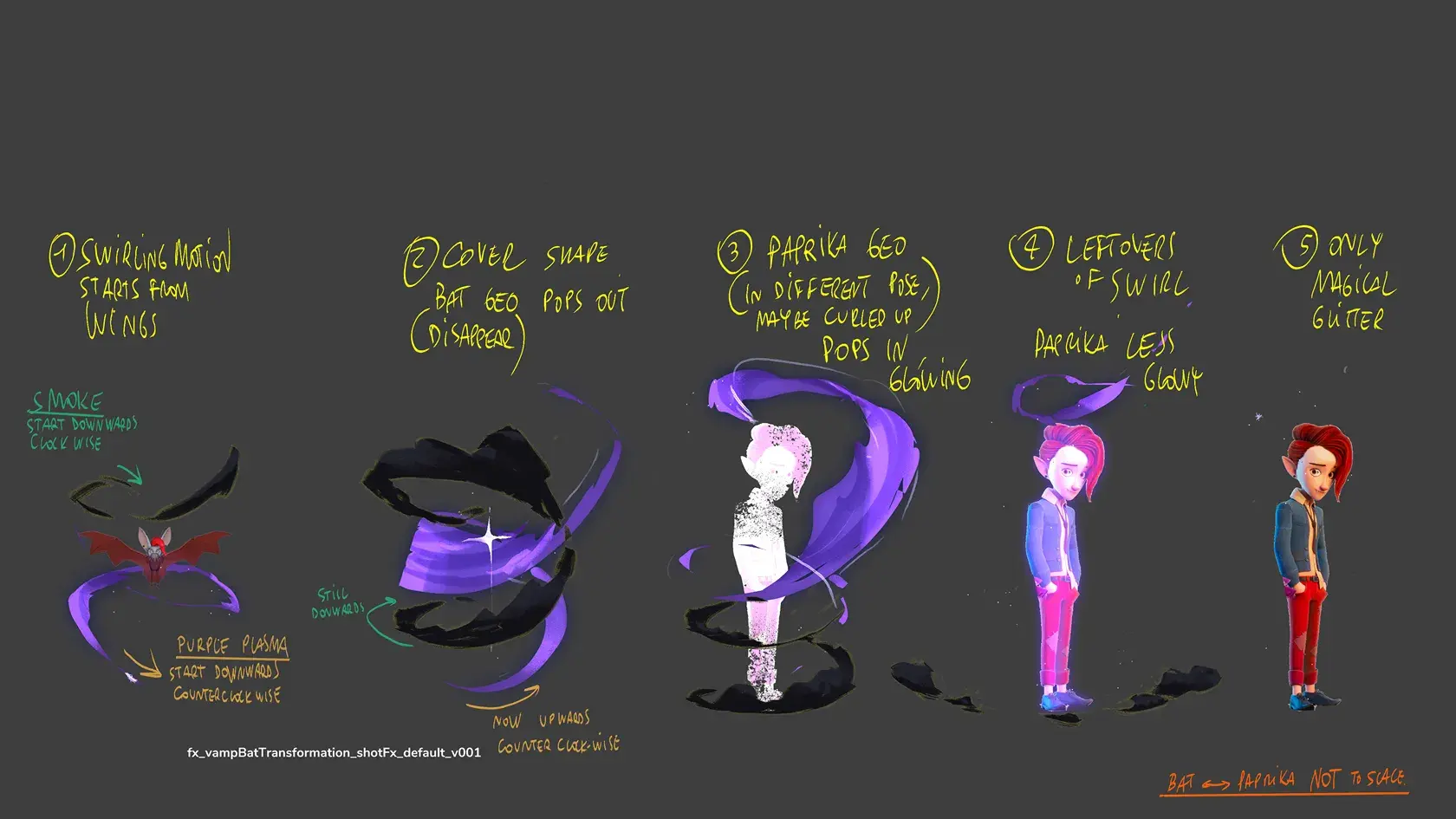
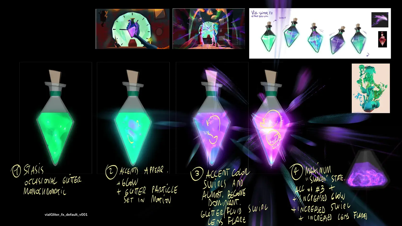
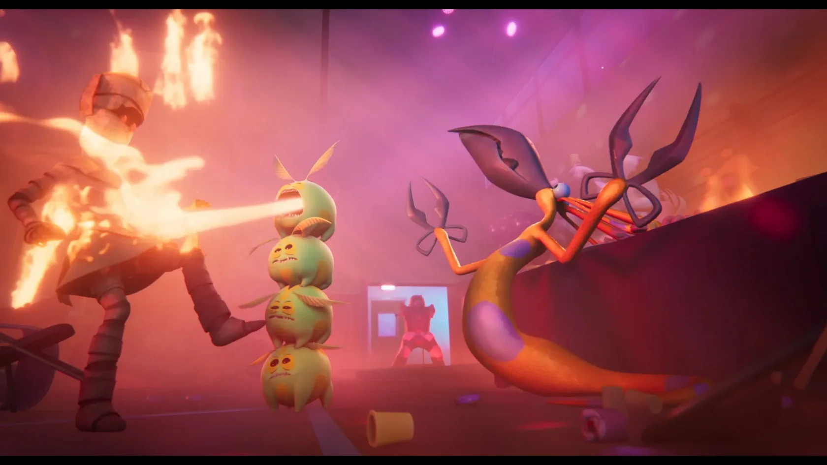
VFXs
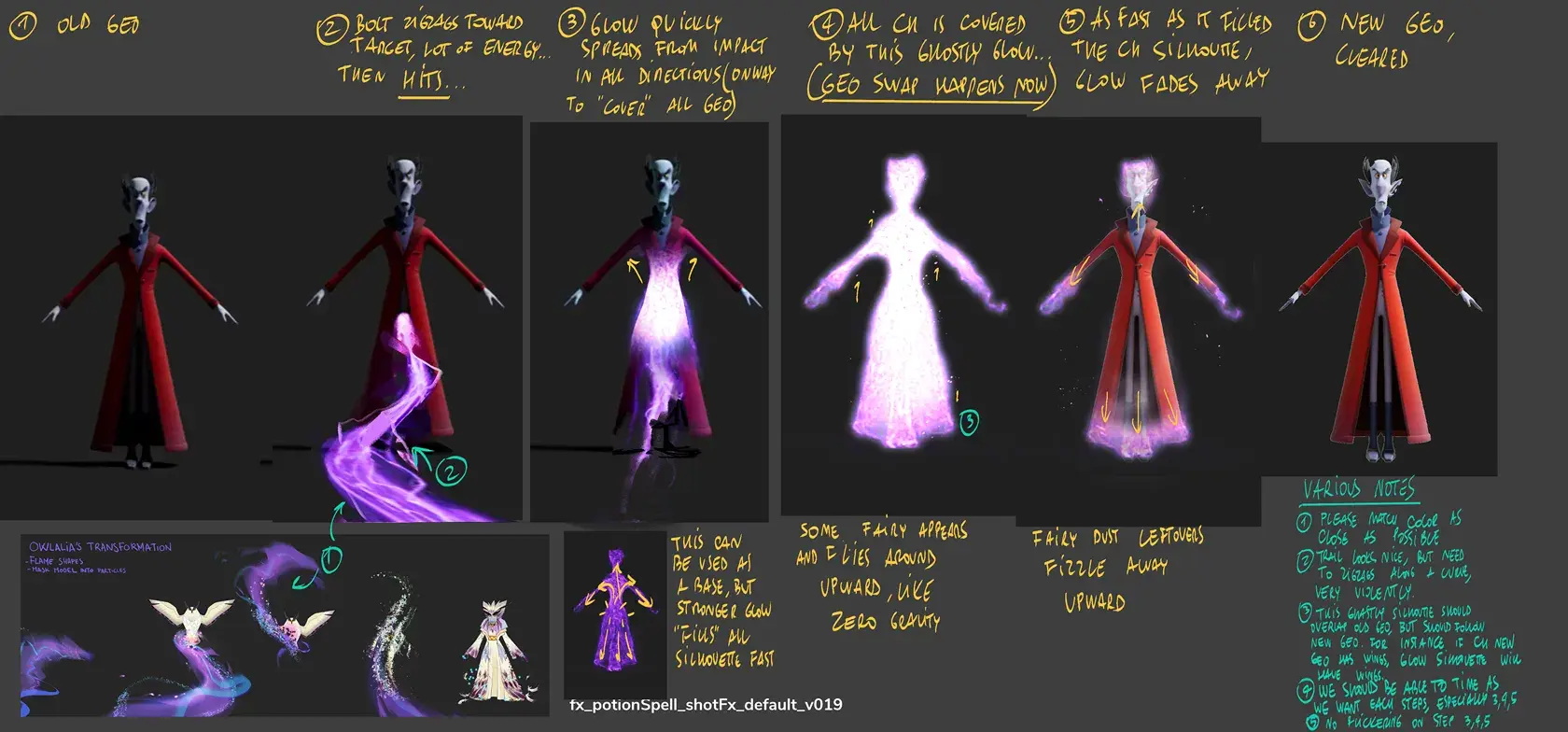
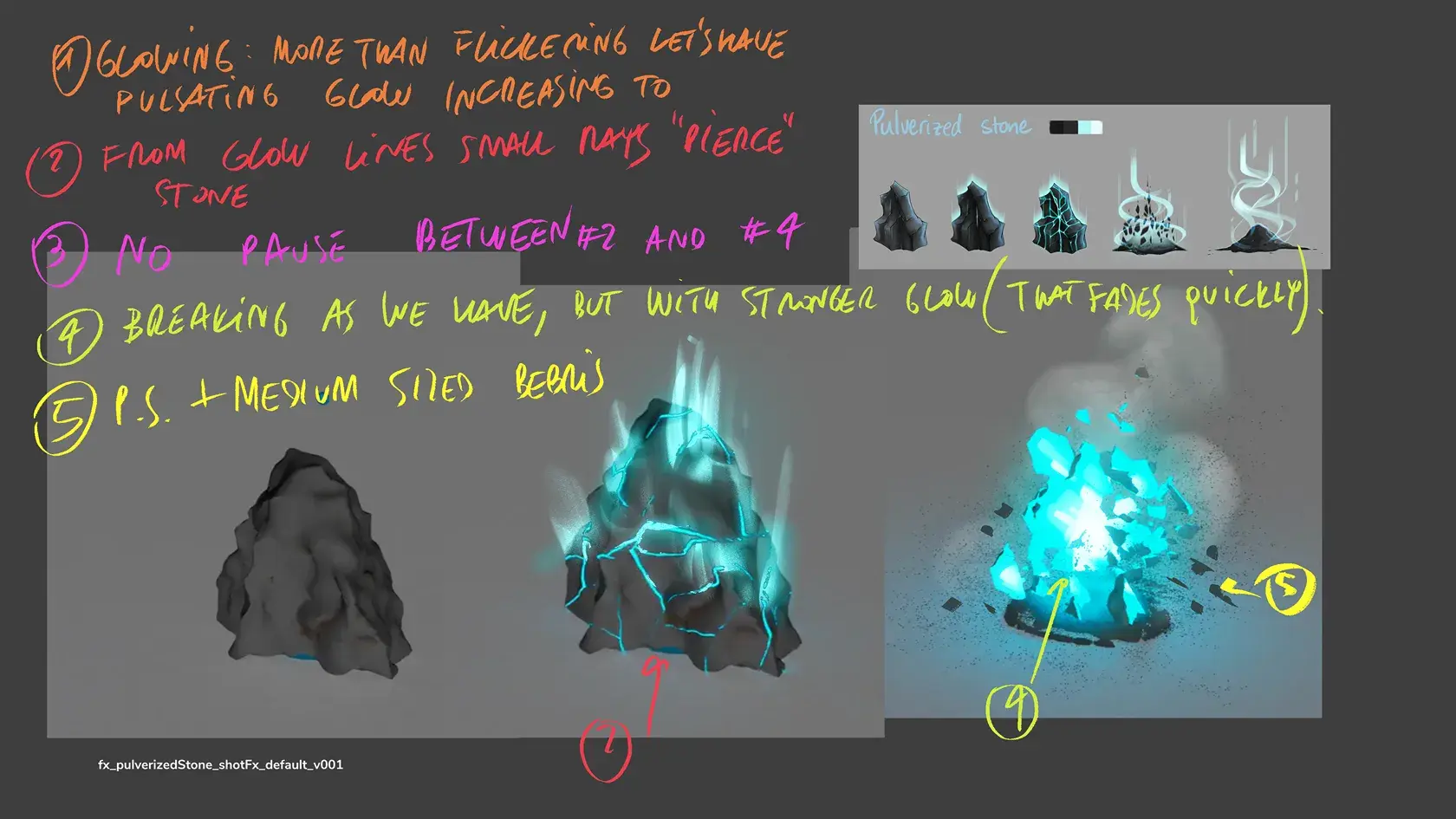
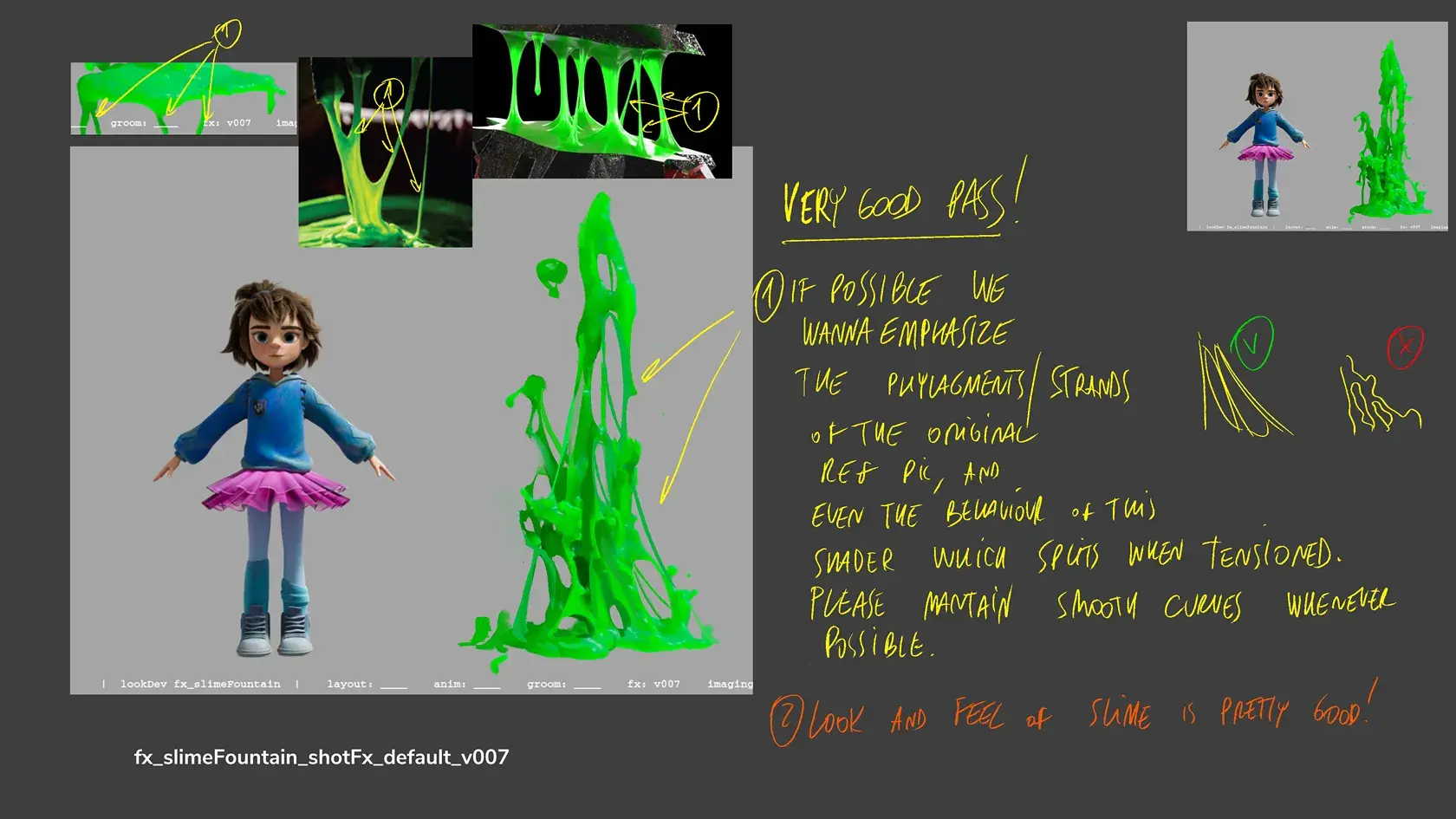
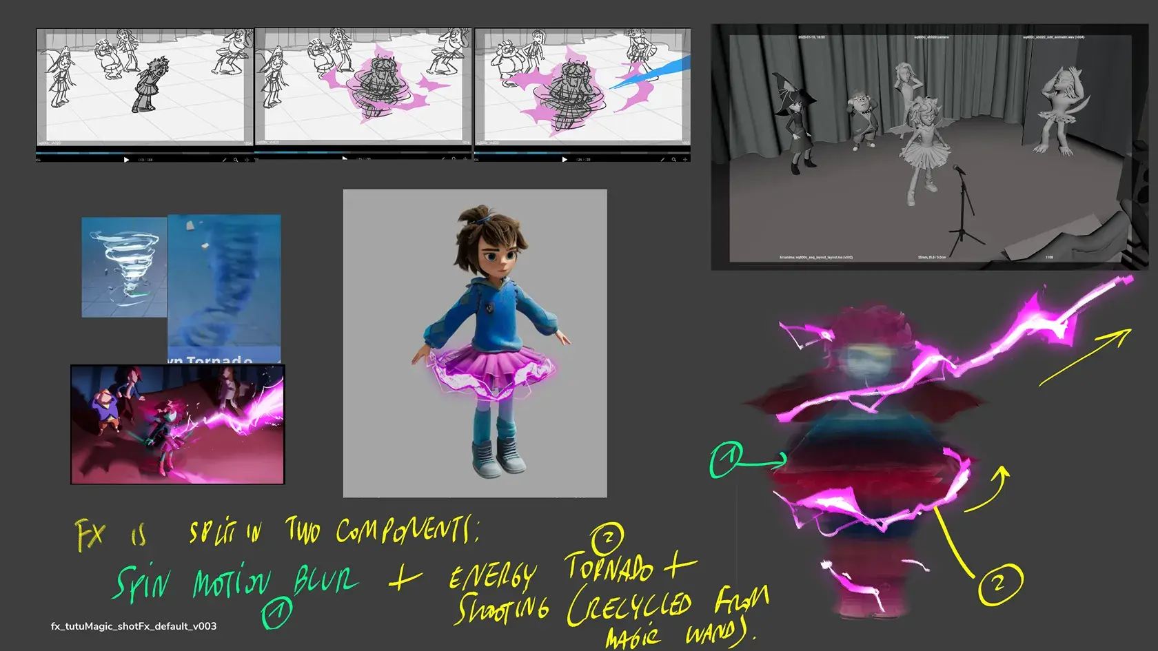
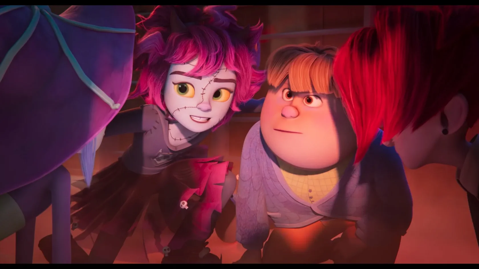
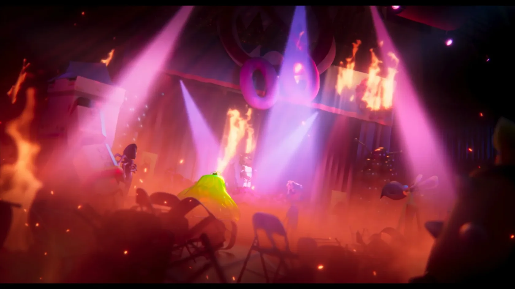
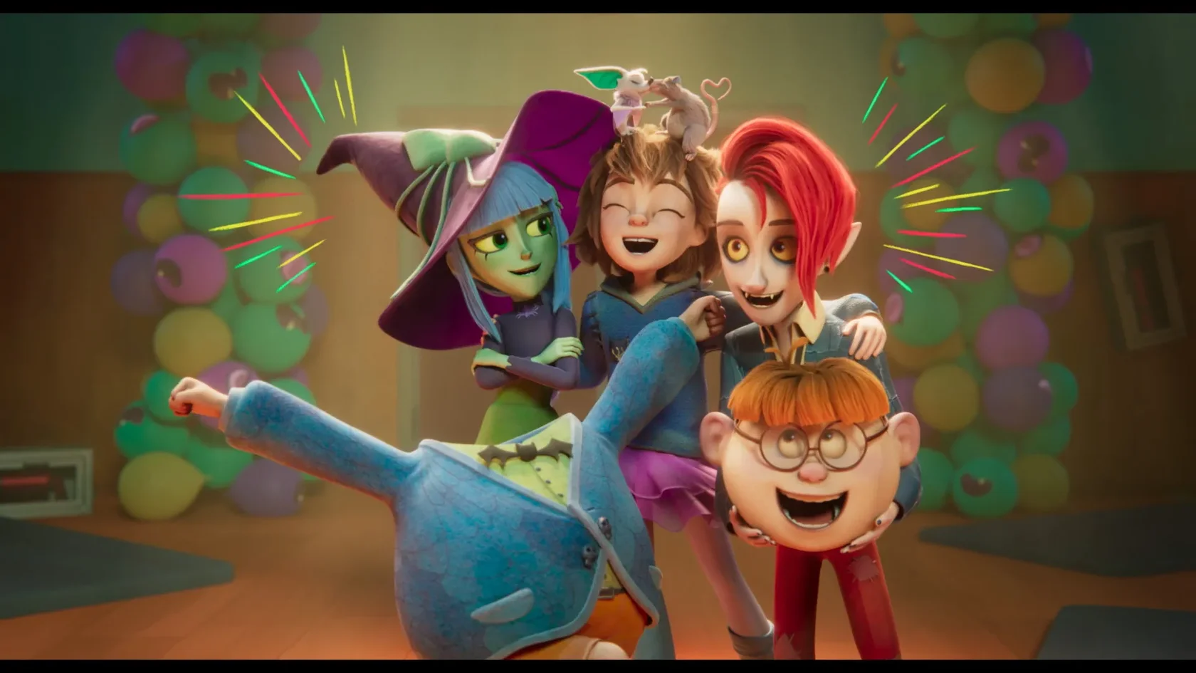
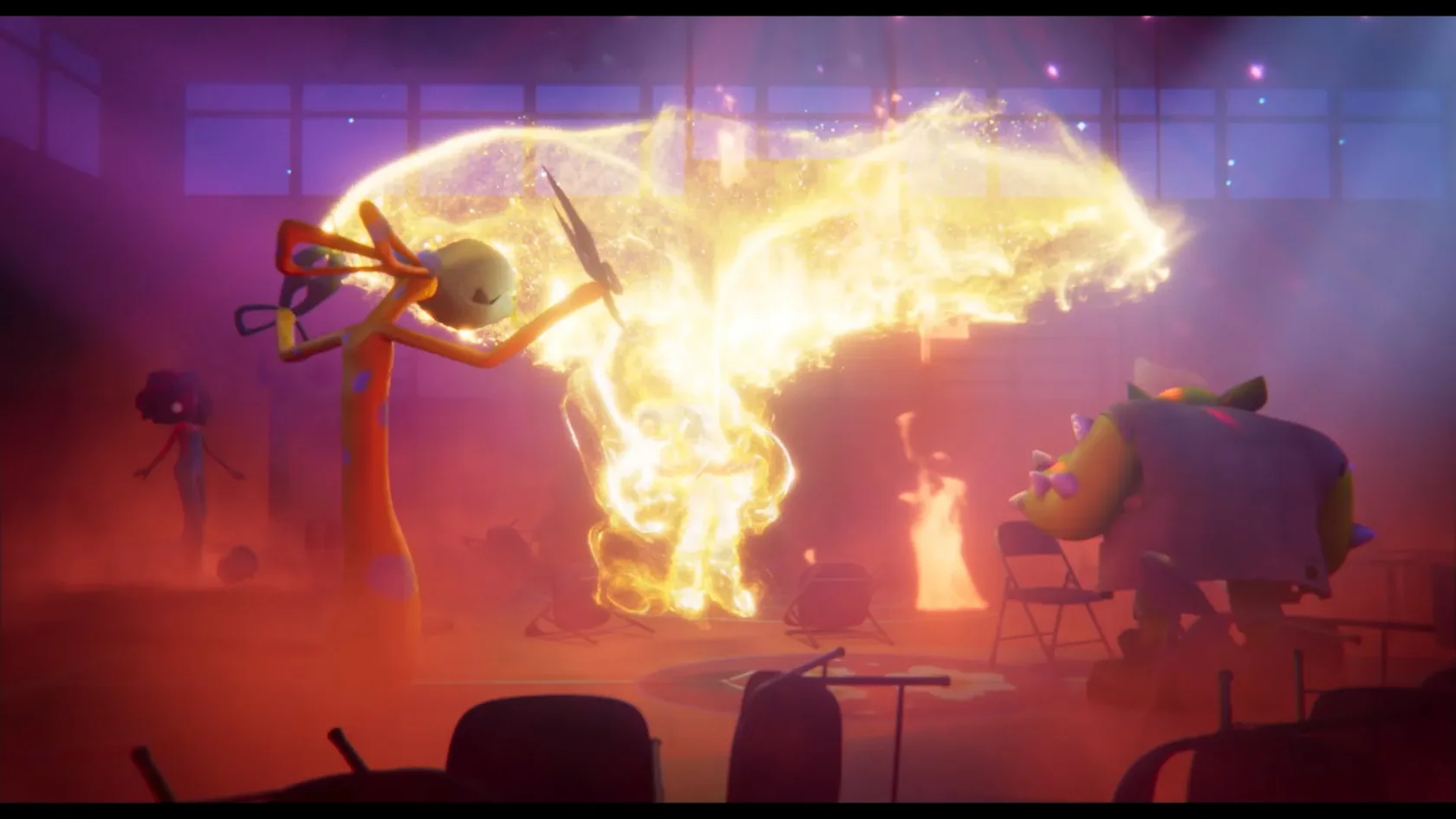
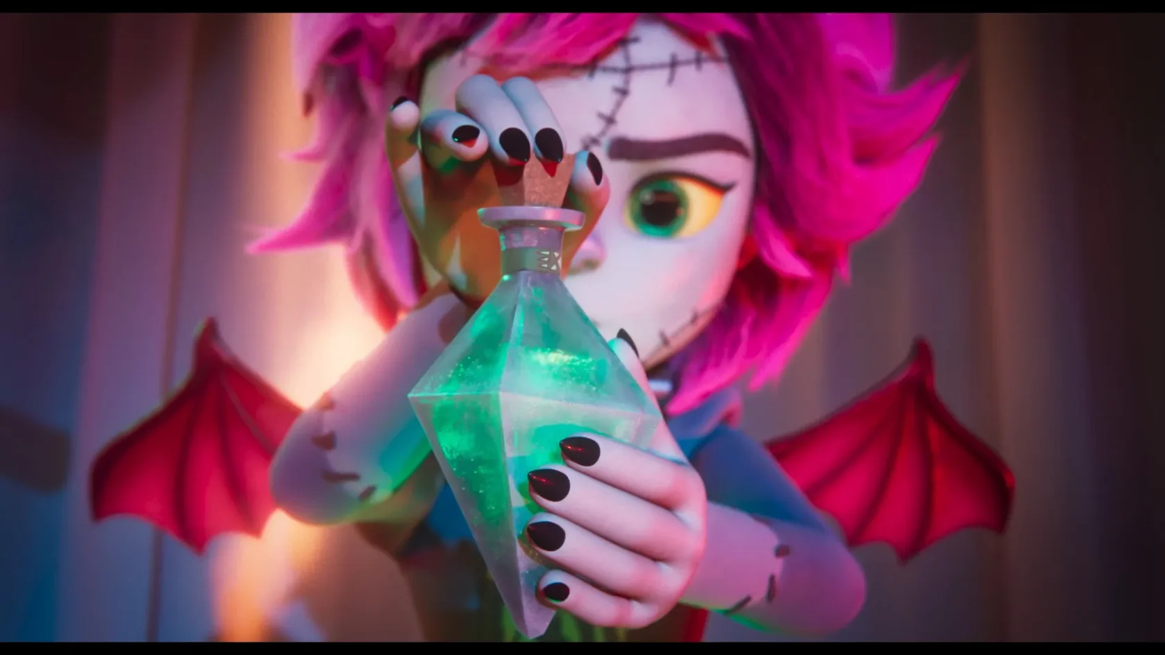
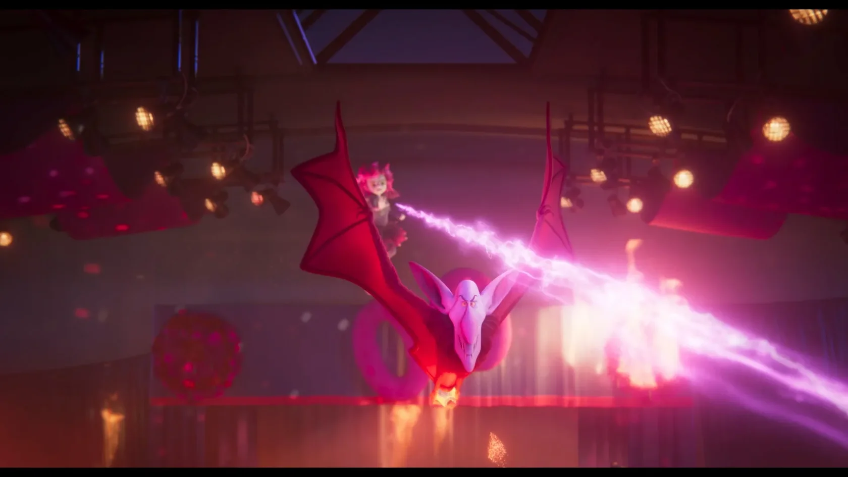
Stills
Email: hello@macalabs.com
Images and text on this website may not be used for AI training, piss off thieves!